Inspiration
My inspiration for this project came from a bit of digging, a bit of Pinterest browsing, and an ever-growing pile of recycling in my apartment that was begging to be repurposed. I’m a lover of art; I try my best to practice when I have the time in various forms. Something that I’ve always enjoyed is making Thank You, holiday, and birthday cards. In a busy time in my life I have found this “kills two birds with one stone” in a sense, although giving back to those in my life that I’m thankful for isn’t always a burden. I spent a large portion of my last semester applying to graduate school and, although this took large portions of my own time, some of the most important aspects of each application were my references. After receiving an offer from my top choice university, I’ve been meaning to follow up with everyone that helped me along the way. I did something similar last semester after submitting my first round of applications and have included some pictures below.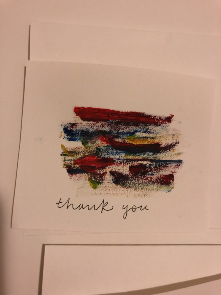
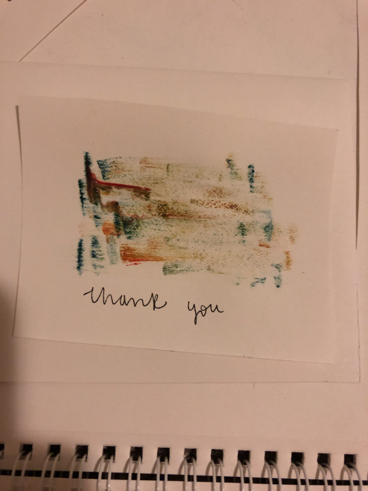
I wanted to try something new; I have made cards using water color and oil paints in the past, but only on traditional paper. Cardboard seemed like a fun challenge and proposed a new medium that intrigued me. Hence, my Upscaling Project was born.
Supplies
1 Quaker Oats Oatmeal Box
1 Peanut and Banana Clif Bar Box
1 Egg Carton
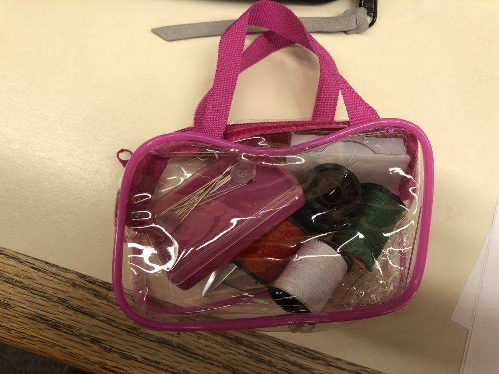
Black thread
Needles
White paper
Black Pen
Design Process
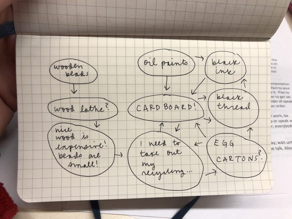
My initial plan for my Upscaling Project was to fabricate wooden beads. I thought it would be a cool way to learn how to use the wood lathe and test out some machining skills. However, after talking to the shop manager at the ITLL, I realized this would be quite the undertaking. First, beads are TINY! The wood lathe is purposed for large scale engineering projects, not precise and detailed beads. Second, the wood required for such precise processes is expensive. With the core goal of this project centered on repurposed material, I figured buying wood would steer away from the concept of upscaling.
I’ve detailed my design process in the sketch shown below. As you can see, I took a few turns before arriving at my final destination. I suppose that was one of the lessons I learned: Don’t use your first idea!
Vision
My vision – and this seems to be a theme with my artistic pursuits – was fairly broad. I wasn’t entirely sure what direction I would take until I sat down and started putting things together. I had initially wanted to use oil paints, although once I saw how the grey egg carton, brown cardboard, and black thread looked together, I realized I wanted to keep it simple. I actually really liked how the grey, black, and brown complemented each other. It created a bit of an earth-tone aesthetic, so I just went with it. I also wanted to incorporate additional art to the design, so I decided to play around with some black ink drawings. Everything started to come together quite nicely, including the functionality of the cards. I was a bit nervous as to how the cardboard would bend, but the material used in the Quaker Oats and Clif Bar boxes was thin enough to function exactly how I needed. Next, it was a matter of putting everything together.
Fabrication Process
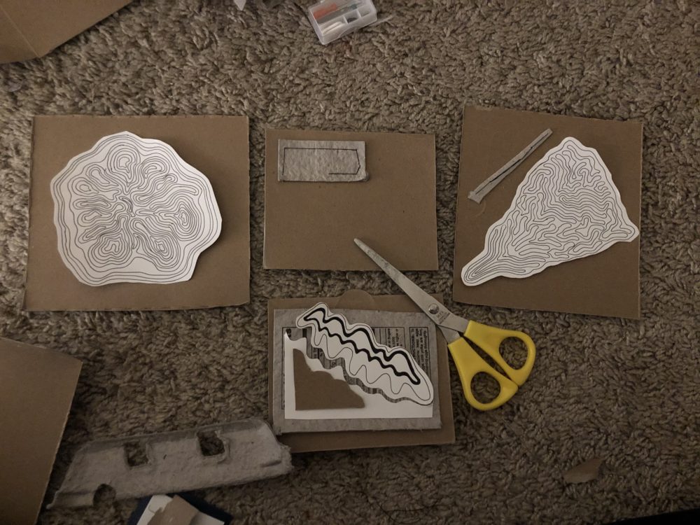
I began by cutting out the sides of each box and seeing what card sizes I would be working with. I decided to make two folding cards and two square cards. I initially thought I would glue everything together, but after experimenting with some sewing techniques, I found this created a neat aesthetic with the cardboard. In addition, I knew nothing would be falling apart.
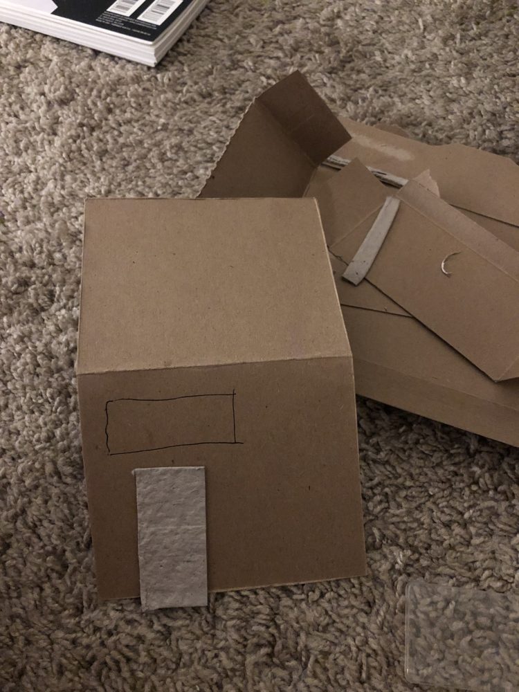
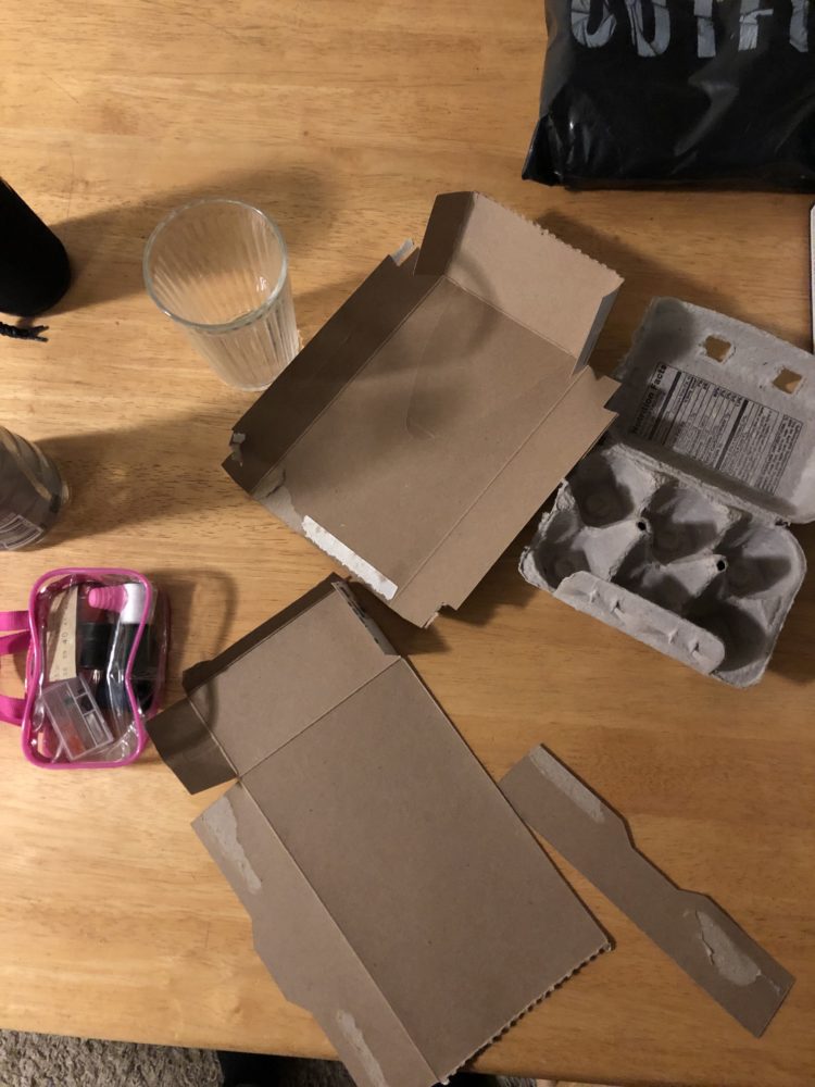
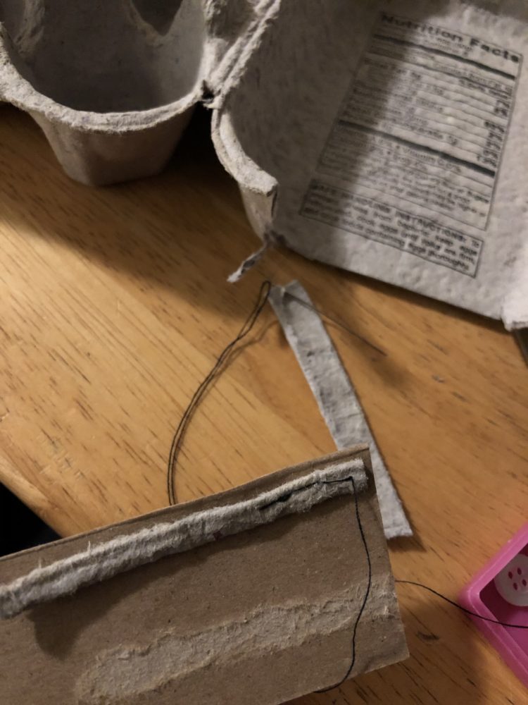
I did some drawings with black ink that are shown below. I’ve been experimenting with line drawings with fine black ink. I thought the designs would be a unique addition to the aesthetic.
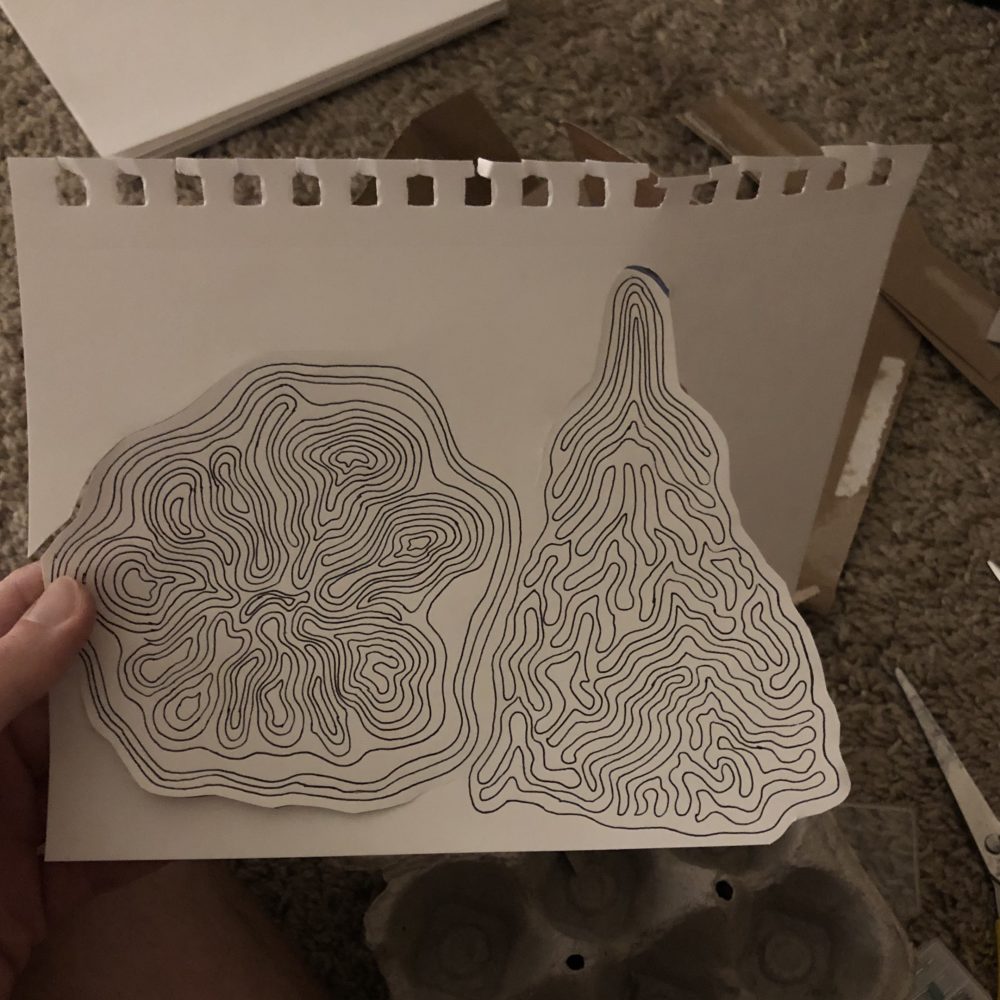
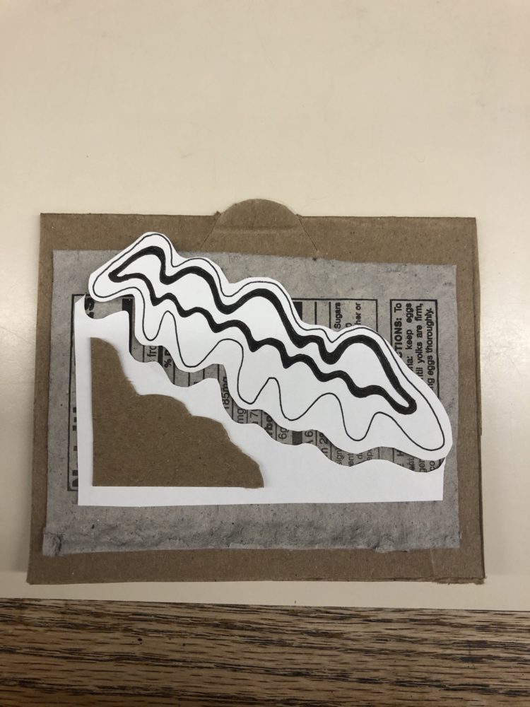
I cut them to shape and used glue to mount the paper to the cardboard. I didn’t want to risk ripping my drawings, so I figured this would be the best route to take. One thing that became a fun additive was the egg carton material. I ended up layering the last card that I made, and I think it’s safe to say it was my favorite. You can really see an additional design process through the card iteration. My first being the simple folded cardboard with one piece of egg carton, my next two incorporating my hand drawings, and the final using layered material. Which one is your favorite?
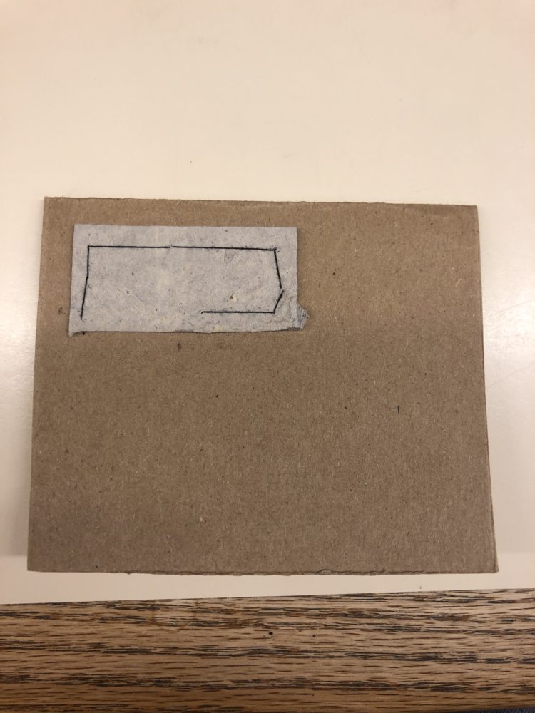
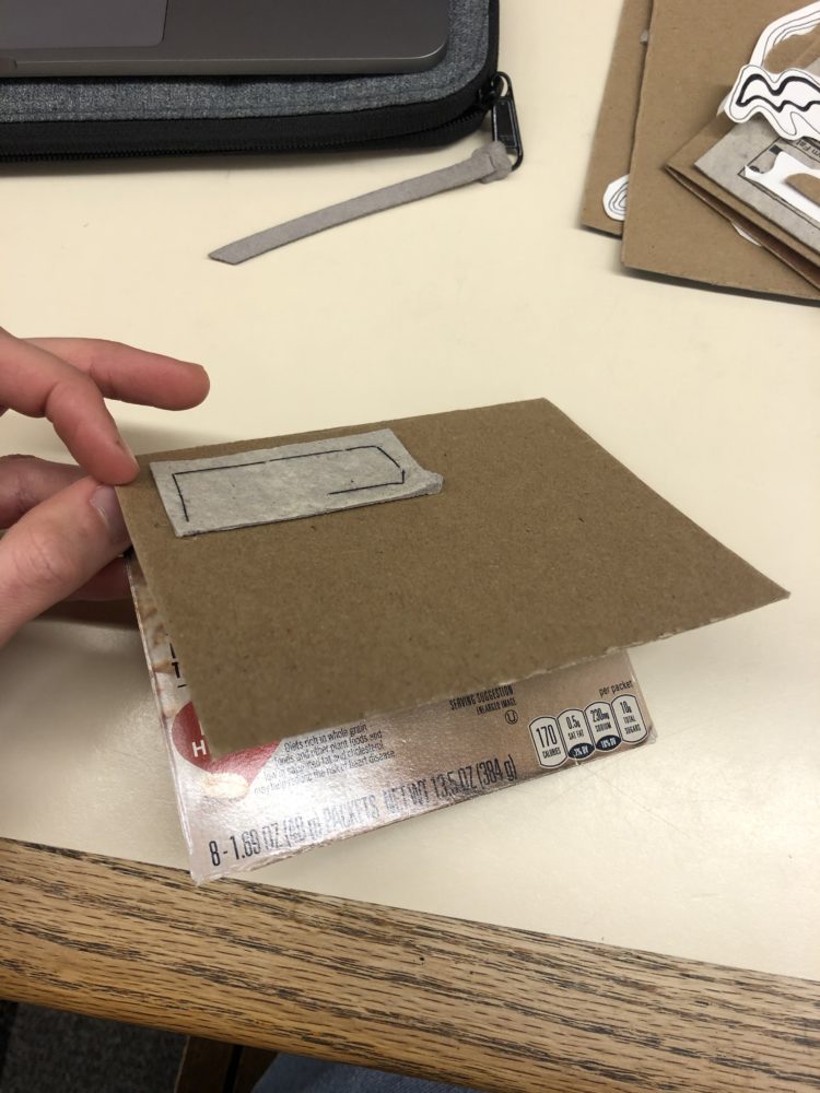
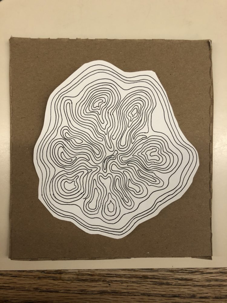
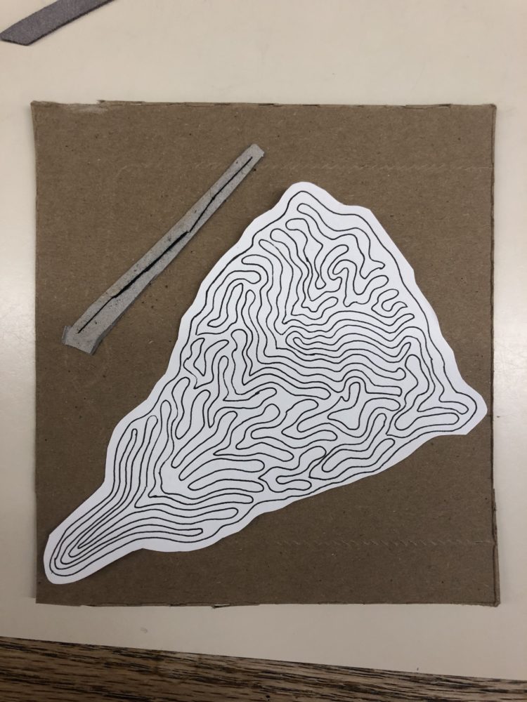
Analysis of Functional and Artistic Goals
The cards are bulky, to say the least. If you’re looking for something that you can mail at minimum price from UPS, these may not be the right products for you. However, I really like the way the aesthetic turned out. It’s simple, but detailed. I had fun doing some black ink drawing as well, and I think it ended up being a nice additive. Overall, I’m satisfied.
Looking Forward
My next steps will be to write the “thank you’s!” I’ll probably draft them in my notebook and then write them out on white sketch paper and glue them into the interior. Nothing fancy, and hopefully they hold up. Cards are an interesting concept as most of us probably throw away the majority that we receive. However, I know that I keep some that hold meaning. These may not be incredibly emotional or memorable cards, but they will be unique. They may end up in the trash, but I’ll definitely let their recipients know that they’re recyclable.
Cheers!
Emily
Link to view in class presentation: https://drive.google.com/file/d/1z-a4nf–3_Pl1TRgKDOc0a_mY9v8foLh/view?usp=sharing


13 Comments. Leave new
Emily – I really appreciate the thought you put into your project. I think you using your old recycling material for thank you notes makes them much more meaningful and the people receiving will definitely appreciate the amount of effort you put in. Would love to see the final products from these!
Emily,
This is an awesome project because it is a very functional project, that you created to serve a purpose.
Each card definitely serves to further the aesthetic, and each one is unique but also fits together with the theme.
Do you think you will use this strategy to make cards in the future?
Hey Emily! I chose your blog to critique, and I think this was such a cool approach to this project! I loved reading about your past process with making your own thank you cards and how you came about deciding to do this project. The drawings remind me so much of a topographic map, and I LOVE how you used sewing techniques to put the whole project together. The design and fabrication look like you really enjoyed making them and found good use out of old material in your house.
How did you decide when a card was finished? And what made you decide on making four different pieces? Also, did you want them to all be connected, or completely on their own? I think this project could be so much fun to create, but also so difficult to decide when to end one card and start the next.
I especially love how detailed you designed the pieces of art. Did you intend for them to look like topographic maps, or did you just want to keep experimenting with line drawings? Would you consider doing this project again, maybe with different materials to create different aesthetics? You could make a whole collection of your own personalized cards to send out – birthdays, Valentines, Christmas, etc!!
I think you took such a unique approach to this project, and created something really meaningful, useful, AND beautiful! I really enjoyed reading about your process with this project, and I think your final product was evident of your creative and artistic passion. Good job!
I think deciding when an art piece is finished is one of the harder parts of a piece! I always struggle with this; sometimes I go one step too far and end up not liking a piece. In this situation, I think I just tried to aim for minimalist aesthetic so, for example, the simple cardboard and egg carton card is only two pieces of material.
I think it’s nice that you were able to give these to people as opposed to creating something for yourself.
I like the simple card it definitely fits the minimalist aesthetic.
Do you plan on creating a proper writing surface?
– Does your project have a final name?
– How do you write on the label?
– Did you use a super thick needle?
I plan on writing on white paper and gluing it to the label. I always draft notes/cards/letters etc. before I write something final, so this part wasn’t included in my report.
The project doesn’t have a final name. I should probably think of something.
I used a standard sized needle and i think a thicker needle would have been much more useful.
Emily,
I liked how you used items that most people would throw away to create custom thank-you cards. I also liked how each card was unique and had it’s own aesthetic to it.
I thought that your presentation was carried out well. You made good eye contact and your slides complimented what you were saying through the use of minimal text and focusing on visual aids.
As a live critique, I made the statement of meaning: “I appreciate that your favorite piece of cardboard art – the featured image – has a strong sense of depth to it, nearly appearing three dimensional.”
Was there intentionality in displaying the nutrition facts VS whatever was on the other side? Love the natural feel.
Emily –
I appreciate your documentation of your fabrication process, with each cardboard that you had. I also appreciate your use of thread and having to sew through cardboard, as I similarly stitched through a fairly tough re-purposed material that I struggled with. And lastly, I appreciate the inspiration you had for your project – in giving back to others. In terms of the aesthetic itself, were there any textures or different designs that you would have liked to add onto your project (For example, extra texture and micro tears and the edges of the card or a fine glossed edge, or perhaps a pop up, etc)?
Using thread to sew into the cardboard is a very unique approach, it definitely adds to the individuality of each piece. I love your hand drawings, too.
Do you think you’ll keep working on these to make for people? Maybe try new materials and approaches to see what you like best?
Maybe! I like home-made cards so perhaps I’ll continue it once Birthdays start coming up.