For the Aesthetics Game, my team pulled the item “backpack” and the aesthetic “Japanese motorcycles”. While these two things aren’t normally thought of as complementary, or in any way similar, we now had to find a way to combine them.
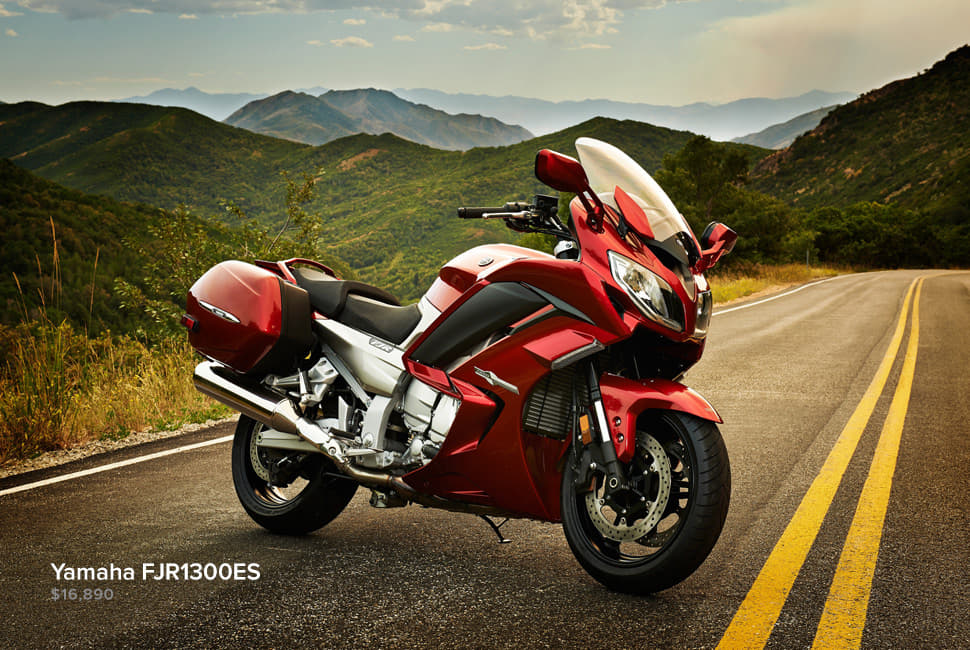
The first step that I took was to start brainstorming. What did the “Japanese motorcycle” aesthetic mean to me? With a quick Google search, it was clear to see that they were very sleek, aerodynamic, and usually decorated in bright or bold colors. This was now the foundation for the design I, and subsequently my team, would come up with.

Image Source: https://gearpatrol.com/2014/01/27/best-japanese-motorcycles-2014/#5
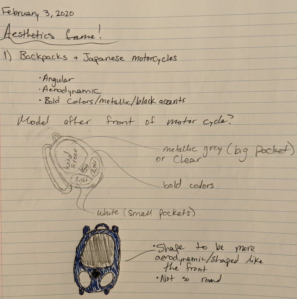
My original idea was to model the backpack off of the front of the motorcycle. Using the lights, windshield, and side mirrors as the main elements to draw from. The different part of the backpack could be colored similarly to represent these elements (the windshield portion is clear, the headlight area is white or yellow, etc.)

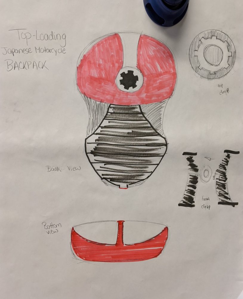
The team’s final idea was somewhat different. Instead of focusing on the front face of the motorcycle, we decided to take inspiration from what the motorcycle looks like from a top-down view, as you look down at the seat and handlebars. At first this was a bit confusing to me, but as our team began to sketch and color, it all started to make sense in my mind. While not my first thought, it turned out to be a really cool design.


