“Kawaii” or “cute” is an aesthetic that has become widespread throughout Japan, and it started gaining traction as early as the 1950s. Rune Naito is credited with being one of the earliest pioneers of this aesthetic, with the creation of his “Rune Girl” characters, defined by their large heads and baby-faced features. Big eyes and soft colors are other defining characteristics of this aesthetic I will be focusing on for my upcycle project, although “Kawaii” is an umbrella term which actually covers more. Below is an image of the Rune Panda, a figure created in 1971 which embodies this aesthetic and was the impetus for the explosive growth of “Kawaii” throughout Japan.

https://chatsticker.com/sticker/rune-naito-panda-girl/7636
From Rune Naito, 1971
Other examples (and key players) which capture the aesthetic of “Kawaii” perfectly would be Hello Kitty, and Pokémon. These are actually the #2 and #1 grossing franchises of all time, respectively, grossing over $80 billion and $90 billion in revenue over their lifetimes.

https://officialpsds.com/hello-kitty-psd-7z0vjy
From Yuko Shimuzu, Sanrio
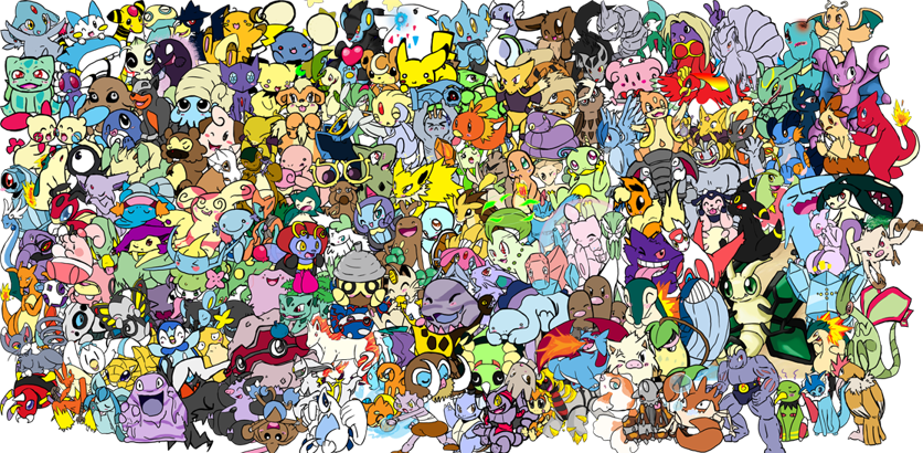
https://www.deviantart.com/shinywoopwoop/art/Adorable-pokemon-collage-160163379
From artist “ShinyWoopWoop” on DeviantArt; Original artists Atsuko Nishida & Ken Sugimori, GameFreak
I thought it was interesting to consider how lucrative this aesthetic is, despite how child-like and simple the designs are of nearly all things that fall within this classification. Finally, the subject of my upcycle project is Kirby, another iconic Japanese figure:

https://play.nintendo.com/themes/friends/kirby/
From Masahiro Sakurai, Nintendo
My vision for this project is to recreate Kirby striking the above pose, using recycled cardboard from my workplace, and the laser cutters on campus. I was excited to put these to use as soon as I learned of them, as I am a new student here. By using SolidWorks to generate Kirby via CAD, I aim to replicate Kirby as a 3D cardboard sculpture by cutting cardboard cross-sections, then stacking them together. Functionally, my goal for this project is to construct a sculpture which can stand by itself, and resembles Kirby closely enough to be instantly recognized by those who are familiar with the character. Below is an example from Epilog of what I am aiming to create, but of Kirby rather than a T-rex.
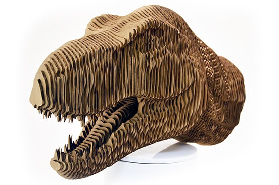
https://www.epiloglaser.com/resources/sample-club/trex-head-3d-model.htm
From EpilogLaser
Artistically, I believe a key underlying aspect to the “Kawaii” aesthetic is to elicit an “aww” from the viewer, or at least the feelings that come with that. My goal artistically then, will be to have my sculpture do just that – if I hear anyone audibly say “aww” or at least admit to thinking it, I’ll consider this a success. Kirby is the perfect example of “Kawaii,” as he has huge eyes, is essentially a giant head, and is a soft pink color, so creating him will be a thorough fit of my chosen aesthetic.
Below is a diagram of my design process:
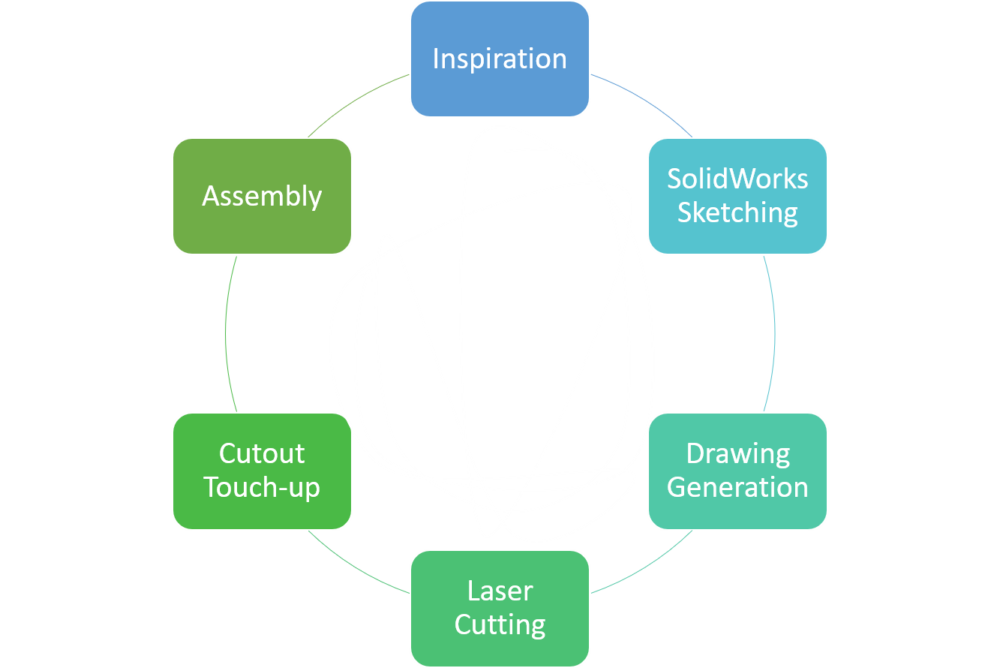
This cycle was at first very linear, proceeding through the different steps in a clockwise fashion. However, after the first dry assembly of Kirby, I found myself bouncing from step to step as I made changes, which led to subsequent inspirations and changes throughout the entire construction.
The starting piece of recreating Kirby as a 3D sculpture lies in generating a CAD model of him via SolidWorks. I began this surprisingly arduous task with sketches of profiles that matched each of Kirby’s defining features, then used the Loft feature to flesh them out.
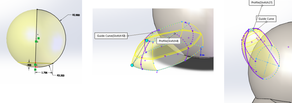
From there, I added facial details such as his mouth via additional sketches and extruded cuts, resulting in the final form as shown here:
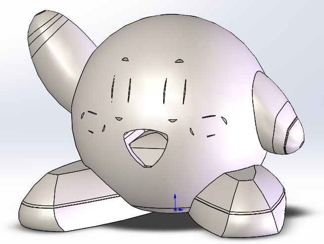
With this time-consuming step complete, I was able to then implement SolidWork’s Slicing tool to automatically generate the sketches necessary for the files necessary for using the Laser Cutter.
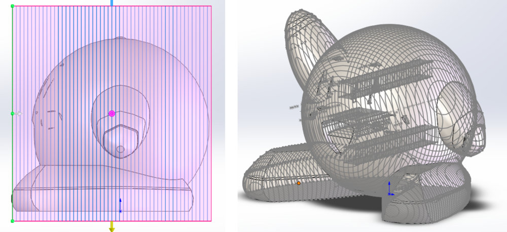
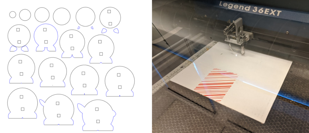
I then used this to create the .dxf files I sent to the laser cutters, which looked like this while running:
After all these cuts were complete, I touched up the rough edges with a box cutter, then did a dry assembly of the cross sections to check my work:
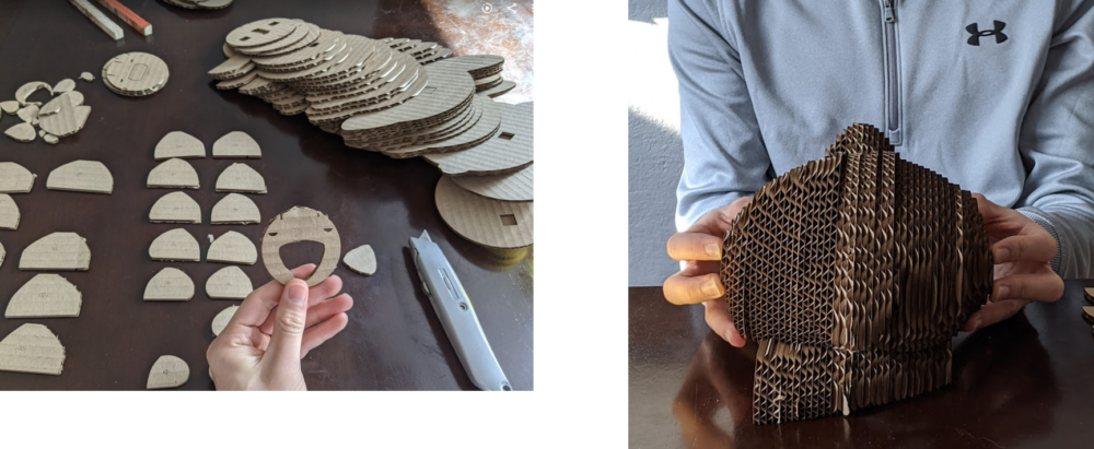
I promptly realized the proportions were a bit skewed, likely due to using cardboard that was slightly thicker than an 1/8th inch, which was the offset used in the Slicing tool of SolidWorks. To compensate, I simply took away a few layers from either side of the midway point, to better balance out his proportions. I simultaneously realized I would want to swap out the first 5-8 layers composing Kirby’s face out for cardboard with a white face, so that I could more easily add color using colored pencils. After fixing the proportions and substituting the bland, brown layers for colored, white ones I determined I was ready for final assembly.
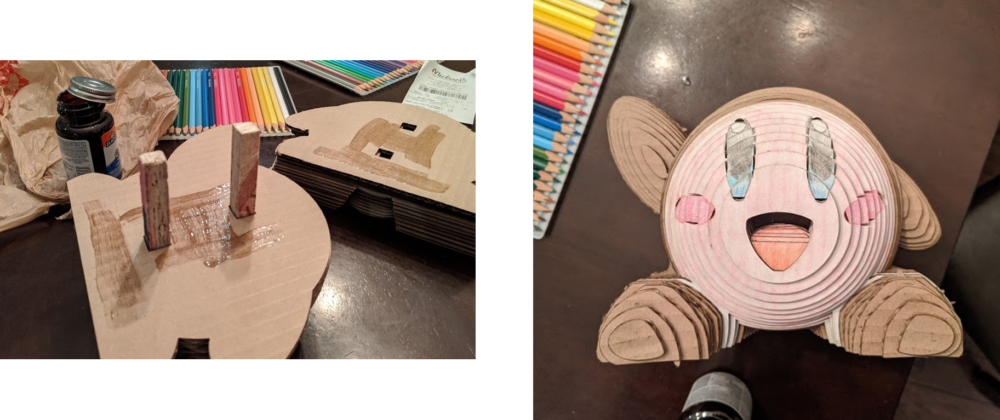
The dowels shown are ½” x ½” scrap plywood I took from ITLL’s manufacturing center, and add stability to the sculpture while assembling. In addition to the dowels, I added rubber cement between each layer to create sturdy bonds, resulting in a solid final sculpture. Here are some additional views of the final product:
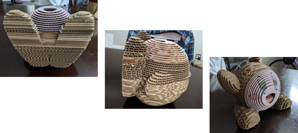
Reviewing my functional goals, I am very satisfied with the final product. This sculpture does indeed stand, and very much resembles Kirby, albeit in a bit of a low-resolution manner. However, assessing this artistically, I am admittedly dissatisfied. Although it did earn a couple of “aww’s” from the audience, I believe I could do a MUCH better job with future iterations, but it would need to stray from the upcycle nature of this project. If you look again at the bottom view of this sculpture, you can see how much more seamlessly the profiles are recreated when viewing the surface perpendicular to the laser cutter’s “edge.” So, if I were to rotate the slicing planes 90 degrees, and swap out the material for a thinner, solid material, I could recreate Kirby at a much higher resolution. Additionally, the solid surface versus the corrugated cardboard would allow me to apply paint, which would again be a massive improvement over my current coloring technique. I do plan on executing these improvements, since most the production time is already sunk into the generation of the CAD model. The drawing changes would take mere seconds to execute, although the new assembly would likely take significantly longer. My prototype here will likely gather dust until hitting the recycling bin once my improved models come off the cutters.
Thanks for reading, I look forward to any critiques you may have for me, and/or additional iteration ideas!
Video of Presentation: https://photos.app.goo.gl/C4YHKiHhPtixWFcS6

7 Comments. Leave new
I thought it was going to be hard to create those organic shapes in CAD and you did it. I really like it and recognize it for sure. Its interesting how you chose to fill it up completely and not do it spaced similar to the dinosaur picture you showed. Did you try to do that at first?
Fabrication and presentation is great – the general shape and form is very representative of the actual character; it’s immediately recognizable (at least to me) that it is Kirby
In response to the question of eliciting emotions: I think that I would say that the artifact is definitely cute to some extent; I think the biggest thing is that the face could be more cute, even if it less similar to the actual face of Kirby.
What other material would you consider using if not cardboard? Given that it can be laser cut, of course.
Thanks Kevin!
Yes, I definitely agree Kirby’s face could use some improvements – I think his eyes came out a bit wonky. For my future iterations, this trial has made me realize I need to trace the full outline of the eyes onto the CAD model, not just the four sections I currently have. Maintaining a consistent profile across the multiple layer depths was much trickier than anticipated. I think the ideal material would be a wood, around 1/16″ thick so I can double the layers, and I would also third the volume of the current model, so I’m not left working with an overwhelming amount of layers (that would be around 105 layers if I kept the same size).
If I were in the audience, this definitely would’ve evoked an “awww” from me! Kirby’s face and shape turned out awesome, but I think you’re right in that a different material would’ve given it a slicker look and feel. Regardless, I’m impressed! #kawaii
With the time that you had, I think your Kirby looks awesome. Kirby is a nostalgic character from my childhood so it is very heartwarming to see it put together. I did feel an “aww” when I saw it!
Although it would be cool to have all of it colored in, I like the depth effect of the first few layers. You did a great job with the mouth by making it hollow. It gives it more dimension and makes it more interesting to look at. Looking ahead, we spoke about this, but by using a thinner material with many more layers, you’ll be able to achieve a smoother texture.
Great job!
Thank you, Nicole!
I agree it would’ve looked much better completely colored in. I only didn’t do so because of time constraints, and also because of the knowledge this would be my just my first iteration. I really like the depth effect of the layers too! I plan to make a few more pieces that take advantage of this unique benefit of the medium. I will definitely capitalize on the idea of increasing the number of layers as well, but I also don’t want to go too extreme in that direction either – I think being able to see the different layers fairly clearly contributes to the feel of this piece, although not necessarily the kawaii aesthetic. Ideally, I’d be able to achieve a smoother texture, but also vary the profile of the perimeter of the layers, to add another interesting element. I’m envisioning 15-30 sided polygons (close to circles), with their vertices offset so the layers would look almost “fuzzy” when looking at it straight on.
Very thorough presentation. I enjoyed the background on the Japanese artists. I thought it was interesting how lucrative the Hello Kitty brand is. I thought your project was really well done and I think you nailed the aesthetic with the big eyes and pastel colors. Great job. You’ve inspired me to create something like this out of cardboard! I agree with some of our peers that the resolution and smoothness could be improved by using more layers of cardboard.