Last time of Aesthetic of Design: Upcycling Project…
In Magic: the Gathering, many cards with beautiful art go unplayed because they are uncommon, or not good enough. The idea of this project is to laser cut these trading cards and stack them on top of each other, thus blending different iconic artistic styles as well as giving the resulting cards a cool 3D effect.
Since then I’ve done some cuts, made some designs, and pondered for a bit. Here’s my process!
Resolving Last Week’s Questions:
- Will aligning the cards be a problem? Sort of, right now I’m using a clear plastic base in the very corner of the cutting space. This makes the alignment easier, but still prone to error if the card is slightly bent or misaligned. It also means I’m cutting one card at a time, which isn’t the most time efficient thing
- Will the laser be precise enough? Yes! As long as they are aligned correctly, the cuts aren’t visible to the naked eye, no browning on the edges.
- Will the card material pass a burn test? Yes! Woohoo!
- How difficult will it be to make laser cutting templates? A little difficult, but ultimately doable. Inkscape is a free and powerful tool, and I’ve been able to google or tinker around with any settings I need to work with.
There are still some problems with the process, mainly with alignment. Having clean cuts on the border of the “art box” is essential because those areas are very easily visible. With the test cuts I made some were to far up or down, resulting in a smidge of art that was peeking through unintentionally. Since I already have a plastic base to put the cards, I might try putting some sort of corner piece to ensure that the cards don’t have any wiggle room at all.
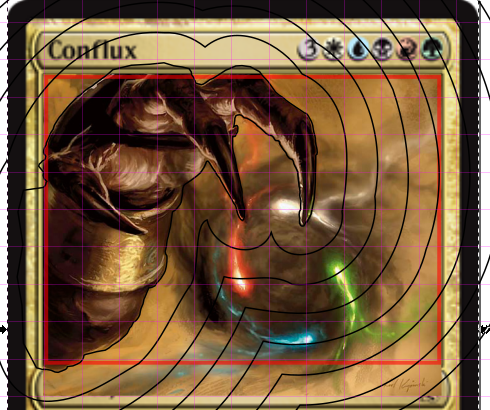
So given that I know that the project is feasible, the real work begins. Now I need to be focusing on what a good 3D magic card looks like so that I can have a completed project by next week. Part of this has been an exploration of depth. In the context of this project. depth serves to put certain parts of a card in the limelight. Key elements “Pop” out, so when thinking about depth we need to be able to easily determine what those items should be. One of the approaches I’m considering from the card “Conflux” is to increase the depth the farther you are from the focal points. Here the hand is front and center, and any cards underneath will pretty much only exist to make that hand look cool. The downside of this is that there isn’t much room to combine art then. These art boxes are tiny, and in order to emphasize art on each layer I need to give them enough space. In this design I definitely wouldn’t be doing that, so I’ll do some more test cuts and we’ll see how it goes.
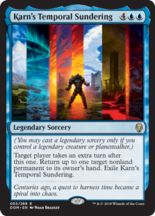
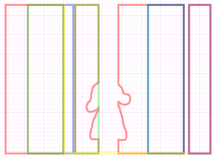
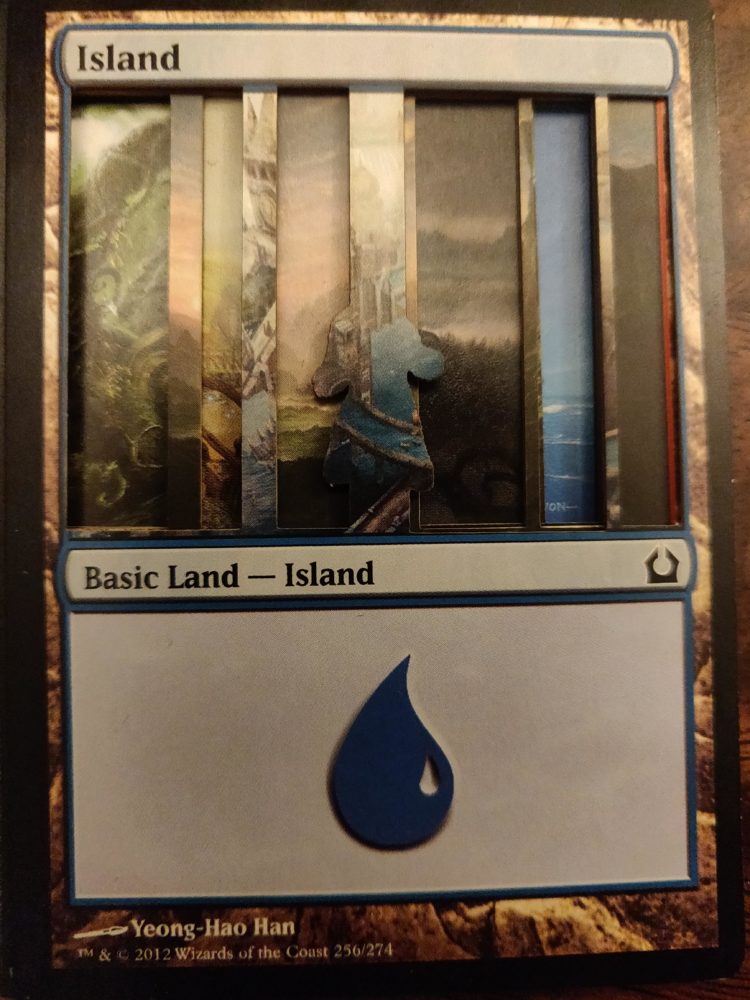

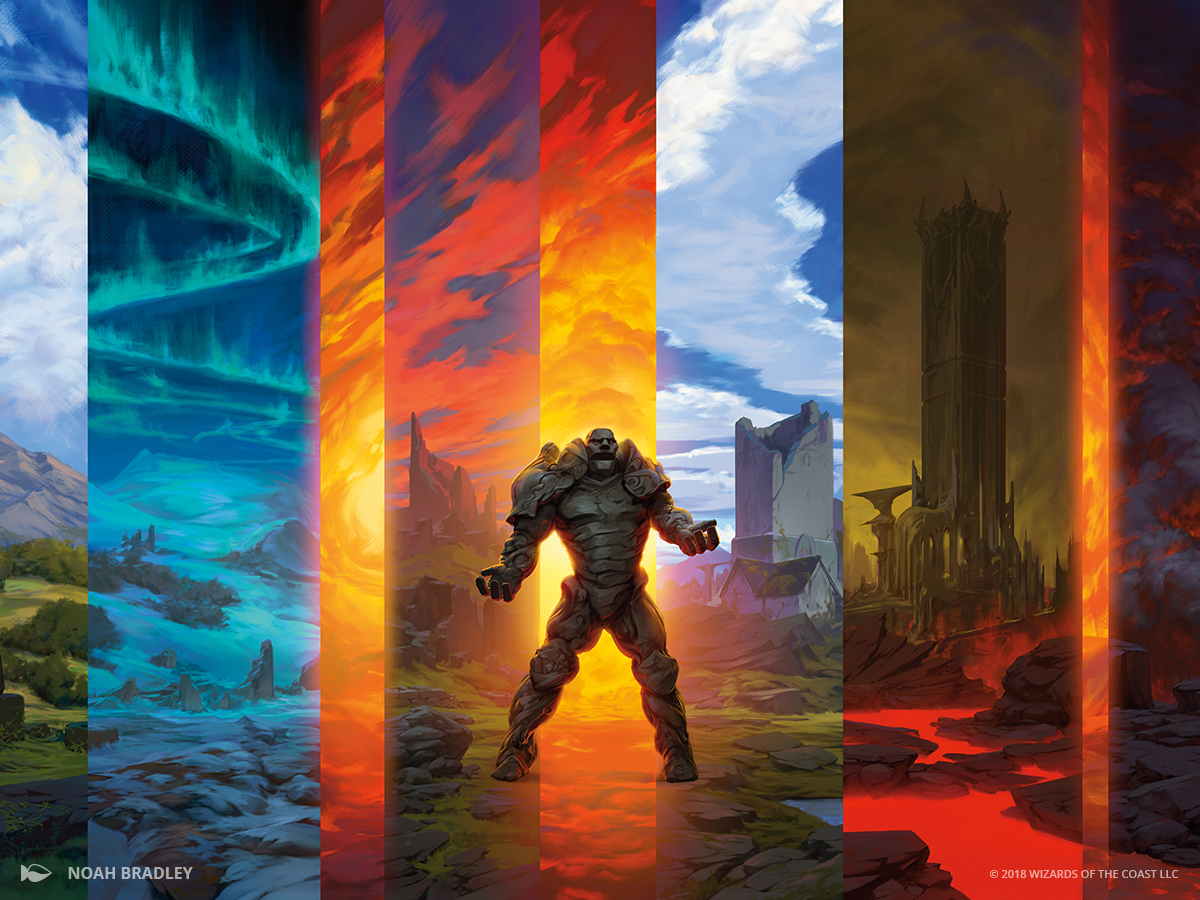
Another one of the cards I worked on in this was “Karn’s Temporal Sundering”. It’s is a great candidate for cutting because its sections of high contrast which clearly lend themselves to the depth approach. The focal point is the guy in the bottom middle, Karn, and the vertical sections seem to easily fit into layers. I made a template and did a test run with this to some mixed results. One of the problems here is contrast. The original card’s verticals slices are beautifully unique, and while I used different artwork for each slice they didn’t quite pop. It seems like for a final cut I will need to carefully select cards so that their colors blend well in context with the others, and also make sure that the focal points (castles, lakes mountains, pretty stuff) show up in that tiny slice. There are also some problems with alignment and it’s pretty rough overall. The tough part of this week will be making these prototypes actually look good and ready for presentations next week.
3 Comments. Leave new
Hey Kyle,
This has got to be one of the greatest thing’s I’ve seen. I played a lot of Yugioh growing up and always thought the same thing about how there are many beautiful cards that were not used. The upcycle portion of using many of the leftover magic cards that you have is also a fantastic idea because i’m assuming you have a bunch of them sitting around. In the future I’d like to see another project like this with non linear cuts like you have above, such as cutting around the creatures or something.
Overall really intrigued.
Hi Kensue, thanks for the input. Trading cards were also a memorable aspect of my childhood, so this project definitely some nostalgia factoring in. This is also a bit of an intro to laser cutting for me, so your suggestion of doing another related project is interesting.
I am incredibly interested in seeing your final project! Your methodology and numerous test runs are impressive and I’m sure will lead to an amazing final product. I think it is a good idea that you are being so thorough in your work and really doing your best to make sure all the elements work together the way you envision them.