Modern art seems to reject conservative methods of expression such as realistic interpretation of a subject instead focusing on experimental techniques and innovative ways to present shapes colors and lines that often comes across a little bit abstract.
Modernism is the aesthetic that I will dive into here as it has always perplexed me. I tend to have an association between modern and money, I infer that this stems from the fact that modern homes always seem to be unachievably expensive and modern art almost always looks very well put together in a similar way. I have always thought that modernism in art or architecture was always able to be broken down by thinking of multiple Venn diagrams with distinct options and overlapping portions. That image seems very vague so allow me to break down what I mean. The first Venn diagram I focus on is shape.
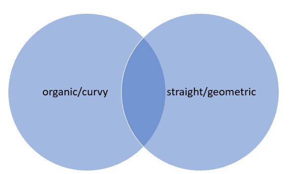
I tend to think of modern art in terms of very organic shapes with lots of curves that seem too well done/intentional to be natural, but could have certainly taken inspiration from nature. These organic pieces tend to bring about more feminine connotations.
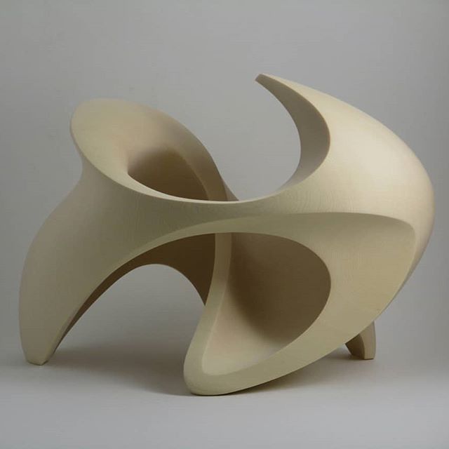
Figure 1: Mike Sasaki’s “Movement No.7” made from Yellow Cedar
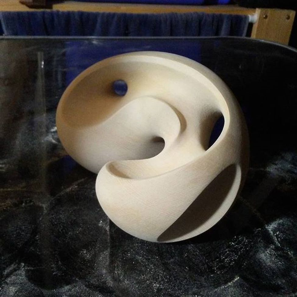
Figure 2: Mike Sasaki’s “The Mystery Of Space No.2”
The other circle in this case is art with very straight lines and geometric repeating patterns. This art can tend to feel a little more sterile and sometimes more abstract in my opinion. I tend to find the geometry and repetition often relieving.
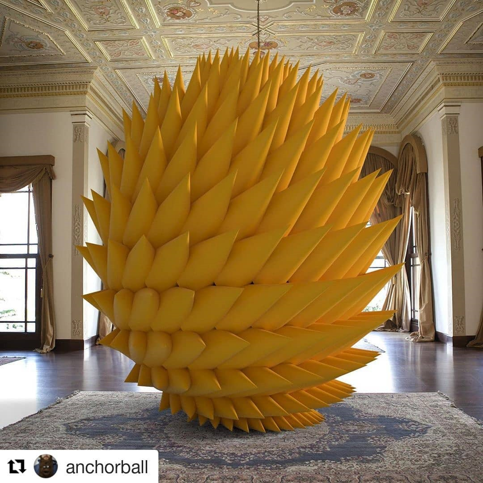
Figure 3: “Hearken” by Ken Kelleher
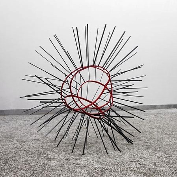
Figure 4: Monika Sosnowska “Balustrade” 2015
Sometimes modern art can be both organic and geometric thus fitting into the overlapping portion of the Venn diagram. These pieces make me feel balanced and often have the ability to shine either grouped together or standing alone.
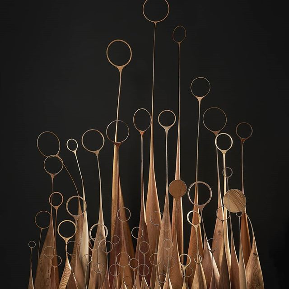
Figure 5: “Los Ángeles” by Odnoder (Pablo Redondo)
Modern art to me is also very much about texture and therefore it is the next lens which we will look at. Art is often created from metal, wood, concrete, stone, clay, or combinations of these media as were the cases f the pieces above. Another example of a singular texture with organic shapes is this stunning twisted sculpture.
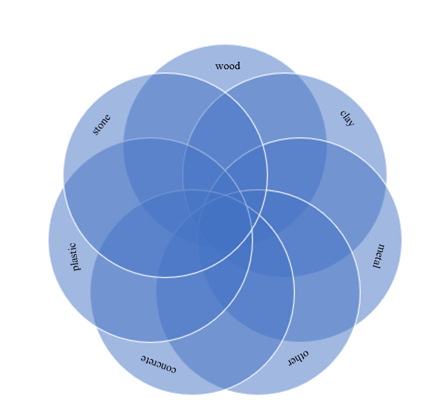
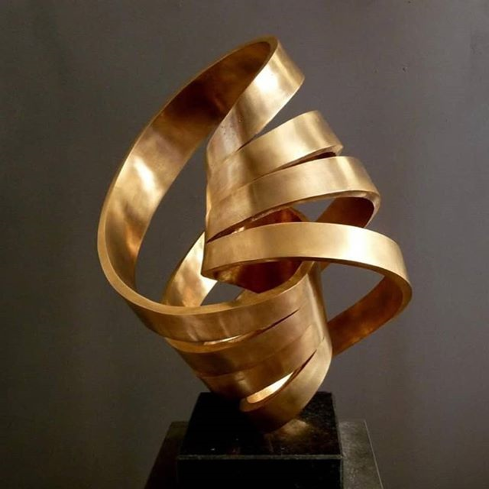
Figure 6: “East West” bronze sculpture from Georg Scheele
By contrast this piece merges metal and stone creating a stark visual difference between the rough natural texture of the rock and the cold, clean, smooth texture of the metal. By adding multiple materials together the artist is able to really make a visual impact.
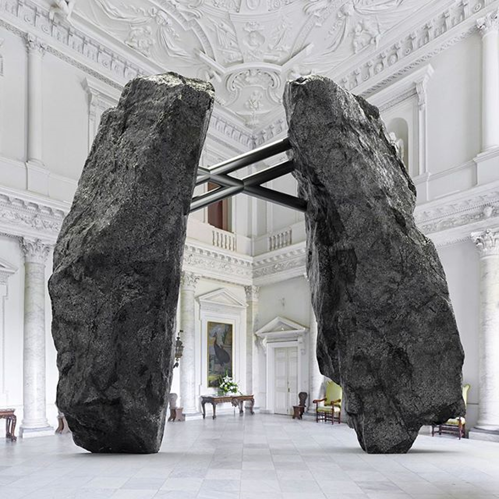
Figure 7: “union” by Ken Kelleher
Finally, the last Venn diagram I think of for this aesthetic of is more related to modern architecture in homes and is about color/light. Lots of modern homes seem to be characterized by minimal but prominent furniture. Spaces tend to features lots of flat surfaces in kitchens and living rooms and very open floor plans. Furthermore, many modern homes seem to be almost assembled from multiple boxes made of different materials such as wood, concrete, and glass. Modern homes tend to use lots of light walls or white features and use materials such as wood or concrete as an accent.
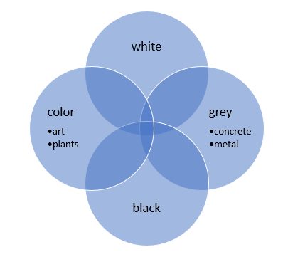
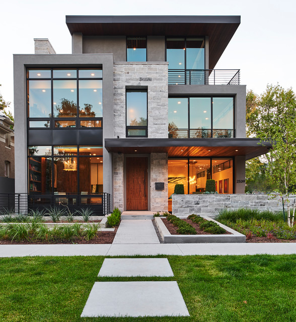
Figure 8: Denver modern home
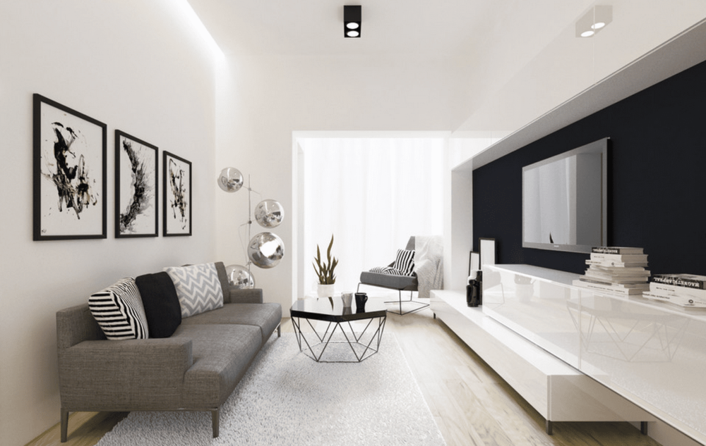
Figure 9: “Graphic art” by ZR Architects
When actually researching modern sculptures, I was surprised to find that it began in the 1840s with Auguste Rodin who worked mostly in bronze and actually ended in the 1960s with minimalism movements according to the article Modern Sculpture. She notes that artists took interest in fragmentation and depicting “essence” by using form. Other influential artists in the movement included Constantin Brancusi who pioneered abstract and distorted sculptures, Henry Moor who made curvilinear human figures, and Alexander Calder who primarily made mobiles (moving parts).
Sources:
Kelleher, Ken. Hearken. @Anchorball, New Hampshire.
Kelleher, Ken. Union. @Anchorball, New Hampshire.
“Modern Sculpture.” Essential Humanities, 2020, www.essential-humanities.net/western-art/sculpture/modern/.
Pierre, Caterina Y. “Modern Sculpture.” Modern Sculpture – Art History – Oxford Bibliographies, 27 June 2017, www.oxfordbibliographies.com/view/document/obo-9780199920105/obo-9780199920105-0111.xml.
Redondo, Pablo Odnoder. Los Ángeles. @odnoder_sculptor, Spain.
Sasaki, Mike. Movement No.7. @Sasaki,mike_woodforms, Metro Vancouver, Canada.
Sasaki, Mike. The Mystery Of Space No.2. @Sasaki,mike_woodforms, Metro Vancouver, Canada.
Scheele, Georg. East West. @georgscheele_sculpture, 2019.
Sosnowska, Monika. Balustrade. 2015, Warsaw Poland.

2 Comments. Leave new
The first thing that caught my attention was when you mentioned the association with money and modernism. To me the modern aesthetic is very real and very expensive typically. I like how you point out that modernism is typically not natural looking but you gave very good examples of modern looks inspired by natural objects. Overall I had not ever seen/noticed modern art modeled after natural materials so I really enjoy that! Thanks.
This is a really interesting explanation of modern sculptures! I have always found that modern sculptures give me more of a reaction than modern art on a canvas. I think that abstract art is easier to relate to when it is in three dimensions.
I agree with you that figure three is somewhat relaxing to look at, despite the fact that its colors are rather bold and the spikes wouldn’t normally be considered relaxing. I also wonder why it is that modern art is associated with wealth, because to me the abstract forms that it takes on would potentially reduce the barriers of entry for new artists. However, this doesn’t seem to have been the case in practice.