Apple introduced changeable wallpaper beginning with system 7 for Mac OS, which was released in 1991, almost 30 years ago. Although the early versions of these wallpapers were very choppy and not aesthetically pleasing, they were unique and changeable, and they laid the framework for where the default wallpapers are now.
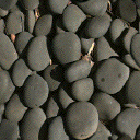
Mac OS System 7 Rock Wallpaper
Source: https://www.thegraphicmac.com/mac-os-7/
It is also interesting to contrast this wallpaper with one that is very similar, but done using more advanced technology. The growth of technology that goes into cameras and scree resolutions has allowed for Apple to create more crisp photos such as the one below, which is similar to that of the system 7 but much more clear.

Mac OS 10.5 Rocks
Source: Source: https://512pixels.net/projects/default-mac-wallpapers-in-5k/
Beginning with the earliest wallpapers, almost all of them since have incorporated some form of wispy lines or very straight edged lines. The types of wall papers can be broken down into two main categories, works of nature, including animals and landscapes, and works of man-made art. The following shows the similarity in aesthetic between the two very different categories. The first, a high resolution photo of Antelope Canyon displaying natural curves of the Earth, which is very similar in style with the next photo, a man-made wallpaper for the most current version of Mac OS.
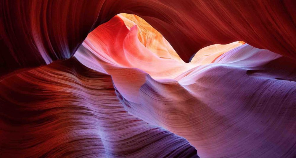
Mac OS 10.9 Antelope Canyon, By: Peter Lik
Source: Source: https://512pixels.net/projects/default-mac-wallpapers-in-5k/
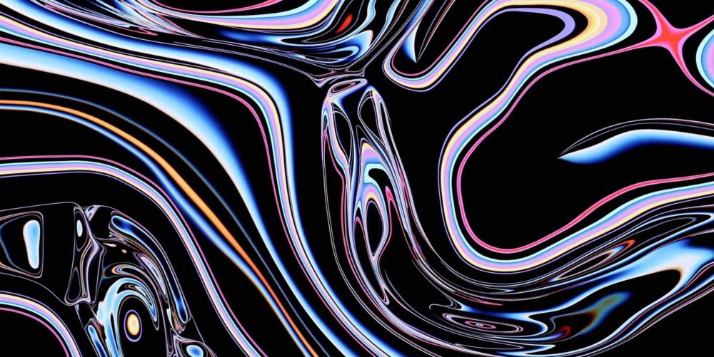
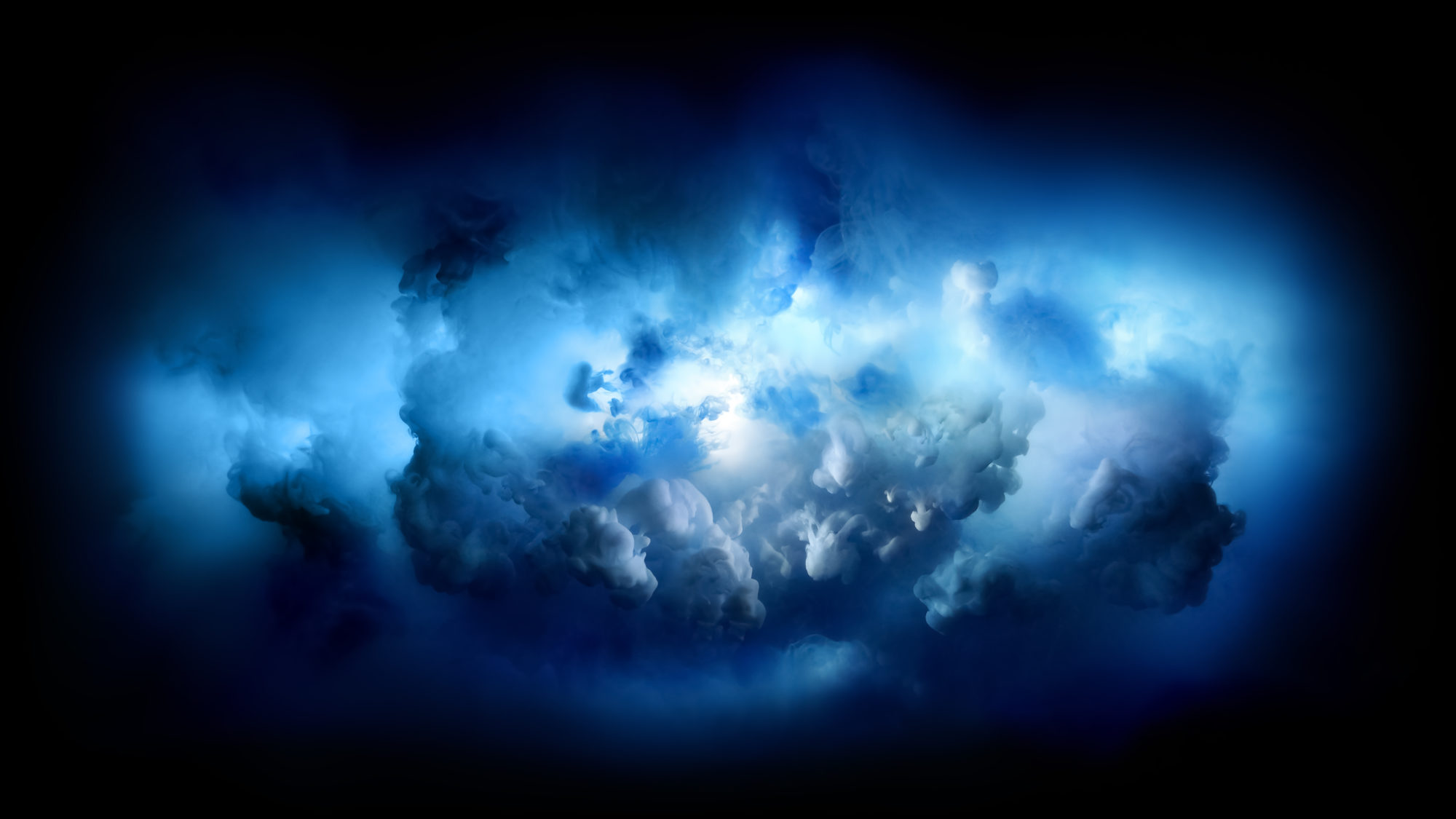
Mac OS Catalina Wallpaper
Source: Source: https://512pixels.net/projects/default-mac-wallpapers-in-5k/
Additionally, the effect these types of wallpapers are trying to achieve is to soothe the viewer. When there is a lot of chaos in a photo or image, the viewer is prone to feel a frantic type of feeling. Whereas these images create a flow for the viewer to follow which creates a soothing feeling. This was taken even further when Apple introduced live wallpapers on Apple iPhones where the curves of the background were able to incorporate motion. The following is one of the first live wallpapers introduced to the iPhone with OS 9 released in 2015.

Live Wallpaper iPhone IOS 9
Source: www.iostweaks.net/news/download-all-of-the-still-and-live-ios-9-wallpapers-here.html
Additionally, the wallpaper design used by apple uses bright and vibrant colors that highlights the contrast found in each. They only have a select few of wallpapers that incorporate black and white aesthetics. And even the few that are presented in black and white are only in this format because it is done in a way that highlights the contrast. The photo below shows a black and white wallpaper that has good contrast.
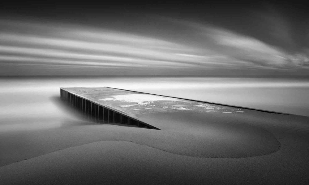
Mac OS 10.5 Pier Black and White
Source: Source: https://512pixels.net/projects/default-mac-wallpapers-in-5k/
All photos included are owned by Apple.

2 Comments. Leave new
Wallpapers seem to be one of the few ways we can customize the look and feel of our devices. I have always wondered why and how Apple selects what native wallpapers to include on software releases, or why they include any at all since you can download your own. I guess it is to include an aesthetic that appeals to all of their users. Although I have realized that a lot of their wallpapers are photographs of nature, I didn’t realize almost all of them include curvatures and saturated colors. Do you have a favorite wallpaper or series of wallpapers from Apple? What about them in comparison with what Windows offers is different? Do Windows wallpapers have their own aesthetic?
Yes it is interesting why they would include and spend so much money on wallpapers to provide when most users do end up using their own photos. Perhaps it just completes the overall aesthetic that the companies brand is trying to follow. As far as windows there are a few common themes such as the outdoor and nature theme Apple has applied. I enjoy a lot of apples wallpapers, my current background is the one featured on this post, I find most of them very calming to look at!