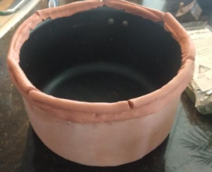
At first I hard a hard time placing my design within a 20th century design movement, but upon more research I selected two design movements that matches my final design project. My final project is a snow globe terrarium. I making the base out of terra cotta. I am keeping the design of the terra cotta clay vary simple with simple and clean lines. This part is very reminiscent of the arts and crafts movement. The arts and crafts movement used quite a bit of terra cotta. An example of the simplicity of the base is shown below:

The other art movement my object is reminiscent of is organic design. In keeping my object with simple with clean lines I am also keeping a lot of curvature in my terra cotta. On top of that I plan to add moss to the exterior of the terra cotta to make it appear that the terra cotta itself is part of the inside of the terrarium. This will make the base appear organic and extracted from nature.
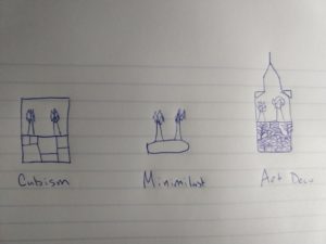
To help think about the aesthetics of my final project, I applied it to three different 20th century design movements that are wildly different than my current aesthetic. The three movements I applied to my project was cubism, minimalism, and art deco. My sketches of my artifact applied to these movements is shown below:

In the cubism case, I squared off all of the edges of the terrarium, and gave a geometric pattern to the base. For the minimalist case I condensed the base of the terrarium, so that it is much smaller, and removed the glass top. For the last case, art deco, I gave my artifact a top that is reminiscent of the Chrysler building, and intricate gold detailing on the bottom. All three are very different from my original concept and have given me a new perspective on the aesthetic of my final project.

2 Comments. Leave new
How interesting! I had no idea that the Arts and Crafts movement used quite a lot of terra cotta! I can see how it could be used in those different aesthetics. For some reason those grooves in the pot you showed really has a semblance of cubism, I think because it would otherwise be minimal without the grooves.
[…] Current Vs. 20th Century Design […]