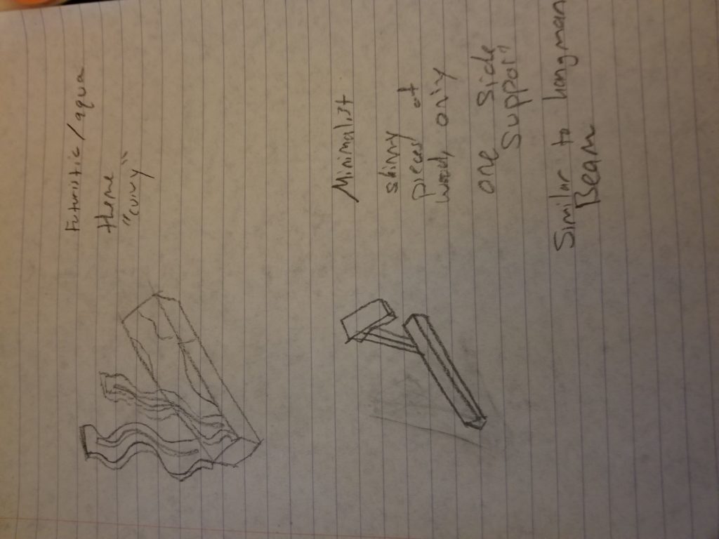
I am making a guillotine vegetable chopper with the French Patriotic aesthetic. This contrasts highly with many of the design movements of the 20th century. For example, the Futurism movement had to do with sleek curves and round looking designs, similar to the space age aesthetic of the 1960s. My guillotine will have sharp, defined edges and will not worry about looking like the futuristic machine of tomorrow. Instead, it hearkens back to the arts and crafts time slightly. It is hard to put patriotic aesthetic in any design movement except for maybe the patriotic movement that was occurring in the USA during WWII or even back during WWI, a time in European history when patriotism was high in the countries of Germany, France, and Britain. During this time, posters were plastered on many walls and buildings, urging the youth to enlist and serve their country proudly in the War to End All Wars. Though this movement was short lived, due to the harsh condition that became synonymous with this war, my aesthetic can closely relate to this time.
The design aesthetics I tried to mimic with my guillotine were the streamlined aesthetic from the 1930s-1950s, the futuristic aesthetic from the same time period, and minimalism from 967-1978. I used the following site for reference: https://www.stedmunds.org.uk/wp-content/uploads/2016/05/Design-Movements-Timeline.pdf


1 Comment. Leave new
I love how you gave your guillotine curvy blades in the futuristic design. It’s a whole new way to look guillotines.