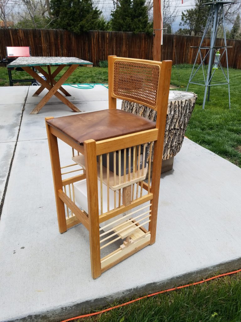
For my aesthetics project I focused on improving the functionality of a chair. I purchased a tall chair from a thrift store and improved the interior space of the chair to utilize storage. I purchased multiple drawers and implemented them into the overall design. This project was mainly completed using my woodworking experience. Special thanks to TinkerMill for letting me use their resources and machines and helping my complete this project on time.
https://www.youtube.com/watch?v=fP9ouZqZEvI

I really enjoyed using symmetry and increasing my woodworking experience. If I had more time I would’ve used wooden drawers. The drawers still work well for showing the functionality of the chair and a proof of concept idea for new possibilities of furniture.


6 Comments. Leave new
This came out really nice, the only thing I would consider is painting or staining some of the added pieces to match the rest of the chair and hopefully you can fit the cabinets better in the future.
This turned out so well. What you did flows really well with the aesthetic of the preexisting part of the chair. I only wish you had done something more to the top part of the chair as well.
Despite its functionality, I actually like the aesthetic of the chair. Very bold looking. If you want to keep improving the chair, I think it is a good idea to make drawers that come out 4 directions
Hi Brandon,
I like your idea. I like the multiple use chair. it is very helpful. however, I can not point out the aesthetics on your project. have your thought about painting the chair to add your own aesthetic look.
Brandon, You’re sitting right next to me so I wont say anything too mean. I really liked the final design of your project. I think that the struts in the chair look really good and the storage idea is refined from your original post. I was wondering what the hardest part to woodwork was.
Your project looks really intricate, despite the simplicity of the wooden components. I like how the intersecting lines give a dynamic feeling to the chair. I think the few circular pieces add a lot to the overall look, making things feel a bit less rigid, contrasting nicely with all the lines. If you were to expand on this idea in the future, using that roundness might be a good space to explore.