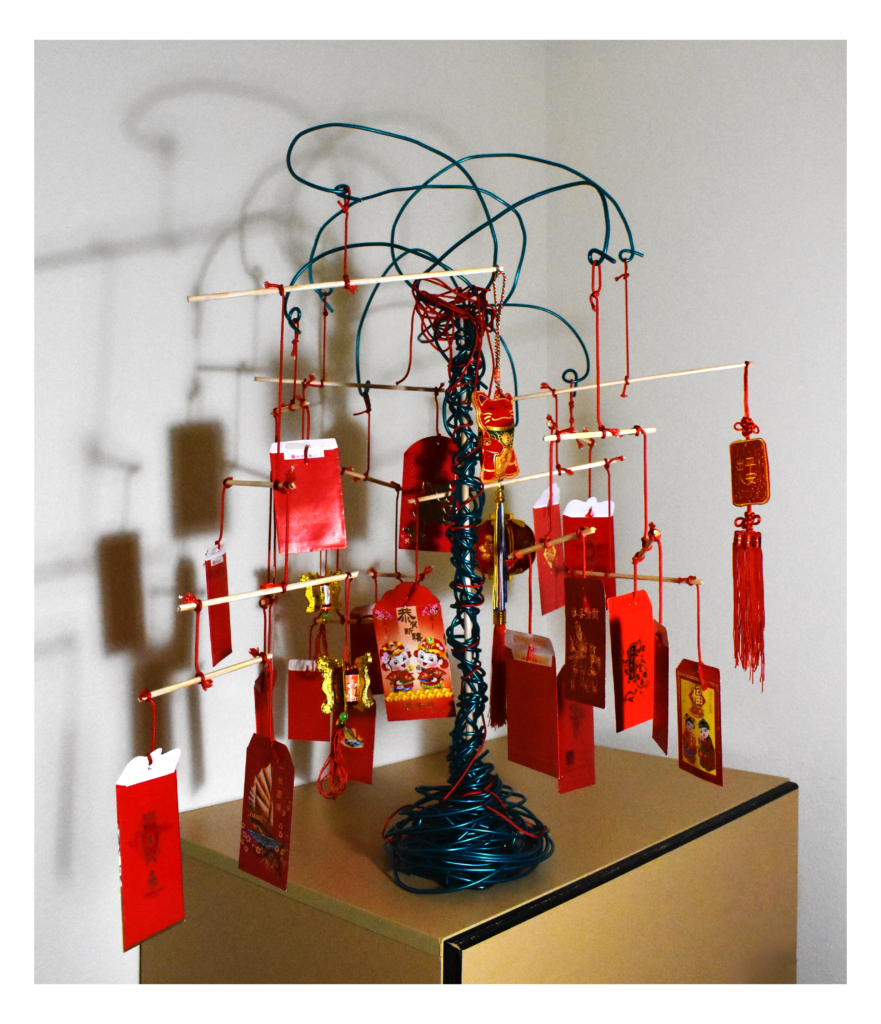
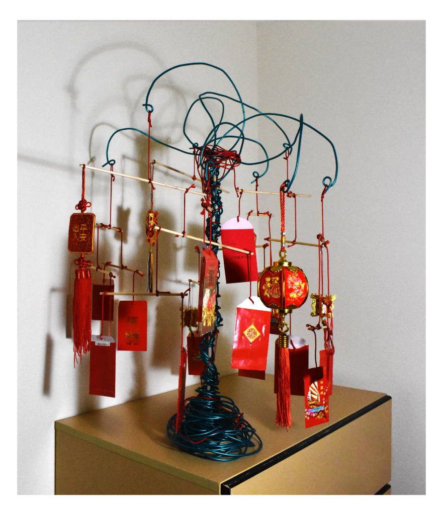
With my final project I set out to design a kinetic sculpture in the vein of the works of Alexander Calder.
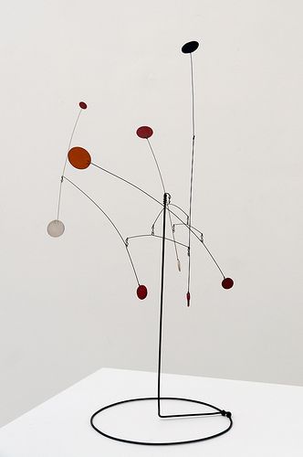
Early in the process, I settled on a Chinese New Year aesthetic, planning to utilize various artifacts associated with the holiday as my ornaments. My initial sketches pushed me towards a hanging mobile structure.
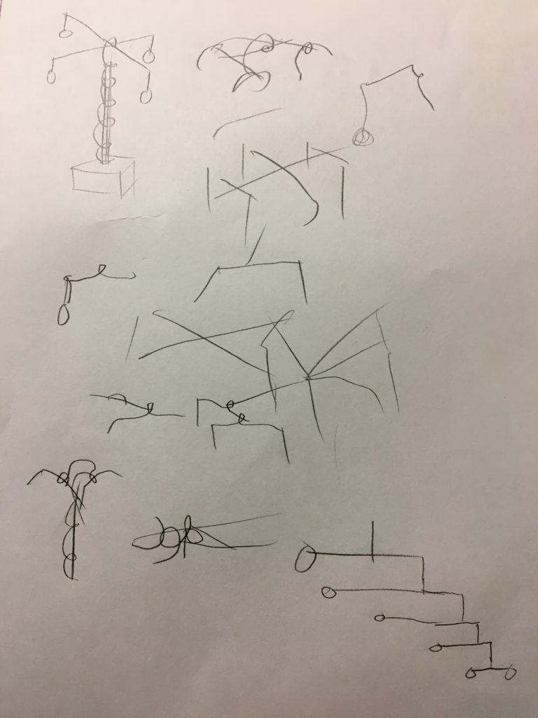
From there I acquired decorations from a Chinese market, and old lucky money envelopes from my basement.


I hung some of the ornaments on a coat rack to give me a sense of how the structure would balance.

Next I bought a few wooden rods from a crafts store, drilled a hole into a block of wood, and inserted a rod, forming the base of my structure. Crucially, I also obtained about 100 yards of flexible metal wire, which would allow me to wrap around the base and hang my ornaments. Originally I planned on shaping a metal base, with a few branches on either side at the top, though this would’ve been a much more rigid structure, which wouldn’t have aligned as well with my overall design goals.

After wrapping the first layer of the base, I sketched an outline for the mobiles, which would roughly balance in a stepping pattern.

However, this pattern assumes an equal weight between each of the ornaments. I my case, there was a fairly large discrepancy, so the actual mobiles were all aligned differently a bit off center to accommodate the different object weights.

I purchased 5 rods total, each of which was enough for about 1 mobile, so I planned to have 4 main hanging branches.
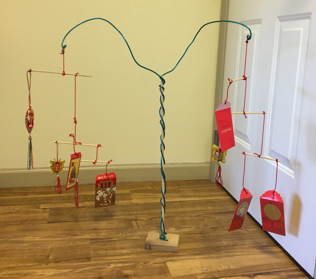
I spent a fair amount of time balancing each mobile and gluing the components to the string and rods.
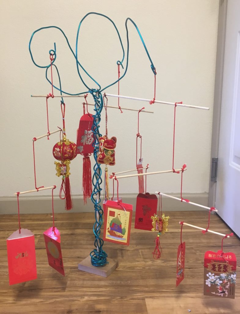
Once I’d added all 4 branches, the sculpture still felt a bit baron, with too many desperate parts and gaps between the top and the mobiles. So I decided to add 4 smaller mobiles in between each of the existing arms, so the final layout is similar to a wheel divided into eighths. But before adding on the remaining mobiles I removed them to finalize the base.
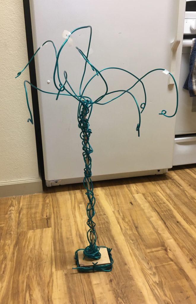
This meant wrapping the wood at the bottom with more wire.
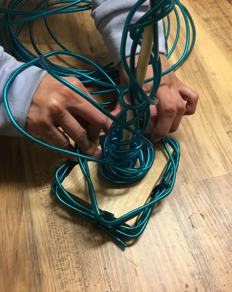
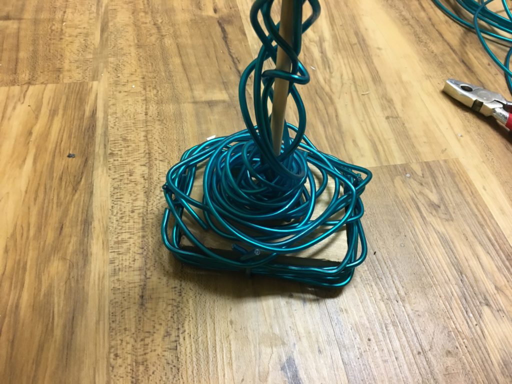
I first added a square layer around the entire base, then began wrapping in a circular pattern, to make it look more natural.
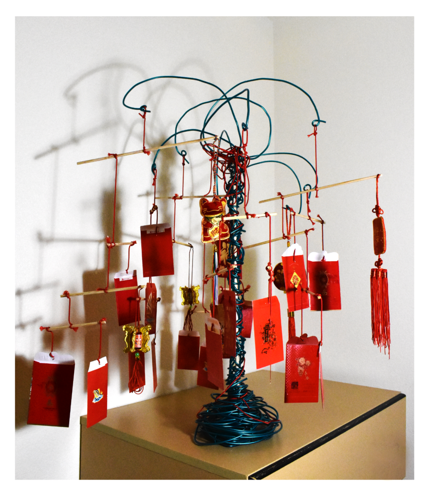
From there, I constructed four smaller mobiles and wrapped a layer of string around the stem before hanging all the mobiles. The final sculpture ended up being quite balanced, though it’s mobiles still move when touched or blown by a current of air, which was the intention.

https://vimeo.com/333001900

8 Comments. Leave new
It’s interesting how you go through your design iterations and add to it each time until you get to a place that you are comfortable with. The only improvement I could see are making the whole thing revolve around.
I really like how the flow of your creative process. You have an idea in mind but sometimes you just have to start creating to see what direction you’ll go in. I think that benefited you very well in this project. You were always trying to make it better until you were pleased with it. I really like the pictures with the shadows in the background.
I like the color coordination of your project. There are so many objects, but you are still capable to balance the whole thing. Also, in my opinion, little fewer objects would have made it cooler
I like the color coordination of your project. There are so many objects, but you are still capable to balance the whole thing. Also, in my opinion, little fewer objects would have made it cooler.
This sculpture is super intricate! I agree with what others were saying in class where the shadow gives off gives a cool effect. Have you though about making another one of these in the future where the true meaning of the sculpture is only seen in the shadow it gives off?
I thought more about this after your presentation and I wanted to know how you have incorporated balance as a visual. Is there some deeper meaning behind the balance of all the pieces, if so how is it embodied in the piece?
Wow! I really like the final look. I think it feels a little cluttered, but I personally really like more cluttered aesthetics. I also really like the shadow your object gives off. I think it adds a whole new dimension to it. If you had the choice do you think would have made the arms larger? Currently the base is very thick but the arms coming off are thin.
Hi Xavier, Great work on your sculpture. It looks very beautiful. The wires colors goes well with hanging parts. Great work.