Background:
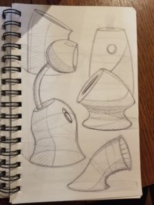
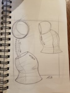
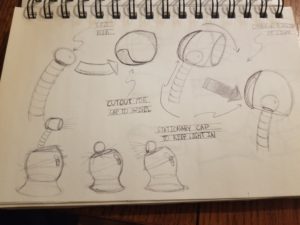
My original design idea came from some random shapes I created while practicing ellipses. The picture on the left is my original sketches. I was creating shapes from different angle ellipses and made one that I liked that looked like it could be a lamp. From that form, the function evolved to be a desk lamp that can collapse in on itself and become an atmospheric light. This is where the 2 in 1 desk lamp idea came from. This idea had a neck that could collapse into the base and a head cap that tips down in order to direct the light into the base for atmospheric use.
When I decided to take this idea and use it as my final project, I had to think more about the aesthetic I wanted to create with this lamp. My original sketch had more of a hi-tech aesthetic feel to me, but this wasn’t quite where I wanted to go aesthetically. I decided that I wanted to go for a minimalist aesthetic combined with an organic aesthetic. I also wanted to take some influence from Bauhaus design. My goal was to create a modern minimalist take on both organic and Bauhaus design.
Inspiration:
Some images I used for inspiration are shown below:
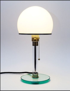
Lamp by Bauhaus alumni Wilhelm Wagenfeld [1]
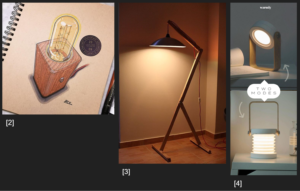
These are three lamps that I liked that incorporated organic design with the use of natural wood. The one on the right also functions as a 2 in 1 lamp.
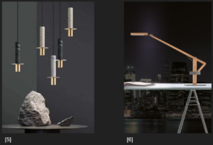
These two lamps also have an organic design but I feel like they have a more modern, minimalist feel to them. This is what I set out to do; create a more modern take on organic design that could fit in with the popular minimalist aesthetic of today.
Design Sketch:

This is the design I decided to go with. The base is made up of alternating layers of stained Oak and Acrylic. There is a hole cut through all of the wood layers to allow light to go through the acrylic layers. This is for the 2 in 1 functionality. The light is located on the end of a hinged arm; like most focused desk lamps. The arm can then be bent down (as shown my the blue sketch) and the light can be directed into the base and come out the sides of the acrylic; creating a diffused atmospheric light. The arm would be made out of stained Oak dowel. The lamp shade and hinges would be black 3D printed PLA.
Design Details:
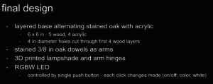
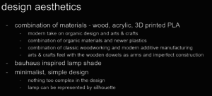
My lamp shade design takes inspiration from the form of the Bauhaus lamp shown earlier. The combination of materials and processing techniques combines organic design and modern minimalist design. The overall design I went with is simple and minimal.
Renders:
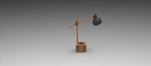
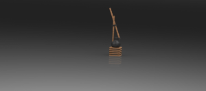
These are 2 quick renders I made in Solidworks to visualize my final lamp. The top image is it as a focused working/reading lamp and the bottom image is in dispersed atmospheric mode.
Construction Process:
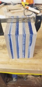
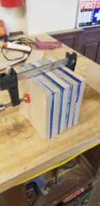
I started by cutting out 5, 6 x 6 in pieces of oak, and 4, 6 x 6 in pieces of acrylic. I then stacked them together, clamped them, and went to even out the sides on the belt sander.
This was a mistake.
First, I didn’t properly square up all of the sides, I simply eyeballed them. Second, the belt sander was way too aggressive for the acrylic. The acrylic melted and burned, leaving those white marks you can see in the pictures.
I then went back and sanded out these burn marks by hand.
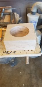
Next, I drilled 4 in diameter holes in 4 of the wood pieces with a hole saw. This is to allow light to penetrate through and come out of the acrylic sides.
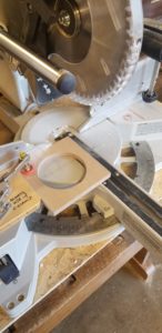
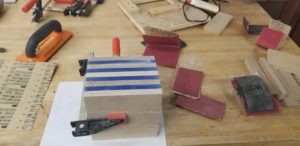
With the advice of Josh, in the CU Makerspace, I went back and tried to square all of the pieces. at first we tried to square them in one axis at a time and then clamp it up again, but the pieces were really off at this point and the clamp method wasn’t quite secure enough.
At this point, I went to the miter saw and skimmed off as little as I could to make each side of each piece flat. I carefully found the flattest side of each piece and used this as my datum. Once I flattened another side, I had a 90 degree angle to work with to straighten out the rest. I learned that it is very important with things like this to mark things at each step and keep track of what orientation my wood is in and what sides have been cut.
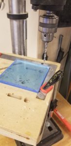
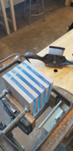
From here, I carefully measure a mark 1/4 x 1/4 in from the corner of one piece. I used this mark to create a fence on the drill press to align each piece in the same orientation. Since I now had all flat sides and 90 degree corners, I could trust this method to be precise. I then went through and drilled 2, 1/4 in holes on the diagonals of each piece. This allowed me to slip a 1/4 in dowel through all of them to hold them aligned properly. I only drilled half way through the top and bottom wood so that the dowels would not be seen from the outside.
In the images above you can see the fence I used (left) and the dowel in the corner of the assembled stack (right). I then clamped up the stack and used a cabinet scraper to get the sides flush.
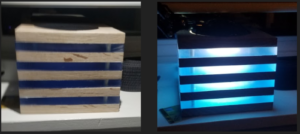
This is what my base looked like at this point. The wood was not stained yet, and the blue tint is from the film protecting the acrylic. I really like the way the base came out. I sort of like the blue tint too. At this point, I had extremely underestimated how long the wood working would take. I am glad I took my time to fix my initial mistakes to make sure I got it right and I learned a ton, but I did not have much time to create a circuit integrating an RGBW LED and build the arm and lamp shade portion. Because of this I decided to use an off the shelf LED bulb and fixture I had laying around. I hope to create a more interesting circuit by the expo.

The next step was finishing and staining. I sanded everything up to 220 grit, and then I stained my wood with a dark walnut stain. I really like the way the stain came out. It gives the wood a more subtle, modern look, but the dark stain really got into the grains and brought them out. I then finished the acrylic with 400 and 600 grit sandpaper.
That concludes the woodworking portion of my project, the next part was the additive manufacturing.
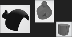
These are some of the 3D models I developed in Solidworks for this project. The left is half of my lampshade. I printed it in 2 halves with a cavity in the middle that fit my LED fixture. I then glued them together around the fixture. Additionally, only one side (the one shown) had that bowl shaped socket attached to it. This was to create a joint with the model in the middle to attach the shade to the dowel.
The middle model is a collar that clips wraps around the dowel and clips into the lampshade. There is a hexagonal cutout on one side to press fit a 1/4 in hex nut. Then a 1/4 in bolt can be inserted from the outside, and screwed in to tighten the collar. The hinge joint was created using a similar collar system.
The third model on the right is a cap for the 1/4 in hex bolts. It just provides a nicer aesthetic from this outside, and gives a more user friendly interface to tighten the collars with.
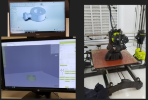
I 3D printed the joints and shade in black PLA on a Lulzbot printer.
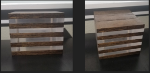
This is how the base looked once finished. I really like how it came out.
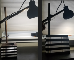
This is the full assembled lamp.
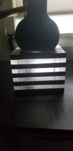
The lamp in atmospheric mode.
Moving Forward:
I really like the aesthetics of the lamp I created and how it looks. I think that I successfully captured a modern, minimal, and organic aesthetic with this lamp. I do think that it can use improvements on functionality. As mentioned previously, I want to put in a custom LED circuit that allows me to have different colors and modes. After seeing the lamp with the blue tint from the acrylic film, I liked the look of the base with color and would like to implement this. Also, as shown in the image above, the atmospheric lighting is not very bright. I think this is due to the dark stain on the wood absorbing the light. I am going to add reflective tape between layers to scatter the light more and try to make it brighter in this mode. Finally, I want to redesign the hinges. I didn’t have a lot of time to work on this aspect of the design; it was more of an after thought. In the end the hinges are not extremely sturdy; they do not do a great job of holding up the weight of the lamp shade. I definitely want to redesign and rebuild the arm portion of the lamp before the expo so that it can function in both focused light and atmospheric light modes.
Citations:
[1]http://cosascool.tumblr.com/post/21763982745/the-first-commercial-product-of-bauhaus
[2]https://www.pinterest.com/pin/ATIkqfaFYRQlY5Fiubm1Pyq-FkXivAp4dAkmkLtWrnqTAQiuoDtN0Pk/
[3]https://www.lightingstores.eu/modern-floor-lamps-youll-love-home-decor/?utm_source=aalves&utm_medium=RedesLS&utm_campaign=Pinterest
[4]https://warmlydecor.com/products/catala-portable-collapse-lantern?t=pin&utm_campaign=CatalaLight-StarterKWs&pp=1
[5]https://www.pinterest.com/pin/421719952606659880/

12 Comments. Leave new
This was such a dope project! When you were presenting, I enjoyed the blue light effect that it had before you turn off the plastic covers. The base is definitely a work of art.
Your sketching abilities are top notch! I can tell a lot of time and heart went into it and that you are proud of your final product, as you should be! Its neat how you tied in your upcycle light idea to the final product as well. Awesome job! I love the final product!
You obviously put a lot of time into this and I think the result is great! What a cool item you can really use after you graduate. Great work! Also, your sketches are great!
Your project turned out so awesome! The bottom base that you fabricated looks amazing and professional. I hope the hinge issue gets solved so you can use this lamp!
It’s really a cool design! I like the way you figure out the base manufacture problem. And you sketch is really impressive since your final design is almost the same as you drew! Besides, the dynamic light hanging is delicate!
I like how you combined the different aesthetics of minimal and bauhaus.
Holy wow! That is an amazing blue glow through the acrylic!
Can you share in detail about how you got them to be 90-degree angles?
This could easily be shown at an art show – and possibly sold!
Josh, I like that you used the practice of ellipses from class to create this design. The final design slide was my favorite. Additionally, I liked the organic material factors and CAD models. Very mechanical, functional, and also extremely aesthetically pleasing!!!
I’m impressed by the sketches you had. I remember you were designing a bed but I’m glad you chose something more practical lol. The idea that the lamp turns into an ambient light is very cool. I think it’s got consumer product potential!
I really like the strategy you implemented into making the dispersed light incorporating the base of the lamp. Though it doesn’t make sense for the dispersed light, I think the blue base looked really cool. I think the reflectors will definitely help the dispersion of the light.
First, your sketches are awesome! The overall design is great and I wouldn’t change anything. You did a really good job, love it.
I like your sketches, they’re neat and nice to look at. I love how from your sketches you got inspired to bring your sketch to life. Your presentation also shows that you have out in a lot of effort into executing the artifact. I’m absolutely in love with how your lamp can serve as a house decor even when its folded and unlit. One of my favorite final projects in this class.
This is such a cool idea and you clearly have put a lot of thought into it. I really like how you continued the light aspect down into the base of the lamp too. I also like how your presentation format follows the minimalist aesthetic of the project itself.