My Aesthetic will be Arts and Crafts, so there is no comparison. Oddly enough I am going for this aesthetic despite the fact that it originally arose from trying to steer away from machine use.
As you can clearly see in the picture below, many designs that were characteristic of this aesthetic could have been created using modern technology (Illustrator, Laser Cutters, 3D printers, etc.)

Aside from Arts and Crafts though, I feel like my piece would work under different aesthetics but not all of them. For example, using a minimalist aesthetic would be almost too easy to do. I would just have to ensure that I use simple geometric shapes in the design and have it look very clean.

On the other hand, I’m not sure I would want to use an aesthetic like Memphis because it detracts from what I had in mind for the project. I have decided on building a puzzle box that looks like a house but has intricate laser cut patterns on its surface in the style of the Arts & Crafts movement.

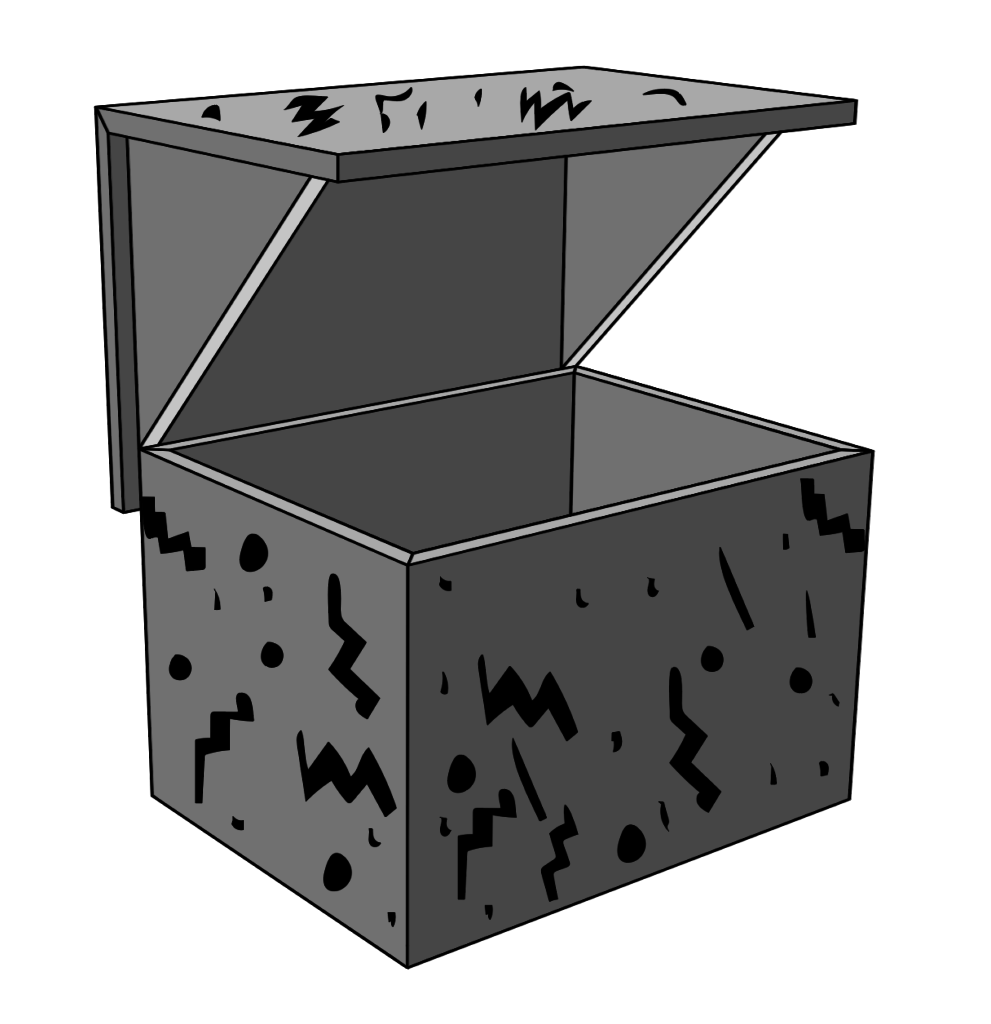
In a sense, my starting canvas for adding my aesthetic on top of will be a minimalist design to give myself room to grow and develop my finished design. It would be hard to compare my design to many other design aesthetics because many of them heavily incorporate metal and industrial-like materials other than wood (Modernism, Futurism, Streamlining). However reimagining my piece in a variety of other forms would mean eliminating part of my aesthetic, which is that my box is made to look like the shape of a house. If I were to reimagine it in one of the more quirky aesthetics (Surrealism, Postmodernism, Memphis, Pop Art) then the object would not make sense. As seen in my Memphis example, if I were to try and incorporate these themes, the idea of keeping the object a “house” would not make much sense.
Other design movements would be suitable for my project, but are not what I am intending to create. Simpler, less detailed , or more geometric aesthetics (Bauhaus, Art Deco, Organic) would be very possible to incorporate into this project instead of Arts & Crafts, but would again require a slightly different direction. I believe that all could still incorporate a house design, but would look completely different when completed.


3 Comments. Leave new
[…] Project Aesthetics Compared to 20th Century Aesthetics […]
Really cool design, and a cool way of incorporating other aesthetics into the design. How much have you considered about playing with the overall form of the project to showcase an aesthsetic without getting too far away from the house design?
Hi Samuel! I love the quirky aesthetic you have reimagined your project with! This is a really fun idea and maybe something you can incorporate into your final project. I like your project idea though.