This is the perfect post to really explore what my aesthetic will be. In my last post, I mentioned that I wish to mix the Grunge aesthetic with the Arts and Crafts aesthetic. These are wildly different schemes. The Grunge aesthetic appears below:

After learning more about aesthetic movements, I think what I’d want to pursue an Art Deco aesthetic. More on this later.
I also am considering a Victorian aesthetic.


4 Comments. Leave new
[…] Design Movements of the Interactive Chair […]
I like the art deco design concept. I’d be interested to see what a Victoria design would look like. Can’t wait to see how it turns out!
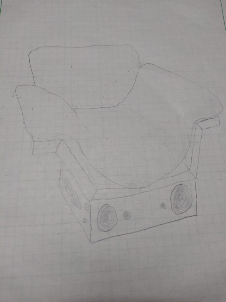
I like you’re idea of applying the art deco aesthetic. I would’ve like to see some more sketches of what you’re thinking. This is a really cool project idea.
I think an Art Deco aesthetic for this chair would turn out well! You could incorporate the classic geometric patterns of art deco easily within the chair. Although mixing two completely different aesthetics would have been interesting, I think the art deco aesthetic will make the piece look more complete, rather than having two different aesthetics.