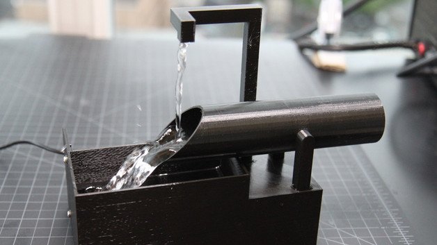
As seen in my previous posts, my final project will be a Shi-Shi Odoshi Japanese water fountain and the main aesthetic is metal. The idea here is to create a modern and sleek version of something traditional. Normally, Shi-Shi Odoshi fountains are made out of bamboo and have a very natural and simple look. However, my project will be spray painted with dark, metallic spray paint in order to achieve that cold metal look. I want the fountain to function the same way while taking on the cold metal look.
The three main aesthetics that I could imagine integrating into my current design are post modernism, cubism, Bauhaus. Post modernism revolves around the use of bold, primary colors and the textures involved are often unorthodox. Incorporating this into my design would include changing my dark color scheme completely and maybe using a bright green or blue. It would also involved moving away from the straight, modern lines that I currently have and instead incorporating more wavy shapes within the walls of the water reservoir.
Moving on to cubism, this design revolves around the use of multiple perspectives, hard geometric forms, and strong features. Incorporating this aesthetic into my design would include creating sharper points at the points of intersection. It would also involve getting rid of all the curved and round features such as the water container that fills up. Cubism also involves the use of monochromatic colors so my current dark color scheme does not need to be changed.
Finally moving on to Bauhaus, this design revolves heavily around the respect for materials, minimalism, and geometric designs. Because Bauhaus is normally associated with interior or architectural design, I way I can incorporate this into my design is to use monochromatic colors on the water reservoir and then put Bauhaus designs on top of that. Rather than altering the physical design of the project, adding on drawings on to the existing walls will not only be a simpler addition but make the project pop more as a whole. A possible drawing I could add is to create a mosaic of random geometrical shapes throughout the surface area of the fountain and fill them in with bright, vibrant colors.


4 Comments. Leave new
Evan, I like this design a lot. I think the juxtaposition of Japanese design and the raw metal is really cool.
I like your idea about combining minimalism with the Japanese style. Not only do these concepts fits well but also the material you picked echoes among the water fountain.
This is a cool idea for the final project. I think you have a wide range of aesthetics to choose from when completing this project. As Clare said, I think your aesthetic can be more than just the material you choose. You can use a material and then engrave, etch, or color it differently to match any aesthetic you want.
Evan, I love this design idea! However, I think your aesthetic is much more than just a material (metal). I think that your design has a cultural aesthetic that you should tie into the design! Do you have any drawings of what you’re thinking?? Additionally, all of the aesthetics you mentioned tie into this design perfectly!! I can’t wait to see the finished product!