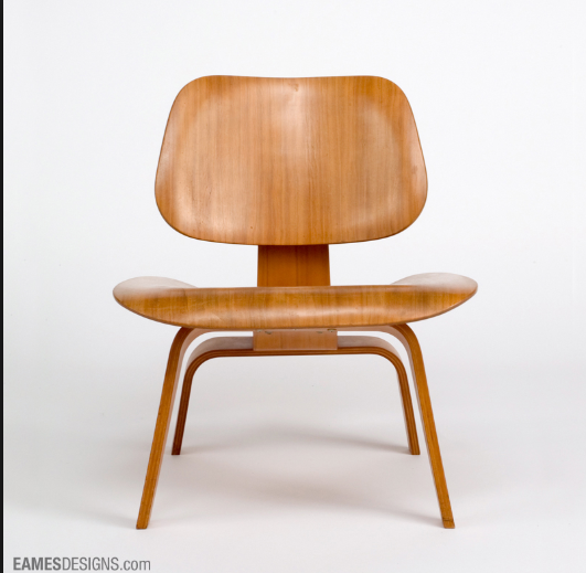
For my main project I’m taking an old chair and refurbishing it with new aesthetics. My goal is to combine the minimal and vintage aesthetics and increase the functionality of the chair by potentially adding a drawer. Compared to other chairs with the 20th century design aesthetic, my piece will have a straight and rigid structure compared to the swirly curved aesthetics. My piece will also differentiate from 20th century designs with the vintage aesthetic. This will be accomplished by weathering down the wood.
Search for content or authors
This Year’s Students
-
Abby Rindfuss
-
Adam Hosburgh
-
Airyl Dayrit
-
Akash Karoshi
-
Alex Jessop
-
Xander Johnson
Allister James Sequeira
-
Annie Cai
-
Andrew Chamberlain
Anjali Shadija
-
Anthony Makuch
Andrea Marks
Andrew Mccoy
-
Anthony Papaianache
-
Andrew Perper
Anoop Subramanya
-
Andrew Widner
-
Ariana Ramirez
-
Arjun Ramachandran
-
Arden Villanueva
-
Ayesha Rawal
-
Ben Erickson
-
Ben Harming
-
Ben Haley
-
Brian Ahn
-
Bryce Johnson
-
Bryan Moreno Najera
Brenton Yu
-
Cason Lane
-
Cecelia Shoenfeld
-
Chris Adami-Sampson
-
Chrisanna Bertuccio
Witt Young
Claire Markus
-
Clemens Pacher-Theinburg
-
Cooper Kramis
-
Cole Romig
-
Cole Sites
-
Cort Sommer
-
Daniel Carranza-Valenzuela
-
DawnMonique Cantu
-
Seth Strayer
-
Danny Vesselovskii
-
David Whisnant
-
Delos Ashcraft
Dev Mahajan
-
Ellyse Jensen
-
Elise Johnson
-
Eli Skelly
-
Eric Fiechtner
-
Evan McCleary
Francine Palmos
-
Garrett Jimenez
-
Garrison Nazare
Rauba, Grady
Reilly, Greg
-
Grant Thompson
Isaiah Straubel
-
Jamie Blanco
-
Jacob Foley
Jack Franz
-
Jacob Krajnik
-
James Overberg
Jackie Padilla
-
Jaks Praeger
-
Jax Whitham
-
Jessica Vo
-
Joe Yoder
-
Jules Fischer-White
-
Kalin Myers
-
Keith Hemenway
-
Kyle Chinn
-
Lia Cucuzzella
-
Lindsey Trussell
-
Luke Gordon
-
Matt Bloomfield
-
Matthew Cumpton
Mateo Esteve
Matt Sherman
-
Max Van Cleave
-
Max Williams
-
Mila Bergmann-Ruzicka
-
Min Than
-
Mia Winstead
-
Nile Brown
Nita Byati
-
Nick Rios
Patrick Hetlage
-
Pisay Suzuki
-
Robert Forstbauer
-
Rystan Qualls
-
Sam Nicastro
-
Scott Ehrlich
-
Seth Dry
-
Sean Ostrander
Senayt Wolde
Shubham Dhumal
-
Shreya Pradeep Sekar
-
Sofia Fernandez
-
Sylvia Robles
-
Tay Cummins
-
Tanmay Mhatre
-
Taylor Wittwer
Thomas Brentano
-
Tyler L'hotta
-
Tyler Lloyd
-
Zoe Cooper
-
Jean Hertzberg


2 Comments. Leave new
I like how you are giving the chair a rigid and straight structure rather than making it curvy like lots of other chairs form the 20th century. Although lots of chairs from 20th century design were curvy, some were rigid and straight like those in the de stijl movement, maybe you can find some inspiration for your chair while looking into this aesthetic.
I really like the drawer idea Brandon! I think it would be cool if it opened from the side, that way you have easy access. Who knows what youll be able to store in there.