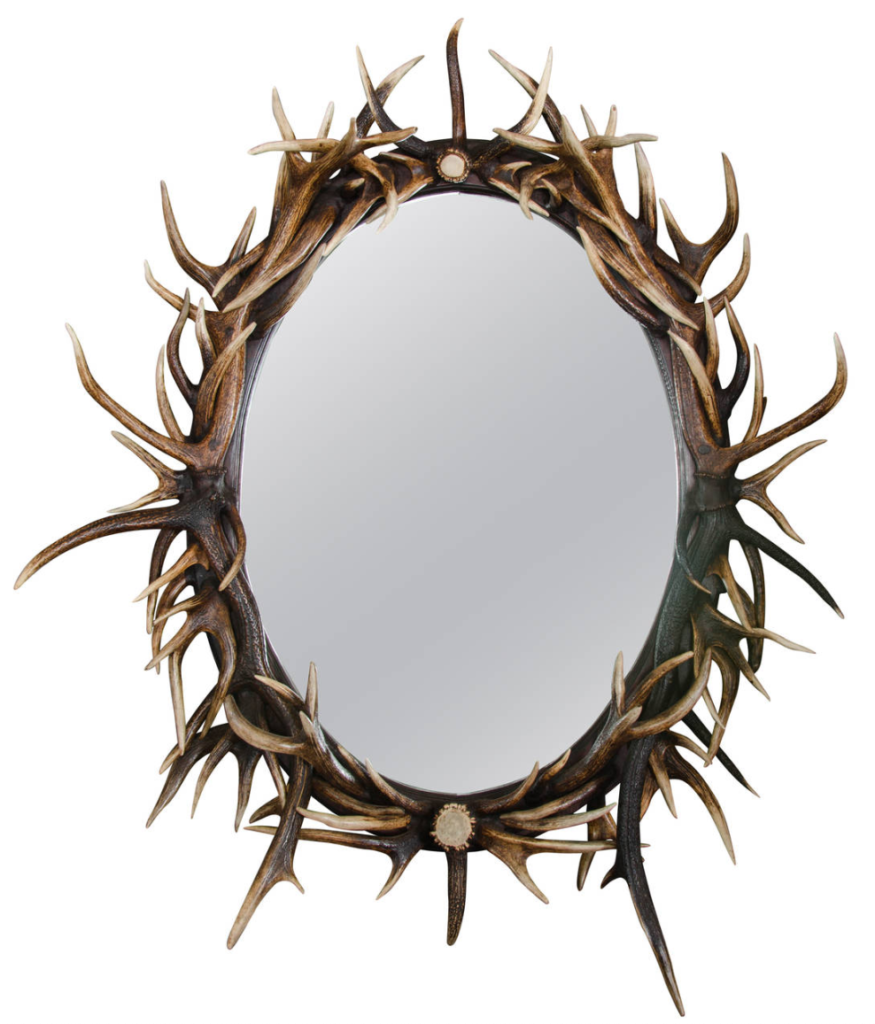


My aesthetic is related to the arts and crafts movement of the 20th century. The three images above are a great example of the types of design elements that I am trying to implement on my piece. The randomness of lines in my design is something that I see in a lot of these pieces. Since all of these were handmade, they have a very natural and elegant look. Someone spent a lot of time making sure that this piece looks as good as it does, and I am trying to replicate this look on my design.
For my sketches, I tried to imagine my piece if I was designing it for different decades then the 1990’s. I went with 1970, 1950 and 1920 because of their wide range of design elements and style. The 1970’s was very hip and colorful, inspired by the different movements of the time. The 1950’s was elegant and natural, much like the arts and craft theme I talked about above. The 1920’s was right before the great depression, and had a very gaudy and extravagant but functional design.
Citations
Image 3: https://www.artsandcraftsliving.co.uk/products/0123copmirr


3 Comments. Leave new
I love the extreme contrast that is being shown in your sketches. It is intriguing, interesting and thought-provoking. I would encourage you to pursue such aesthetic in the future.
I agree with Danielle that the project is almost a complete opposite of what they were in the past. Nowadays, the mirrors serve an entirely different purpose and the aesthetic you’re using still is based off the classic design.
Hi Andrew! I love this aesthetic applied to your project because it is almost in direct contrast. It is very rustic, while your project is fairly technical. I would love to see some sketches you have of a couple of different versions of the aesthetic applied to your project. Good work though!