The three artistic movements I am sketching my amp in the style of are Surrealism, Pop Art, and Cubism (three of my favorites).
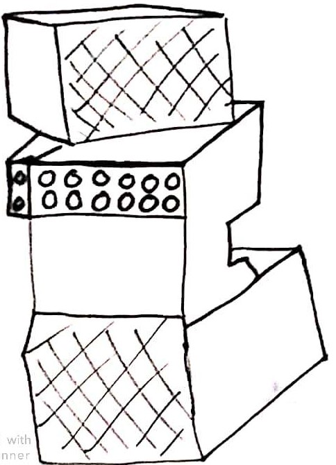
For Cubism, this is not a deep cut, but I would break each component of the amp into its own cube. I am aware that cubism isn’t any art made of cubes. The reason cubes make sense here is that the standard shape of an amp is one with six sides and 90-degree angles. Thus, in this sketch, you can see that the speakers are on the top and the bottom, the electrical components are in the middle, and the controls are in between, with inputs placed outside to the left.
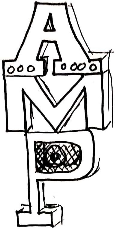
For Pop Art, I have two takes. The first is simply the letters stacked up to spell “AMP” in a serif font (though I forgot to put serifs into the “M”). This is simplistic, but very much in the style of Pop Art. The letters would be bright, basic colors (likely blue, green, and red since they are the only colors of lightsabers in the original trilogy).
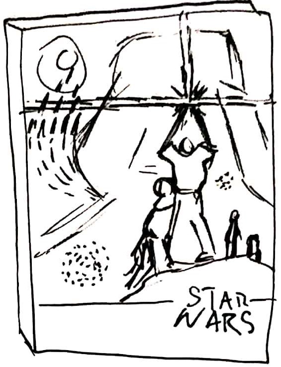
I also would create an amp in the Pop Art style by blowing up the poster for the original Star Wars release and boxing it like a VHS or DVD. This is putting something ordinary and possibly pedestrian into a scale that makes it unavoidable. I also think this would possibly change the viewing of the art on the poster, as the scale would force the viewer to actually move their gaze around the poster rather than take it all in at once.
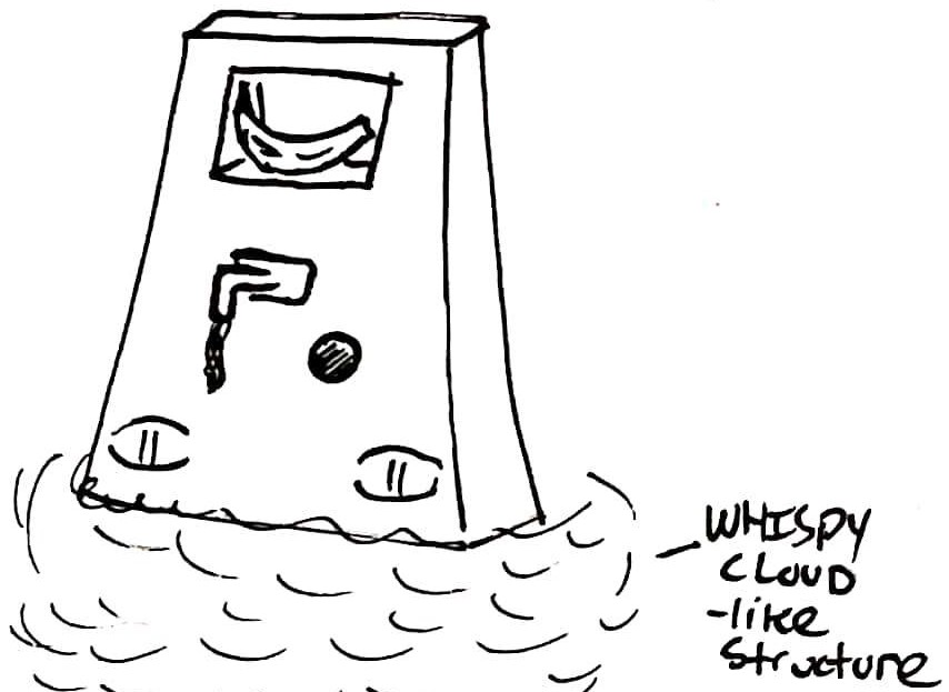
Finally, for Surrealism, I would have a dark monolith which is shaped roughly like Vader’s mouthpiece/vent. Inside the top would be a shelf for a slightly over-ripe banana, and below that a spigot dispensing ramen. Near the spigot would be a hole that does not quite go through the amp (and is where the sound actually leaves the amp). Eyes would be in place of the bolts that hold the vent onto Vader’s headpiece, and the whole thing would rest on a cloud that would not appear to be able to hold up the massive monolith. There is no reason for any of this to happen, and the controls are nowhere in sight, so I can’t imagine that you could reasonably draw meaning from any of it and it is surrealist enough for my taste (plus, you don’t have to watch someone have their eye scooped out in a film named after a dog).
2 Comments. Leave new
Tyler, I really like your sketches in this post. They definitely do a good job of conveying the idea you had in your mind. Very cool adaptations of your design to different styles. Do you plan on using any of these styles in your final project?
This was an awesome post! You really gave a lot of thought to all three styles. Are you planning to use any of these aesthetics any of these for your final project? I think any of these could be modified to embrace the star wars aesthetic you’re going for,