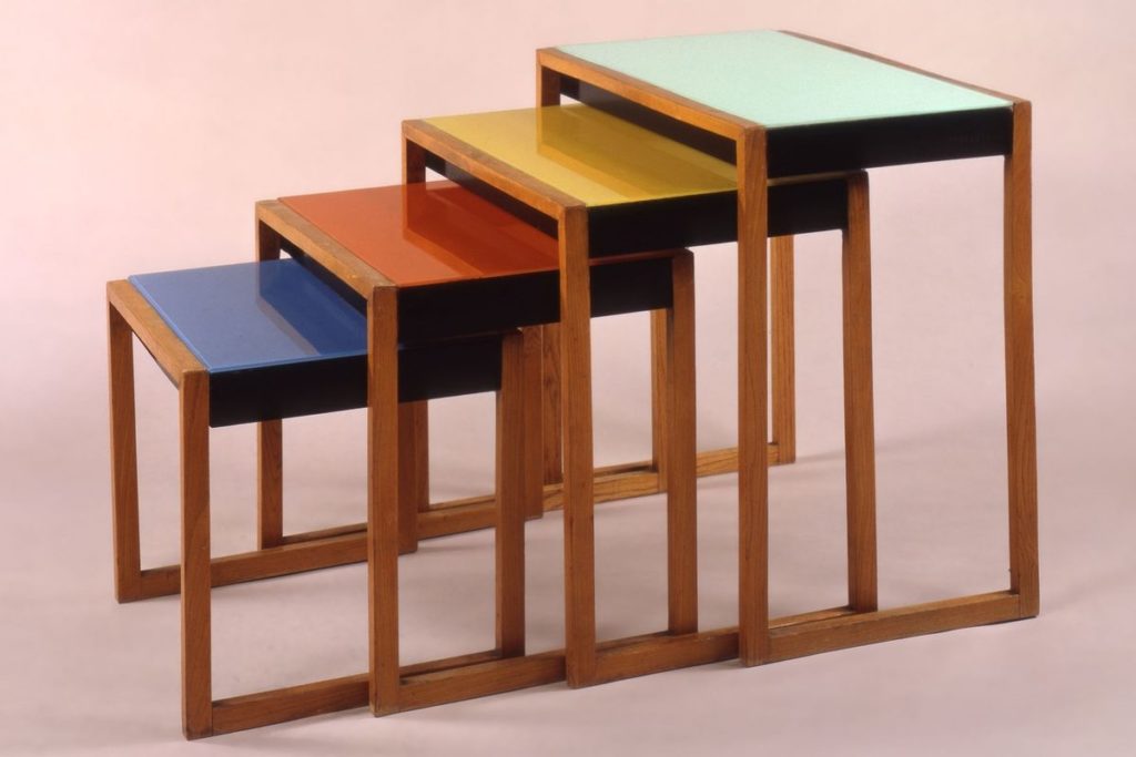
My current aesthetic is Bauhaus. Some aspects of Bauhaus design are neutral colors, no unnecessary decoration and grids. My aesthetic compared to other 20th century designs are very different. Bauhaus was a design movement that it was an actual school in Germany. Art deco and art nouveau for example are all about decorations while Bauhaus looks to push those decorations away.

Looking past Bauhaus, post war design has some similarities in that people started looking for minimal ways to style things and so did Bauhaus. Bauhaus also combined graphic design, industrial design and art to create a movement. Mid-century modern design and stream line design incorporated design into products form everyday life to create a design movement. Design movements after the 1930s took aspects from Bauhaus and you can see them in lots of futurism designs and mid century modern designs.
Citations: https://madirichardson.wordpress.com/2011/10/14/bauhaus/ , https://www.widewalls.ch/bauhaus-design/


2 Comments. Leave new
Nicole, I think that bahaus is a very popular aesthetic right now and a neat one to try and replicate. I was wondering what other aesthetics you could try and incorporate into your design.
I agree with you that a lot of 20th century design share some core principles such as just bringing more thoughtful design into products. I was wondering what aspects of your project would you change for it to fit one of these different movements?