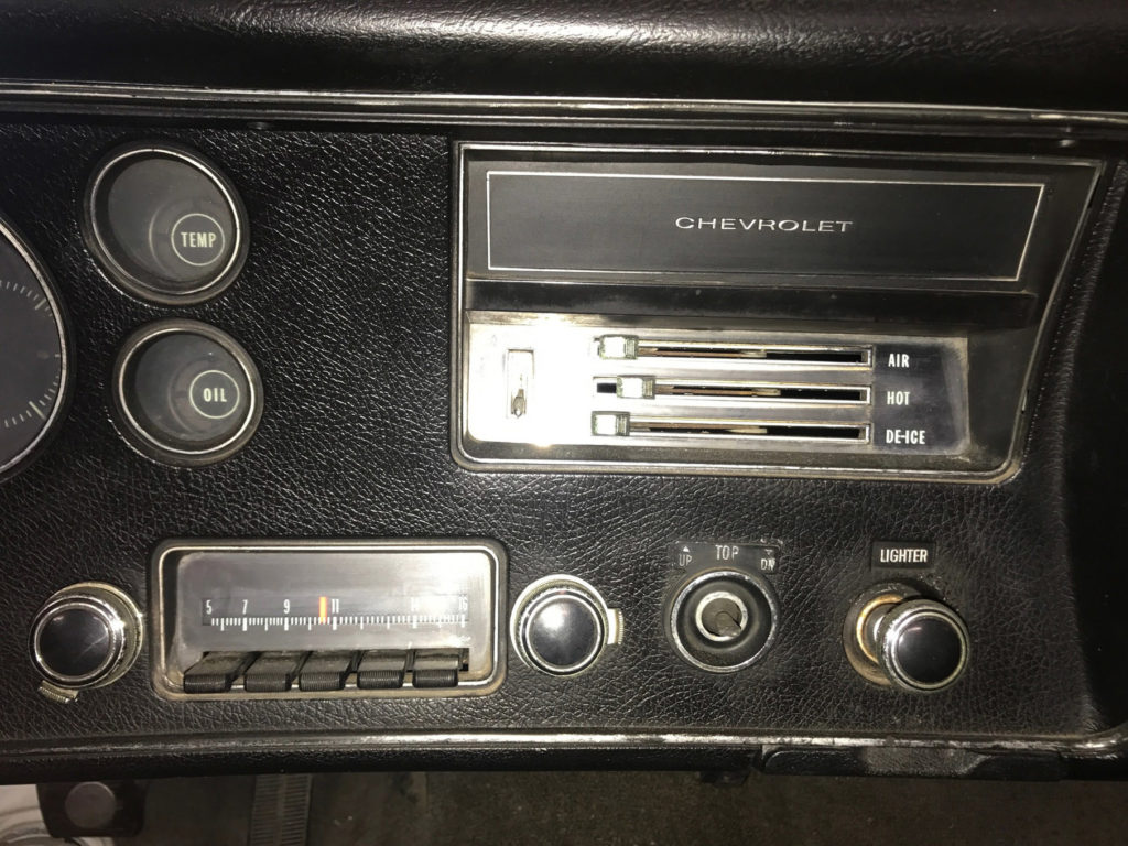
I will be building a car radio unit for my final project. It will be going in a 1970 Chevrolet and it must not look out of place in the vintage dashboard. If I had to compare my desired aesthetic to one of the major 20th century design movements discussed in class I’d say it is closest to post-war design/mid-century modern. It is certainly after the “Streamlining” movement. The streamline movement is generally said to have wrapped up in the 1950s, yet some car manufactures retained these style elements and liberal chrome usage into the mid-1960s. Post-war design features less chrome and avoids features that do not contribute to function, yet not to the degree of Bauhaus and similar movements.
We were tasked with applying three wildy differet aesthetics to our projects. I created some sketches, but my sketching skills do not convey the ideas as well as they could. They all have the same dimension limitations.
For the first one I choose to go with was the “high tech/matte black” look of the ’70s-’80s.


I later realized that I actually have a car radio unit from that era:

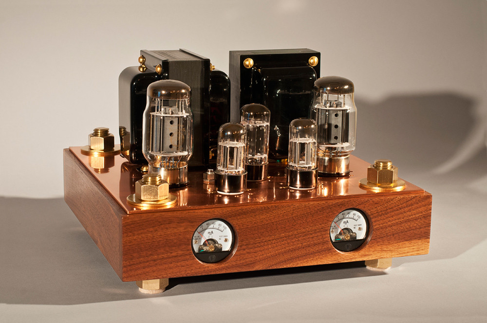
Next I tried to go for a steampunk aesthetic.


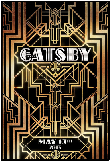
Lastly, art deco.


3 Comments. Leave new
[…] Compare Final Project Aesthetic to Major Design Movements/Apply Different Aesthetics […]
I like the high tech matte you used for the radio, it surprisingly works with the vintage car aesthetic you are going for. Excited to see what you end up with!
I miss window handle to roll up the car window. When I was a kid, it was kinda fun to do.