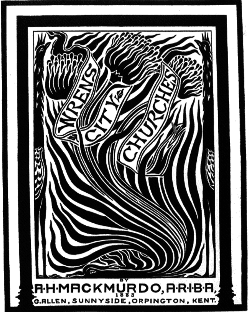
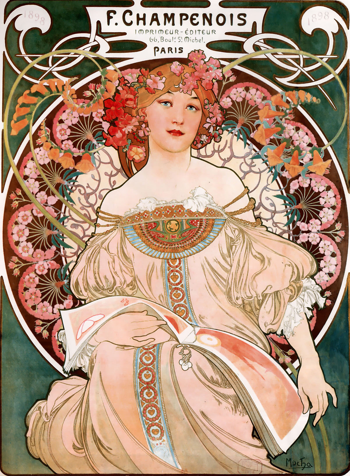
For my project I am creating a food dehydrator which is a modern device created in the 20th century. Since not much variation can be added to a dehydrator I instead decided to imprint my aesthetic onto my device. The aesthetic I chose was art nouveau which is an art form that uses natural shapes like plants or animals.
In the attempt to cast my design with a new aesthetic I decided to choose the opposite of art nouveau which is art deco. Art deco is an art form which likes to use Geometrics, bold colors and metallic finishes. A coincidence occurred when I realized I am using a metallic finish which meant my design actually has mixed features from both art forms, so both art forms are somewhat both used in my design. Another aesthetic I liked was fauvism which is an art form that uses strong colors and realistic values retained by Impressionism. I could etch some paintings from artists who used this art onto the dehydrator, but the art may not fit in well with the rest of the kitchen as it does not match its modern aesthetic.


3 Comments. Leave new
[…] 20th Century Movements: Dehydrator […]
I like your point about the contrasting aesthetics of your piece. Have you thought of using some sort of facade to make a “false” body for the dehydrator? some shape may help you communicate your chosen aesthetic better than simply etching on a design.
I really like the idea of finishing the design with Art Deco as it will make the design both functional and aesthetically pleasing. Have you considered engraving the metal instead of painting it?