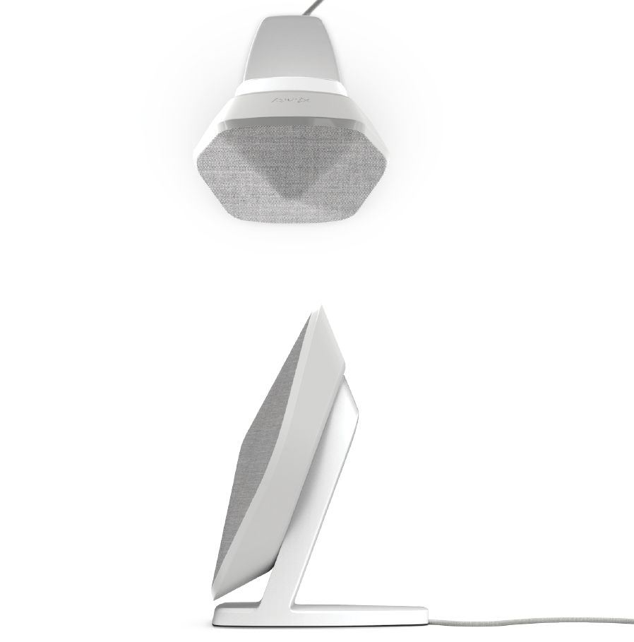
My project has currently emphasized a modern/futuristic aesthetic. I have implemented a white tone that emphasizes the geometry of the speaker design.

I purposely wanted the design to be very symmetrical across the center with very clear and straight lines.
This closely represents Cubism from 20th Century design movements. Cubism was created principally by artist Pablo Picasso in the early 20th century and depicted radically fragmented objects.

Another aesthetic that my project related to is the Futurism aesthetic because it represents a dynamic/aerodynamic aspect that my project clearly shows.

The last aesthetic that my project fits into is Minimalism. This is because my project doesn’t have and outer buttons or anything to distract the observer from the overall design. A sleek and smooth profile also portrays simplicity.

Citations:
https://www.britannica.com/topic/list-of-art-and-design-movements-of-the-20th-century-2004700


5 Comments. Leave new
[…] Project Aesthetics Compared to the 20th Century: https://www.aesdes.org/2019/03/18/project-aesthetics-compared-to-the-20th-century/ […]
I appreciate the cubism used in your design and how you’ve turned it into a minimalist project. Throughout the years, minimalism has changed a lot and it’s interesting to see that change in your design.
cubism* and cube like figures*
Combining cubanism and futurism is a very interesting move. I am honestly in love with this very clean design. Will you use any colors or cuban like figures on the speaker or leave it white?
The cubism and minimalism can definitely be seen in your design. It is a simple shape with no physical buttons which is a combination of these design movements. Maybe you can find a strong way to incorporate futurism accents.