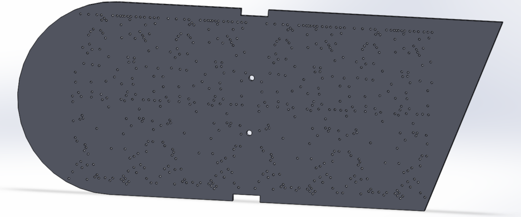
Currently, I am in working through the design process for my futuristic fiber optic digital clock. The first step I took in this process was designing the front plate that will be used as a guide for placing the fiber optic cables. The cad for this piece is included as the featured image for this post. The hole pattern was made through a trial and error process of sketching in SolidWorks. I created a line drawing of thee numbers then put points along the lines until I found an arrangement that worked. While doing this I had to ensure no points overlapped and that the points adequately displayed the numbers. With the hole pattern solidified I then laser cut the piece and began using fiber optics to ensure the pattern would work. Images of this are included below.

Testing the hole pattern for the 7 
First laser cut
prototype
Trough testing the prototype I found that some spacing of the holes were off and that the holes were a little too large for the fibers. This lead to a redesign of the hole template that I believe will work much better.
The front plate is shaped how it is in order to convey the aesthetic of Italian futurism. Two components of this design style was a fascination with aircraft and the use of geometric shapes. With the front plate, I tried to create the profile of a plane using ver rigid and geometric shapes. These motifs impacted my conceptual design for the rest of the clock as well. A rough sketch of this is included below.
Throughout the design geometric shapes are focused on. This sketch does not show this but I plan to have all surfaces converge to a point in the back right corner. I feel this will contribute to the aggressive nature of Italian Futurism. The front plate will be coated in black epoxy in order to contribute to the constellation appearance of the numbers. The top, bottom and left side off the clock will be curved aluminum sheet since industrial materials do due to the futuristic look it will give. The back and right panels will be made with wood ether painted or stained a deep red. This will supply a pop of color, something very prominent if Futuristic art.
In addition to prototyping the body, I have also started to prototype the electronics. Currently, I have produced the code an nd circuitry to change the color of the lights using a slide potentiometer. I am waiting for a few more parts in order to start prototyping the LED matrix that will be used to light the numerous bundles of fiber optics.
Moving forward I do want to do a few more prototyping tasks, One of these will be gathering the materials I plan to use for the body in order to ensure the color scheme works out. Once this is done and al the electronics are prototyped I will begin production of the final product.
Presentation:


10 Comments. Leave new
I really like the concept of this project. I think your final project will be really cool and functional. I wonder if you can program other animations into your clock other than just displaying numbers.
I like your reasoning for choosing the Italian Futurism aesthetic. Seeing your prototype pictures, especially the lit up one, helped show what the final one might look like.
This project sounds awesome and super ambitious! I like the aesthetic you chose because it isn’t very common. A lot of the aesthetics used in this class are pretty main stream but this is a really cool deviation.
I don’t know much about optical fibers or apoxy, but it seems like you have done your research. I am interested in how the optical fibers are going to make the shapes. Where will you be buying your unique supplies from?
A cool and useful project, it looks like there’s a lot of room to play with the aesthetics of this type of project. Is there any purpose to the color of the fiber optics? Is there any way you can integrate the color of it into the overall aesthetic?
You seem like you are really far ahead on this project. I’ll be interested to see the finish with the epoxy resin and how you are actually going to finish it. Great choice on the aesthetic as well. Didn’t even know that existed.
I like how you merged old Italian art with modern design. I’m sure the clock is going to be an eye catcher. Good luck on the project!
Nick – this is an awesome idea. It seems like you have already put in a lot of work. If you need any help, let me know!
I like the idea of combining your minor in Italian with your aesthetic. What shape do you intend on making the numbers to go along with your geometric aesthetic?
Very cool to relate this project back towards the modern Italian aesthetic that you are going for. The electrical design seems way over my head but extremely interesting if you can pull it off!