I recommend to read this after my presentation if you are watching my presentation.

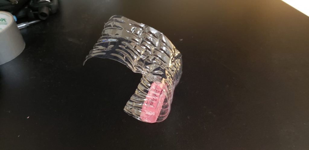
I made my kitchen glove that can avoid injury and mainly odor from garlic or chili. Also, the oil from spicy vegetables can hurt your eyes if you touch your eyes. If you are a home cook and wear contact lenses, you probably know what I am talking about. I bought rubber gloves because of this problem, but the rubber gloves sometimes get cut with vegetables and takes times to wear(I hate when my flow is disturbed during cooking). So I made a glove that can wear on and off quickly and is reuseable.

For Aesthetics, I chose Advertisement. This is because I actually enjoy watching interesting advertisements on TV or social media. There is a wide range of advertisement from low to high budget. In fact, some low budget advertisements catch a good amount of attentions and make a lot of sales. Since I made something unique and possibly innovative, I thought my project will match with Advertisement Aesthetics. Therefore, I presented in Steve Jobs style and made a review video in social media advertisement style. This is humorous (hopefully), but humor is a really good option to make people to remember something. Even though the product itself is not high-end, people will still buy the product with interesting advertisement and good price.
The glove is made out of a plastic water bottle, normal eraser, and 4 staples. I tried to find good material for the rubber, but eraser is the only rubber that is around me.


13 Comments. Leave new
I like the functionality of your project. The aesthetic design integrating advertisement is intriguing. The video from your
presentation was also funny and well done. Have you considered using different upcycled materials to enhance the performance of your product?
You really approached this project from a different angle than some of the others. I would be interested to see more of your process that led you to this final design and project. You certainly had a unique way of thinking about this and your aesthetic choice was awesome. Advertising was not something that I considered at all and I think it really showed in the final project. Good work!
Jae, I like how you approached this project and tried to solve a problem that you were facing. However, you ended up throwing away your project after class because it didn’t work how you expected. Could you maybe have iterated through the design process a couple of times to developed something that actually worked.
I appreciated how you set up this project as a problem/solution to get you started, and how you had a positive attitude throughout the presentation along with a creative demonstration video.
I really loved how useful you product was! I also loved the video you had during your presentation, it really pulled the entire presentation together! I don’t know if I really understand how your aesthetic was applied to your actual product though. Without the presentation I feel that the product does not carry the aesthetic of advertisements.
I would not discount how you presented. You might have been trying to channel Steve Jobs, but I think you have a good presence in presenting that speaks a little more genuinely to who you are and what you were trying to showcase.
I like your design, especially as it fits the prompt from the class.
Look into what additional processes you can perform to hone your design. I think that the reason Dr. Hertzberg asked if the plastic was a thermoplastic is that you would be able to melt and mold it to a design that is easily replicated and can have additional features not present in a cut bottle (though I am not attempting to speak for her, so consider the last part of that commentary my own addition to it).
I like how you came up with this idea from inconvenience in everyday life. The product seems pretty useful and it’s simple to make. I think you should definitely spends some time on improving its aesthetics and maybe you can come up with a consumer product and make tons of money out of it!
Your product is very useful, I really liked it! Your presentation was really engaging, too. I think that the idea is good enough to sell. Have you thought about what material you would have used if you did not need to use upcycle materials and made it for real?
I would use PP for the overall body and food grade rubber to grip the food. However, the design will be different. There will be three different subcomponents which are two rigid plastic for the upper body and one for grip. The rubber will connect the two plastic components. I hope you understand and use the idea for your future venture only if you give me the free sample.
Jae nice presentation! I like your introduction with your passion for cooking. Your product is very useful and could have a lot of potential however I would suggest adding more though to the aesthetics. I liked the advertisement theme very much and the presentation was pretty funny. We were lucky to get to see it twice!
I thought that your project was really witty and funny. I was a bit confused until you revealed that you were modeling commercial aesthetics. I appreciate your presentation tactics and I thought it was very creative. Did you consider adding editing effects such as infomercials use?
I would love to do infomercials, but I had no resource to edit my video to fulfill infomercials. So I stuck with the Instagram commercials.
I really liked your idea. The final product looks good. I really like your aesthetic idea where you used advertisement as your aesthetic. Great work and great video.