Process:

As I mentioned in my previous blog, this flow chart shows my process for this project. To recap, I started by deciding to work with toothpicks and doing a quick ideation around things that I could associate with toothpicks. I didn’t really like anything I came up with there and then realized I needed to incorporate an aesthetic. I realized that toothpicks might be perfect to represent the rough design sketch I had researched in my first blog post. I started ideating on that and ended up wanting to make it functional which led me to the lamp idea.
Inspiration:


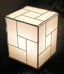
My inspiration for this project came from the rough product design sketches of the ideation phase of design, and these Japanese style paper and wood lamps. I really like the look of these sketches because they are such simple line sketches that can convey complex forms. They are easy and quick to create and an array of sketches, like that shown above, really gives a look into the designers mind. I also like the look of these Japanese lamps and how they create a diffused, atmospheric light. I was looking to create a dimmer diffused lamp for my bedroom when I don’t want the bright overhead lights on.
Ideation:
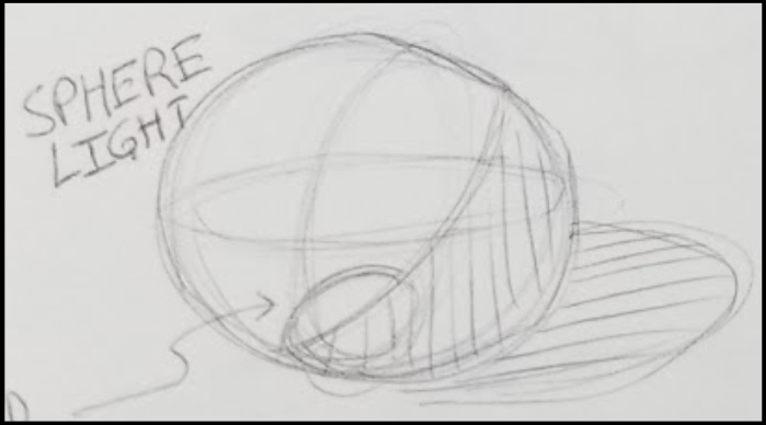
I began ideating through sketching, to find a lamp form that I would like and that I would be able to make out of toothpicks. Here are some of my sketches:


Final Design:
In the end, I liked the sphere shape. I wanted to create a lamp that had the overlapping ellipses of sketching a sphere as well as a hashed shading as if it were 2D.

Construction and Prototyping:
I started out by trying to make circles out of toothpicks. I ended up with this hexagon shape. I was fairly easy to make and fit well around my LED bulb.

Next I looked to create the “sketchy” feel of overlapping circles, which I thought would also cut down on the angular appearance of the hexagons. I also created a frame for the bulb to fit in by cutting off 1 toothpick from one of the hexagons and gluing in a smaller hexagon in a perpendicular orientation.

Next I glued the two circles together perpendicular to create the “construction lines” of the sketched sphere.

Next, I added the shading.

Paper Sphere:
My frame was done at this point. This was the sketch representation part. Now to move onto the inner paper sphere. I did not put any forethought into making the paper sphere and it turned out to be the most challenging part. I tried a number of different methods, but ended up creating 6 paper cutouts each with tabs to glue to the others; as shown below. I decided the top/bottom circumference I wanted for my sphere as well as the center
circumference. I divided these numbers by 6 to figure out the dimensions of my paper cutouts.

Finished Lamp:

Final Thoughts:
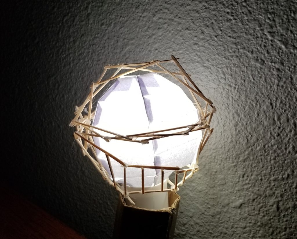
In the end I like the aesthetic of the lamp I created. I would have liked to have a little less angles and more of a curved feel to it, but I think that the overlapping circles helps to create the illusion of a circle. My process for this project was very free flow, much like when sketching. I think that the free sketch-like process I used in construction adds to the aesthetic I was going for. I really just had an idea on paper and just started gluing toothpicks until I figured out a way to make it. Then the paper sphere was very trial and error. I really like the shape it has, I don’t love how you can see the overlap of the glue tabs through the paper when the light is on. If i were to do this again, I would do a little more research into different types of paper and how they diffuse light.
I like the overall lighting that this lamp creates. I was successful in creating a dim, atmospheric lighting for my bedroom. I am still working on developing a way to connect the sphere to the bulb so that it is secure but still removable. I am planning on creating this connection and then mounting it on the wall in my room.

Presentation Video:
Citations:
[1] https://www.core77.com/posts/23798/mike-serafins-hurricane-lantern-and-old-school-id-sketches-23798
[2] https://www.instructables.com/id/5-Japanese-lamp-from-recycled-materials/


8 Comments. Leave new
I really liked how you used your sketch book to think through the process for this piece of art. It’s awesome how your project is useful now and can be used daily!
The ideation path was very cool and intriguing. It’s interesting how you went from having no ideas in your head to the idea of the lamp. If you were to make this for a larger lamp, like some place in your family room, would you choose the same design or what would you do to change it and allow the light to be brighter?
I like the light sphere you made! I think it especially looked good in the dark room where you could see the shadows from the toothpicks around it. It would be cool if you made some more and used them as lights around your house.
I enjoyed going through with what you did, good job! your idea actually amazed me! The calculation you went through to get the right dimensions is really cool. As you said, I also liked the hanging lamp idea! I wouldn’t change anything in your design, it’s perfect the way it is!
I actually enjoyed looking at your final results more than what you have initially planned. Having a geometric spherical lamp, in my opinion, added to the aesthetic. If it had been a regular sphere, then it wouldn’t have given it the edgy and sharp look that it has now. Your design gave an edgy, modern and clean look to a regular light bulb. I think you should consider making this part of 3 or more lamps that look different yet integrate the same aesthetic and hanging them on your wall. You’ve outdone yourself!
The sphere light was a great idea, and I enjoyed seeing the many iterations from the drawings that you showed us from the original idea. It’s a nice reminder that what we envision is harder to bring into creation than what we think – round edges turned spherical. The sphere out of paper was the most interesting. Have you thought about doing this with numerous lights?
I really liked how you incorporated the simulation of the sketch lines into the design. The hexagon overlaps definitely made it more of a circular design, which took away from the angularity of the hexagons. I would definitely make it a wall mounted design so that way you wouldn’t necessarily have to hang it from the ceiling.
I like how you really utilized your sketch book to fully create your design. I also like that you incorporated both your original aesthetic choice with something that you could really use. You could consider painting parts of it if you wanted, but it also looks really nice with the sort of “unfinished” look.