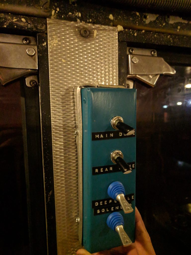
My upcycling project was made both to fulfill the assignment requirement of this class and to be a part of a personal project I have. I created a switch panel for mounting multiple toggle switches. The switch panel is intended to be installed on a wall.
If you read my previous upcycle project design process post you may recall that I wanted to make a messenger bag strap out of a seatbelt, but was unable to find the old seatbelts I had. I did eventually find the seatbelts, but chose not to go that route for my upcycling project because it seemed too simple. All I would really need to do is attach the seatbelt sections to a bag using carabiniers or something. I probably still will do that project some day.

I made my switch panel out of an old HVAC duct piece. An unused piece of fresh sheet metal was also at my disposal, but that seemed to defeat the purpose of an upcycling project. This was one of my first times working with sheet metal. Looking at the final product it is evident that I am not an experienced metal worker, but I am still pleased with it. Here are some photos of the build process and some of the tools I used.


https://photos.app.goo.gl/wQ6TguJYYGkNd7XV6
It took two attempts to make the main switch panel housing. A back plate was also made.


I would have really liked to use old-school-style toggle switches, but would have have to buy them brand new. The switches used instead I got at a Radioshack “going out of business” sale and they were super cheap. Even though they are unused, it felt more appropriate to use them in this project than to go out and buy more switches.

I put aluminum trim around the edges of the switch panel. This was also an upcycle material. In a previous life it was the metal strips on a bus floor, sometimes known as runners.


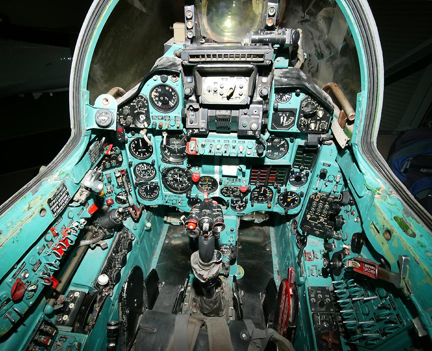
The paint color I chose inspired by the cockpits of Russian aircraft. Fighters, freighters and airlines have a blue-green painted cockpit. This is supposedly because the color was calming to pilots and kept them awake.


Embossed labels were used to label each switch. The embossed labels, toggle switches, and blue-green paint all contribute to an airplane cockpit aesthetic.

Overall I am happy with the outcome of this project. I think it did a good job of reusing materials, achieves the usefulness goal, and bears the desired aesthetic. There is, however, room for improvement. It would look more professional if edges were straighter and if surfaces were flatter. As mentioned before, the older, all metal toggle switches would be cooler. The biggest flaw is the aluminum trim. It is not straight or even. I shaped and cut it using only pliers. Better tools probably would have made it look nicer. It also is not evenly spaced. If I had taken more time to line it up properly it could have looked better. I will probably do this before installing the switch panel at its new home on the wall.


11 Comments. Leave new
Hello Conrad, your project came out really good. I think it’s really cool that you made something you will actually be able to use in another project, and the aesthetic you were going for came out really well. It would be cool if you could include another aviation aesthetic in your design, but I think you did a great job!
great design and a very clean looking product. I liked how you wanted to go for a Russian cockpit aesthetic. I can see the precission you needed to pull that off. I would have loved it if you did not have to buy anything new and made it entirely from cycled material, but that would have impacted the aesthetics. great job.
I really like the old school aesthetic too. I think you did a great job with the limited experience you claimed to have. I would like to know how you incorporate this into your other project. Nicely done!
This was a really cool project. Your presentation was great at outlining your inspiration and build process. You mentioned possibly redoing the base trim. Are you planning to use the same material or switching that up? If you do I think rubber could help achieve the aesthetic you’re aiming for while also being easy to work with.
The older aesthetic comes through very clearly, especially in the old style labels, a nice addition to wrap it all together. Would the finished product be any cleaner if you used a different process to cut the sheet metal, or was it mainly due to inexperience of dealing with the material? Overall it came together very nicely and really shows the desired aesthetic.
I think that the Soviet Era Aesthetic is a super unique idea. I think you definitely hit the mark. You are going to have to give us an update of where you mount it on the bus.
The fact that you used an old HVAC duct and ended up with that beautiful switch box shows how much work you’ve put in this project. Your presentation was more like a story which in my opinion is how presentation should be, well done. I wonder if you could soldering those gaps on the switch box shut.
Conrad,
It was nice to see how your project came out after seeing the design process for your switch. It was great to see your manufacturing/construction process because it looks like you spent a good deal of time ensuring it reached your desired aesthetic at the end.
Nice! I think you definitely achieved your aesthetic, it looks like it could be bolted to the inside of an old Russian plane.
I like that the color of your project was inspired by older airplanes (blue). I personally really liked the open space on either side of the switches. The labels combined with the metal aesthetic from the bus made the project looked amazing. Changing the trim would make it look a lot more professional, but overall you did a really good job!
The final product looks awesome! I am curious why you needed the switches? Also where did you get the dangerous old duct paint and the school bus metal lining?