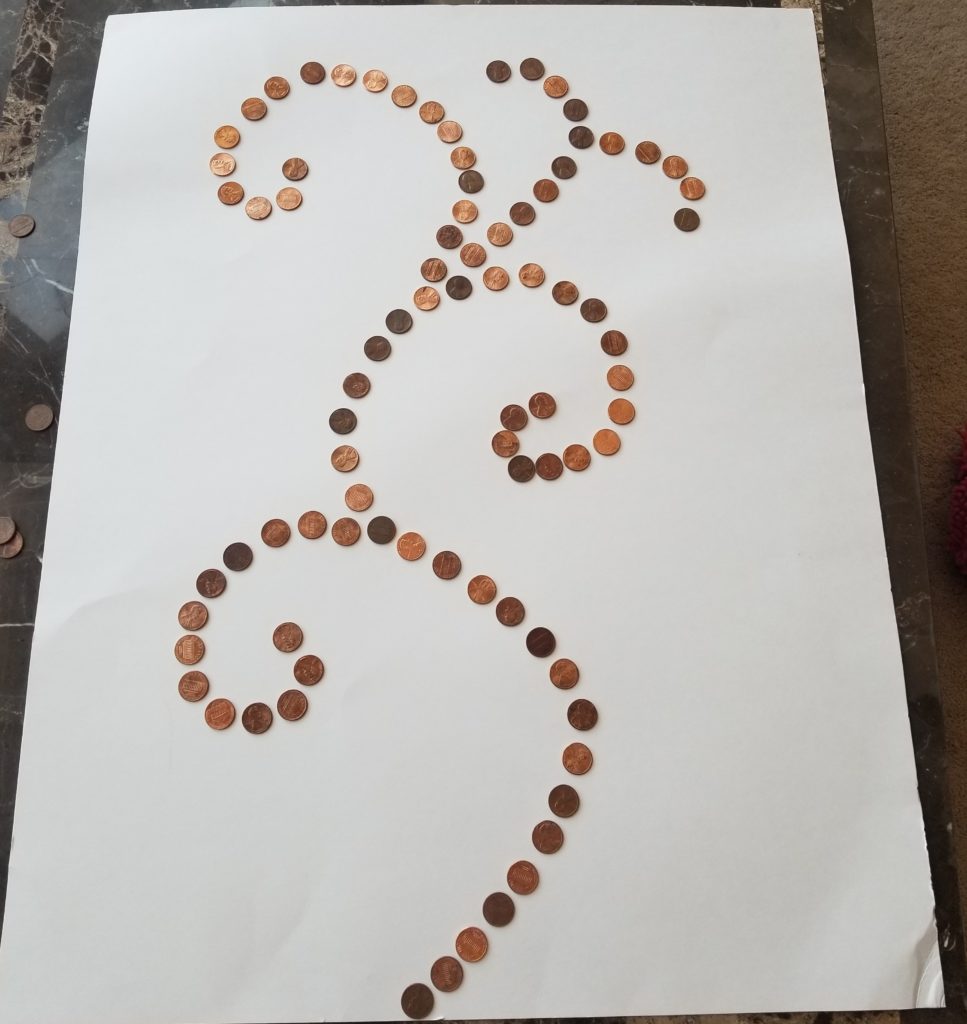
Utilization of pennies in an art installation can be extremely pleasing due to the varying colors of copper and the shape of the penny. When used in a linear pattern placement like the final product, they can create wonderful designs.
As discussed in the video presentation, the final design was chosen to look like a sprouting plant. The center “stem” curves out of the ground and has small “branches” breaking off and curling on itself like a spring sapling would. The reason for this design stems from the original idea I had for the upcycle project, which was discussed in a previous post. I wanted to try to retain the idea of having a plant still be apart of my final creation.
Though this idea of incorporating the original idea into my final product stayed with me throughout the entire process, I did still draw up some possible concepts. The very first concept, seen below, shows the pennies spread out to mirror a playing card, the Ace of Hearts. This idea comes from the in class activity where Professor Hertzberg challenged us to incorporate a random aesthetic we pulled from a hat into our upcycle project.

The two pictures below depict random designs I had come up with during the design process. I cannot pinpoint the inspiration for these two designs. However, the final design chosen by me was in fact the plant like design. This was because after laying down the pennies on the poster board, I did not like how the Ace of Hearts design nor the other to designs looked as the line design seemed random and the swirl design and Ace of Heart design looked too clunky and claustrophobic. The plant design, though simple, seemed fresh and open. No part of it felt clunky. It was for this reason that it was ultimately chosen.


The making of the piece, once the design was chosen, was not all too difficult. I only needed the large amount of pennies, a hot glue gun, and a poster board. For those who have been following the development of this, you may recall I said I would try to use Styrofoam. I changed material because my idea for what I wanted to do changed as well as I was originally going to have pennies and possibly other coins, standing up and the Styrofoam would’ve proved to be a good way to do this. However, my ideas changed and ultimately I felt that a poster would be the best option and chose that as my canvas.

The final product pleases me greatly. It turned out great and perfectly captures the aesthetic of pennies and how they are still of use if used in application like this. Unfortunately some pennies did fall off while transporting this piece to campus but it can be fixed easily. Though the final product is slightly fragile when exposed to wind, which makes the poster board bend and causes the pennies to dislodge, I plan to hang this up in my house.
If I was to repeat this project, and I was given more time to work on it, I would try to use a bigger canvas which would allow for a more intricate design. This design, as I stated, was not all too complex. I would try for a more difficult design to create using pennies still. I would also maybe emphasize the placement of each penny depending on its color. Depending on the design I chose, I may even consider using nickels or dimes as well to aid in the project.

11 Comments. Leave new
Great project. Simple but creative. loved your design process and how you explained it. would be cool to use different coin colors to create different images or bodies.
Cool concept! I like the form that your final piece has. It almost looks like a person dancing, with fun swirls.
I like how the final product came out. It reminds me of the sport symbols for 2008 Beijing Olympics somehow, very cool!
I really enjoyed your design and how you turned something so simple into such a beautiful piece of art! Since no one really likes change, especially pennies, this project was definitely an upcycled one!
I like the final design shape you went with! It is very aesthetically pleasing. It would be really cool to see an organized version with the pennies going from dull to shiny as the design progresses. Overall good presentation and project!
I like that you used pennies, it’s an interesting cycling material! I see different colors of them and I think it would be great if they were organized in a way like from the darkest to the lightest. It will represent a shadow in a very cool way. I also thought maybe a colorful background might look nice behind the design. I loved the curves and the project overall, Good job.
Your idea is very interesting. Giving value to something that has been forgotten or invaluable to us nowadays gives it purpose. I like the curves you traced using pennies, however, I would like it if you added more lines using other material or coins to further accentuate the pennies or give them a purpose to serve in the artwork. As you mentioned, pennies vary in brightness, how could you use that as an advantage in your artwork next time? Where your layout of pennies random or did you choose to lay them this way in particular?
I think you did a good job creating implied curves in the layout of the pennies. It fills the canvas very well (with the exception of the missing pennies). To improve, I would suggest using poster-board like what’s used on cereal boxes, or foam core. Hit me up if you need some foam core, I think I have an extra sheet.
That’s my two cents!
I liked the original idea about “death of the pennies” and the idea that pennies died out in modern society. The colors of the pennies did in fact look amazing on the white background. I liked to hear the future of this art piece – despite how fragile it seemed to be. I thought it was interesting to see how something so simple could look aesthetically pleasing. The heads and tails being random as well as the colors was a great idea.
I liked that you kept the idea from your initial project to incorporate the sprout shape in your final design. The white background definitely makes the pennies pop. One thing that I think many people wouldn’t consider is how difficult it is to arrange such small pieces to glue them down, but I’m sure it wasn’t easy as I have done something similar with bottle caps and it took way longer than I had anticipated. It looks great!
I like that your final design is similar to the plant idea you first had! It’s cool to see how it followed through your entire design process because the design looks somewhat like a plant. I also really liked the metaphor you were making in one of your ideas with the “penny graveyard.” To take your project one step further, you could consider painting the background or using other materials in addition to pennies.