With this upcycling project I had no specific inspirations, in terms of what motivated me to chose this sculpture topic and style, other than the constraints of the materials I had available to me, and some discussions with friends about what I could do with said materials. However, as I’ve progressed with the construction of the project, I’ve begun leaning into designs inspired by Studio Ghibli films.

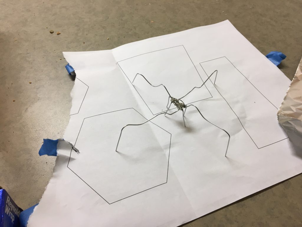
Originally, this structure reminded me of a spider, though I wasn’t exactly sure how I would build upon it for the final design.

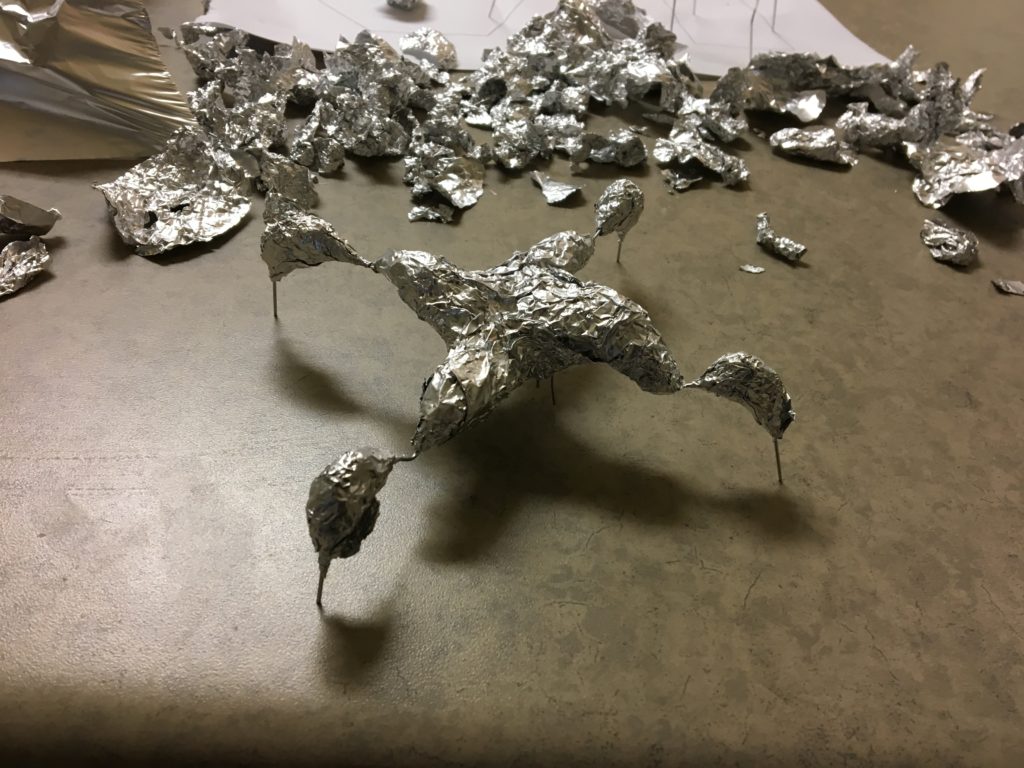
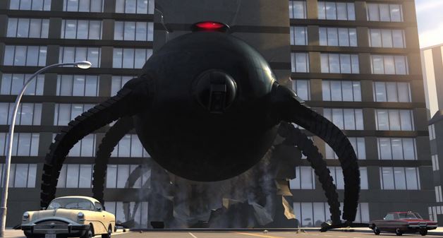
Adding layers to the design, and it’s become apparent that I want to build upwards upon the existing middle portion, as some sort of head. The legs sprouting from a central body feel reminiscent of the robot antagonist from the movie The Incredibles.

Although, I wanted to avoid this kind of shape, as I’m not fond of the aesthetic. Pushing away from that, I wanted to emulate the look of the castle in the film Howl’s Moving Castle.

I like the feeling of instability in projects, something more natural and uneven than the Incredibles robot.

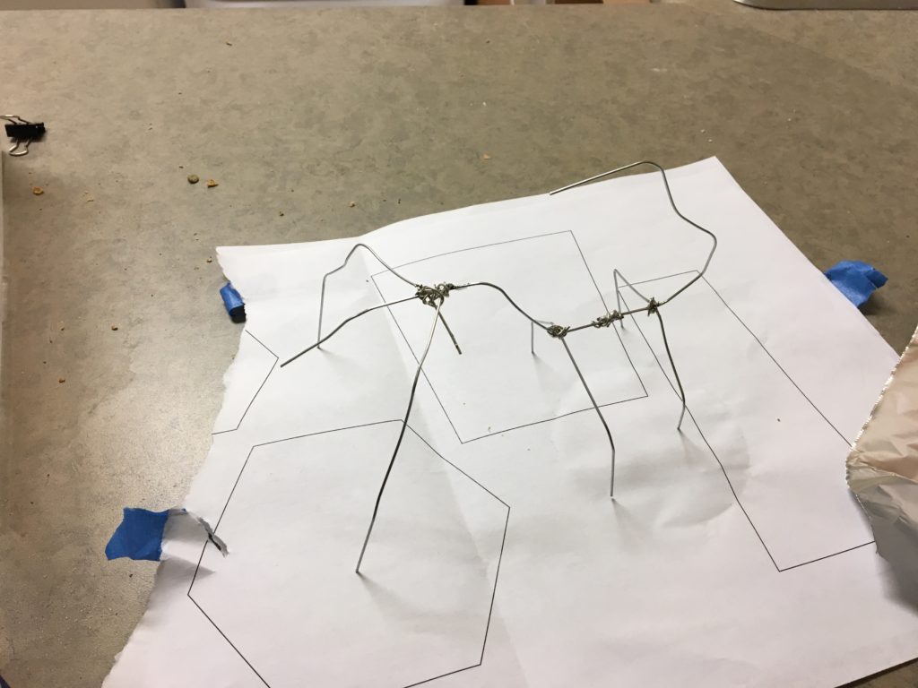
As for the taller structure, I designed it akin to a scorpion. I’ve yet to begin layering this insect, so I’m unsure of where I’ll head with it at this point, but for now I’m planning on mirroring the style of the first insect, in terms of thick and thin portions contrasting the tinfoil and the paperclip skeleton.

1 Comment. Leave new
Awesome images included. Interesting how the design evolved, but remained an insect.