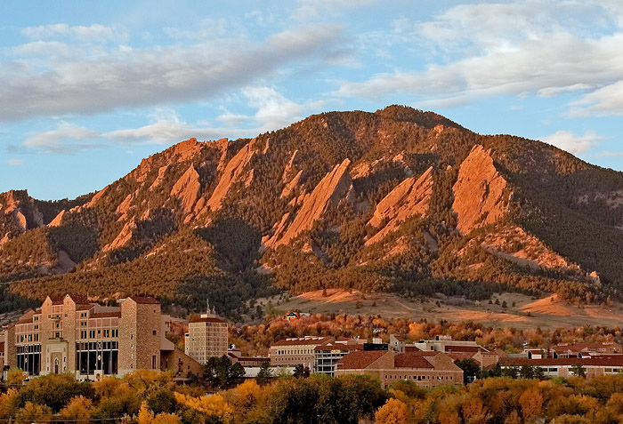
When driving into Boulder from the east, you reach the top of a hill and then a beautiful view of Boulder and the surrounding mountains opens up. It’s hard not be taken away by the view each and every time. Almost as hard to miss as the mountains is the grouping of red buildings. This is CU Boulder. Most of the modern architecture on this campus is built to blend in in terms of material used, but each building sticks out in its layout. As part of the design principles, architect Charles Klauder said that the whole of the campus was more important that the individual buildings. The effect of the campus must be taken in all together.

The main material used in CU architecture is a red brick that is meant to mimic the red sandstone of the rocks surrounding the city. The rock comes from an oxidized iron and is iconic on the front range of Colorado. The red brick is a celebration of this natural beauty.

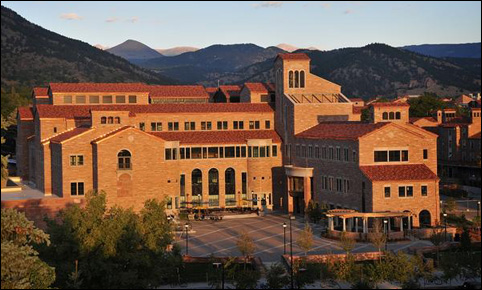
The campus was opened officially in 1877. Its first building was Old Main. Old Main is not made of the exact material that most of the CU buildings are made of today, but it encapsulates the rich red of iron oxide. Even the sidewalks on campus are made of red sandstone on places.

In 1919, architect Charles Klauder for approval for building in the collegiate gothic style. This move prominently influenced the majority of buildings on the campus. The technical materials used were laid-up sandstone, red roof tiles, and Indiana limestone trim and the term for this style is the Tuscan Vernacular Revival.

Coming directly from the Campus Architect website, the design (aesthetic) principles of the buildings are as follows:
- “Soft, playful, non-serious forms that are natural and simple
- Forms that are picturesque and exhibit charm
- Modest in massing with detail reserved for focal points
- Interesting in silhouette with roofs of various heights and intersecting forms”
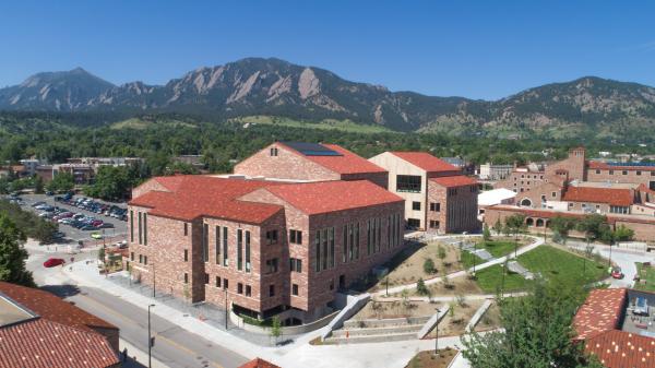
These design principles have held true. The new CASE building (2018) showcases these principles well. The middle walkway that connect the two sides serves as a modest focal point, there’s a variety in shape on the roof, and it is absolutely picturesque.

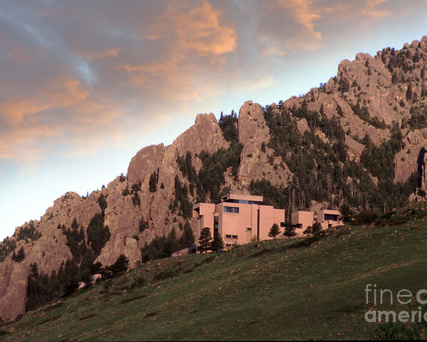
Not only is this aesthetic apparent in the architecture on campus, but it’s also apparent in some of the other buildings in Boulder. The National Center for Atmospheric Research (NCAR) sits directly on the the mountain. Although it doesn’t use the exact style as CU Boulder, it is pink in color and creates a picturesque setting.

In conclusion, the architecture in Boulder, particularly the CU campus, mimics the surrounding color of the mountains well. There’s always been a value in Boulder to be in harmony with nature and it shows well.
Information references:
https://www.colorado.edu/fm/departments/planning-design-construction/campus-architect
https://www.bouldercoloradousa.com/about-boulder/boulder-history/
https://www.colorado.edu/coloradan/2017/01/10/10-cu-boulders-oldest-buildings
Image references:
https://www.colorado.edu/today/2018/07/05/case-building-set-open-first-4-programs-move
https://connections.cu.edu/stories/campuses-showcase-current-and-future-architectural-gems
Free Solo Climber Falls, Dies on Boulder, Colorado’s Flatirons
e13e7: https://www.reddit.com/r/climbing/comments/1ry0o4/the_textured_walls_of_the_buildings_at_cu_boulder/
NCAR image: Jerry McElroy


2 Comments. Leave new
I appreciate that you take something everyone in this class observes everyday and add a thorough explanation of the context. Colorado is such a beautiful state, and it is fitting that we have such a beautiful aesthetic to complement it here at the University. You mentioned the Tuscan influence Charles Klauder had when designing, which I have heard he was so dedicated to that he frequented Florence in order to bring back the feel of the Resonance city. A place that encourages learning and art.
It is also worth mentioning the dedication to green-space the University has taken up. Amazing green walks and parks are scattered everywhere it seems like. Nice work!
The CU campus is an incredibly beautiful place, and how it mimics the surroundings is an easily overlooked part of the design of it. Each and every building is unique and beautiful in its own way, but when taken in together it brings out a different part of the beauty that is present in the campus. The idea that the whole of the campus is more important than the individual building is an interesting idea behind adding to an existing design. How much do you think that goes into the design process of new buildings, and how are they integrated into the campus while maintaining their own uniqueness and the balance between the campus design and the building design?