Sketching by hand is not lost in today’s digital age. The ability to sketch by hand allows designers to quickly put ideas onto paper, make changes, and flesh out concepts.

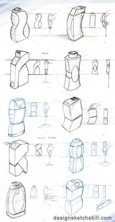
Early stages of design sketching often looks like this. Many simple images on one page. Often in a side view so that they are easy to draw quickly and the designer doesn’t have to worry about perspective. Simple shading done to create the idea of 3D form. Lines often go past their end point.
These rough sketches are a tool for designers to freely put a lot of ideas on paper and then evaluate them based on which designs stand out in the chaos. This is a very powerful tool for designers during ideation, but also creates a unique aesthetic. The rough thumbnail sketches just give you enough information to evaluate the form without any particular design being overwhelming. There is a stream of consciousness feel to the page, like you are looking into the designers mind. You can see ideas evolve on the page.

Moving forward in the design process, the designer will pick their favorite thumbnails and start to add some perspective and more detail to better evaluate them and allow them to grow. Even though these sketches are done by a different designer, they still have that unique product design feel to them. For lack of a better word, they’re sketchy. You can still see construction lines, there is no color, and shading is pretty minimal. Yet you can still see the form of the designs and infer the potential beauty of the final products based on these quick sketches.

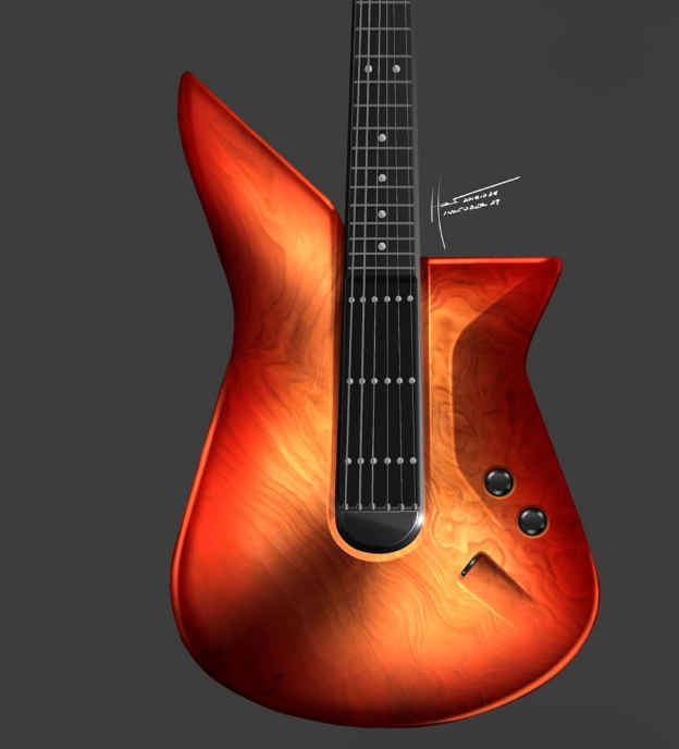
The next step in the design process is to pick a few of the best ideas and render them to look like the final product. These sketches are often shown to clients. Sketching allows designers a tool to visually convey an idea to clients with more emotion and control over how it is interpreted than a CAD drawing would. This image is an example of a digitally sketched render. Although this is digital, it is still “done by hand” in that the designer used a pen and tablet to create the sketch. Although this is very different than the ideation sketches some of the same concepts are still there. Shading, or in this case highlights and shadows are used to emphasize the important aspects of form and allows the designer the ability to influence where the client’s eye is drawn.

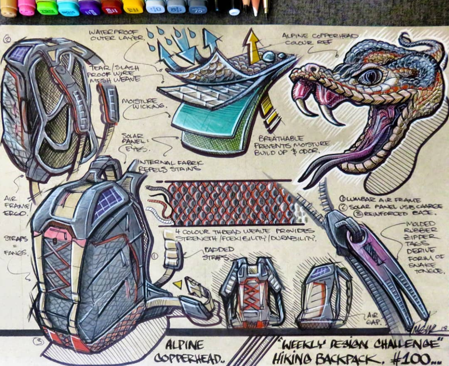
Here is another example of a product render. This is done in analog and therefore has a bit more of that “sketchy” feel that the ideation sketches had. This is also a composition that breaks out different details of the product to emphasize, such as the zipper or the moisture wicking material. There are also callouts with curvy arrows all over the page, pointing out small details and bringing the client’s eye around the page.
This is an example of where the “product design sketch” aesthetic has become more than just a tool for product development and has become an art. This product is a very cool concept since it is derived from the form of the Alpine Copperhead, but it is not extremely practical as a consumer product. It would be very expensive to make, and the intense design would probably alienate a lot of people. It is still awesome as a concept, and this sketch was created as just that; a really interesting concept that uses the product design aesthetic to communicate its details.

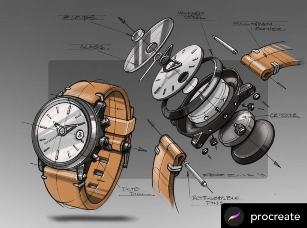
This image is another example of how the tool of product sketching has become art with its own unique aesthetic. This is similar to the array of ideation sketches, but it is more apparent here that the sketches were created with the beauty of the final composition in mind rather with visually brainstorming being the goal. That first image was a tool to move an idea from the designers head to a finished render. It was messy, ideas were all quick, and proportions were off. But this sketch is created to emphasize the beauty of that ideation stage of the process. The beauty of looking into the mind of a designer; seeing how they rapidly put an ideas on a page and how the ideas evolve with each new sketch.
Here the designer isn’t looking to create a chair concept, they are looking to create a pleasing page of chair ideas that evokes the same feelings of controlled chaos and being a part of the brainstorming process. It’s interesting to see how this aesthetic was developed as a tool for rapid idea development and communication has become an art in and of itself.
Citations:
Cover photo: https://www.instagram.com/p/BrfcxO1nZq3/?utm_source=ig_web_copy_link
1st Image: https://www.core77.com/posts/23798/mike-serafins-hurricane-lantern-and-old-school-id-sketches-23798
2nd Image: designsketchskill.com
3rd Image: https://www.instagram.com/p/BphYyDWgcrO/?utm_source=ig_web_copy_link
4th Image: https://www.instagram.com/p/BrUFMRZHZjk/?utm_source=ig_web_copy_link
5th Image: https://www.instagram.com/p/BcmuvvSB_5K/?utm_source=ig_web_copy_link


6 Comments. Leave new
[…] Aesthetic Exploration: Product Design Sketches […]
Josh, Excellent choice for your aesthetic exploration I agree with you in most things. The picture selection is very good, and I think drawing is a great skill. The one thing I see a little out of place is the guitar render, how does it relate to the design sketches done by hand when renders are done in computers? Or is this render done by hand? Great choice
There is a part in the paragraph under the guitar that reads “Although this is digital, it is still “done by hand” in that the designer used a pen and tablet to create the sketch.” I hope it answers your question.
Josh,
Josh, I love how you identified these product design sketches as an aesthetic of their own rather than simply a means to generate ideas for forms of other designs. I’ve actually seen people hang sketches like this on their walls as art. It’s interesting that the unfinished, rough feel with lines extending past their ends is often more compelling than a photorealistic CAD rendering. Do you think this aesthetic could be used more often for more finished applications like as advertisements for products?
Josh, I thought it was an interesting perspective that hand drawn sketches convey more emotion to clients rather than just a CAD model. The more you think about it, I would agree with you. Do you think that a digitally rendered sketch takes away from this emotional response at all? Does it potentially enhance the sketch? Great work!