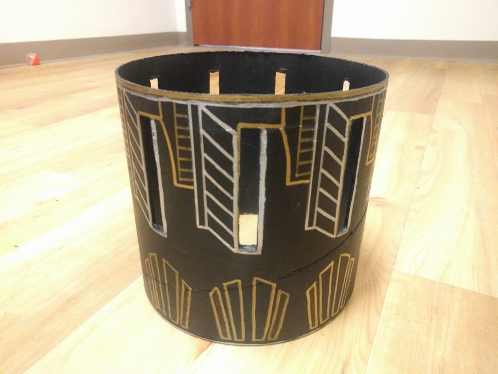
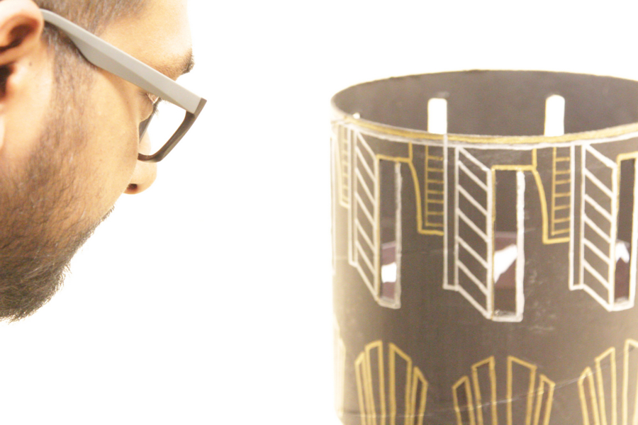
Overall, I think my project came out pretty well. I was able to successfully iterate through many designs and finalize on the one I like the most, which was also the most simple.
Initially, I went with a boxed design (where the cylindrical zoetrope would sit over a box) and have a motorized function to spin the cylinder and animate the frames. Finally, after taking a lot of factors in consideration, including what I would do with it after I am done with the class, I decided not to have a box with a motorized function. I wanted the paint and the texture to look like pottery that would sit on my mom’s shelf after I was done with the project and I am quite satisfied with the outcome.

The EXPO was a very fascinating experience for me. I felt that my project spoke to young children and seniors. For children, seeing the images move was captivating and I went on the explain how cartoons work. The excitement and wonder they felt was a great experience. The senior citizens were happy to see it and one particular gentleman talked about Muybridge and how he was very much into zoetropes and told me his stories.

Moving forward, I plan to give it to my mom when she comes here, and she will display with other random artifacts we have collected over the years. I will make another version with more animation frames and probably some lighting inside and use white background so that I can use the frames I already sketched but was not able to use for this one.
To conclude, This class was probably the most fun class that I ever took in grad school, it challenged me in ways I did not imagine and incidentally, I found out that I have a lot of interest in fonts! I have absorbed a lot of information on aesthetics and its applications. I have developed a deep appreciation to various aesthetic styles and the effect it has on people.

1 Comment. Leave new
How inspiring that you made those connections with your audience at expo! I love how passionate you have always been about this project. It really came out looking amazing. I agree that focusing on the desired aesthetics of your project was a wise move. I really think you hit the nail on the head with the “art deco” aesthetic and the flow of your animation is remarkable. Spinning the zoetrope was so easy and I think that feature made your project really stand out. The structure and language of your report are very nice — I appreciate the photos!