Why and what next?
Original Project Intent vs. Reality
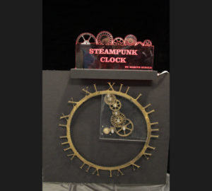
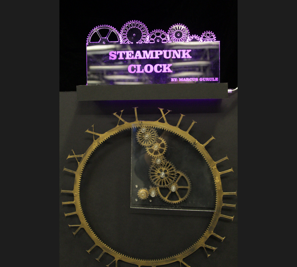
Originally my inspiration was to create a steampunk inspired interpretation of a clock. This clock was to work a little different than a standard clock in that instead of the hands moving around the clock to tell the time, the numbers would actually rotate around the clock. To tell the time you would simply read what is vertically straight up. Sticking with the aesthetic I wanted the gears to look like they were either gold or brass and that look like they were pulled straight off of heavy machinery. Using the weathering technique of spray painting a black base coat and using “Rub N’ Buff” I was able to make the plastic look like metal.
Public Reaction
At first the public needed a brief explanation as to what was going on when they first looked at my project. Once I gave a brief overview of what was actually going on and the aesthetic that I was trying to accomplish everyone seemed to enjoy the project. Some people even asked me how long it took me to machine all of the gears which was a huge compliment because I was able to pull off the aesthetic that I was going for only using plastic.
Lessons Learned
Since I did have to do a little bit of explaining in the beginning on how to read the clock I think that it would be more useful to add an arrow to indicate where to look to tell what time it actually is.
Things to do Differently
The motherboard and power supply that I used was far more advanced than I needed to just control one stepper motor. The motherboard that I used is intended to be used for a 3D printer. In the future I would like to get a smaller chip to control the motor that would allow me to make the clock more portable and also the possibility of being able to hang it on the wall.


3 Comments. Leave new
Hi Marcus,
I really like how you presented your project at expo, the lighted sign and the black background made it look really professional. Also, the finish you used on the acrylic really did look steam-punky, so good job there. I did notice that the outer ring kind of wobbles a little. You mentioned that before in one of your presentations, about how you might add some guides for it. Is that still an option? The wall hang is a great idea. I wonder if there is a way you could make it so that you wouldn’t need the background acrylic piece? I think seeing that negative space would be neat. Thanks for nice project!
Really cool looking project! I would have never known that you had used plastic. I completely thought it was metal. I think what made the public not think of it being the clock was probably the background that was used, it the shape was more rounded instead of it being mounted to a rectangle it might convey the idea better. Overall though the clock looks great and it’s awesome that you have plans for future improvement.
Fantastic project! I love that you sought to make a functional project inspired by an aesthetic discussed in class, and you were obviously able to challenge yourself to use concepts like 3D modelling and wiring the circuit for the clock and lights. Great work with the steampunk aesthetic, it looks absolutely looks fancier than something you could buy from a store. I saw your project in person at the expo as well and was very impressed. It looks professionally done but I could tell you put more thought into it than any industrial manufacturers would. Honestly, I can’t think of any way to improve upon your project design. As long as you are happy with the end result, I am thoroughly impressed! Great job!