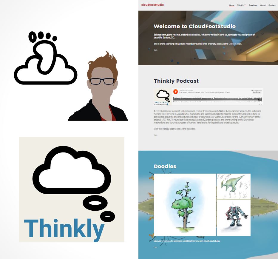
https://itunes.apple.com/us/podcast/thinkly/id1223786056
It took me a while to decide what I was going to do for my final project… I considered a sort of large-scale upcycle project with reclaimed materials and wind to generate electricity, but I’m pretty sure I came up with something better. I’m going to design a website: a personal and professional design-oriented site to aggregate my online presence in other areas like Instagram, Twitter, and LinkedIn. It will also be the home of a podcast I started with my brother, called Thinkly.
One of the most important features of any website is a unique and memorable domain name, one that is easily understood and easily spelled. It was a bit of a challenge to actually get the domain that I wanted, but I have had it decided for a while. In my previous post on Main Project Inspirations I told the story of how I got the name (Luke -> skywalker -> cloudfoot), but there are so many possible instantiations of that title… cloudfoot, CF, cloudfoot studio, CloudFootStudios, CFStudio, and so on. You can tell I was pretty settled on the “studio” moniker, and going singular was really a result of the number of letters allowed by Instagram and Twitter, lol. Unfortunately my online store on Society6 was already “studios” so I’m trying to fill it with enough keywords and tags that cloudfootstudio will return it as a result. I owe both cloudfootstudio.com and cloudfootstudios.com, but the companies that hold them for me are rather old-fashioned and don’t provide any site design tools. It was very complicated to connect those domains to my current draft site, but it’s mine now! See for yourself…
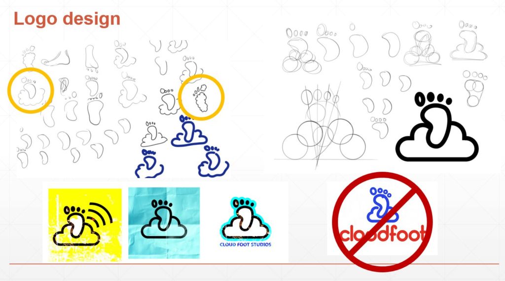
As you can see I had a few different ideas for how to graphically represent my chosen identity, and I didn’t really look at anything to help me decide on the final version. I guess I just like the rounded edges, the simplicity, the cartoonish and approachable nature of the imagery. The type font is based on the curves of the cloud and the close spacing of the lines, though it is definitely on the table for modifications. But this will serve as the initial icon and logo of my website, hurrah!
There are several options I evaluated for hosting the first draft of my website—I compared Wix, SquareSpace, Weebly, and GoDaddy, but WordPress had the best templates and the most intuitive customization structure for page layout and menu organization. So I grabbed a modern template and went for it. I was pleasantly surprised at how simple my mobile-friendly constraint was to achieve so far… the web template I installed quickly and cleanly proved dynamic enough to adjust based on the width of the screen on which it is viewed. I just had to ensure that, as I made changes, I don’t introduce any incompatibilities with the interface or overlapping graphical elements. I also tried to make entire boxes/regions click through to the links instead of just the text within them, but this has proven to require more coding knowledge than I have (CSS in particular) so I’m trying to learn how that works.
I’m definitely going for a sort of “helvetica” aesthetic here… clean and intentional sharp lines, distinct (one might say high-contrast) graphical elements, welcoming but professional curves. I don’t know if I’ll actually use the Helvetica font, but I can definitely say it’s been an initial inspiration for the layout and balance of the web design. I’ll be employing some of my favorite color palette here… primary greys and blacks, white background, red accents, and most likely a deep blue or black logo.
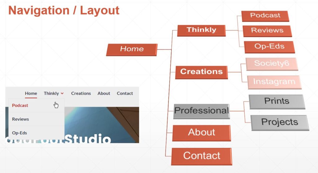
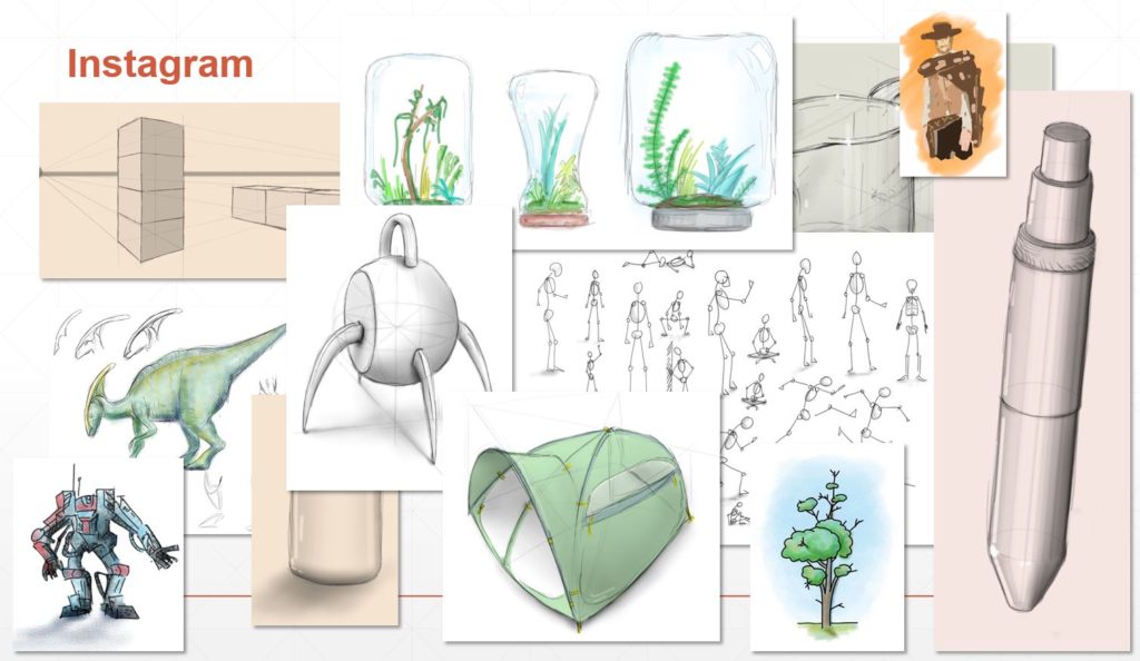
I also knew I needed it to be dynamic, more so than a typical updated-every-now-and-then website might be. So I’m taking a page from my favorite online journals and incorporating Twitter and Instagram directly into the pages appropriate for that content. So first I needed some pages. One of the earliest pages I knew I wanted was something I called Creations to showcase some of the products that I’ve put up on Society6—a site where you upload images, photographs, drawings, designs, etc. and configure them to be put on products such as T-shirts, coffee mugs, wall clocks, or poster prints. I haven’t made a ton of sales but it’s a great way to get some exposure, gain confidence, and even give your family unique gifts by purchase your own products, hehe. Anyway, this page seemed like the ideal location for my Instagram feed, because that in essence is also a set of creations, albeit ones that are more likely to be doodles, photographs, or text images rather than things ready for products and sale. It’s a perfect fit and I’m quite proud of how this technique applies the “dynamic” constraint to web design, especially without be having to go into the web editor and make changes daily or weekly to get anything new to display.
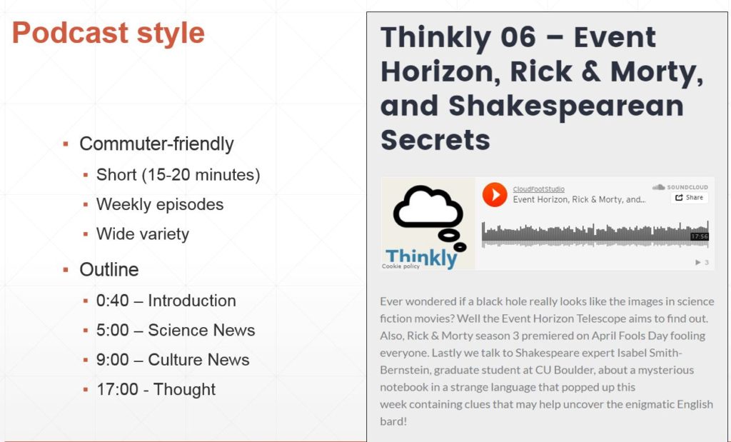
Another dynamic section is my Thinkly page, the home of posts, podcast, and reviews of movies, books, videogames, etc. In this page, I can use the WordPress posts feature to upload new content easily when I have something to share. Currently I’ve got a single blog post and some filler, but I anticipate at least weekly additions as well as contributions from my brother and other design-oriented friends who are skilled writers and thinkers. Twitter also belong on this section because—although yes, my posts are often artistic in nature—it is a platform perfectly suited to concise, relevant, or humorous thoughts. Tweets, retweets, and quotes will show up here, which again allows me to update my site frequently and effectively without the effort of making substantive alterations to the webpages themselves. The podcast Thinkly itself is a short (15-20 minutes) series about science and technology news, then a section on culture and media, and finally a thought for the week—something either Zander or I was curious about and decided to do some research about to learn a bit more. So far some of the news and subjects we’ve discussed include SpaceX, nuclear reactors, The Legend of Zelda, national parks, and batteries that last for centuries. If you have time, please give it a listen! We’re new to this and sure could use some feedback so we can improve the style and presentation of Thinkly. It’s up on iTunes, Google Play, TuneIn, and a bunch of other directories. Send me a message if it’s not in your podcast app!!
Of course there are the obligatory About and Contact sections, but those aren’t really where design is going to come into play. Unfortunately I’ve had to abandoned for the time being my goal of having professional and academic work posted to the site because of IP rights and access to information. So here’s a summary of my work and actions taken to create cloudfootstudio and Thinkly:
- Determine and purchase URL
- Find a template that matches aesthetic goals
- Modify fonts
- Modify colors
- Add design images
- Create logo and vector avatar
- Organize page structure
- Add footer and side content
- Link social media channels
- Set podcast options
- Configure RSS feed
- Select title (“Thinkly”)
- Create artwork
- Author content
- Create artwork
- Write opinion pieces
- Record podcast episodes
- Get Thinkly approved in directories (lots of waiting)
- iTunes
- Google Play
- Stitcher
- Customize menu layout and animations (Rule of 7)
- Debug mobile-friendly interface
- Edit CSS to control alignment
- Configure nesting for ease-of-use
- Add professional portfolio
- Engineering drawings (permissions)
- Abbreviated CV (appropriate style)
- Enable contributors
- Set-up log-ins for people I want to be able to write posts
At this point I’m extremely proud of the site I’ve created and of the ongoing podcast Thinkly. I think it give a good sense of who I am, what I like to create, and what I’m interested in doing with my time and my future.

