On the first day of class, during some brain storming for my upcycle project, I stumbled upon a chess board, which I started sketching.


 As I thought more about it, a chess board seemed like an timeless art piece, seen at home in many diverse environments: City parks, fancy hotel lobbys, living rooms, and more. As I look around my living room, I see an empty space on the wooden table, and figured that a chess board could change the dynamic of a room. My original idea at the time was to make a matching cribbage board, but this had to be put on hold due to time and budgetary constraints.
To begin this project I needed to create a project scope, requirements, budget, and schedule. These are all seen below:
Project Scope: Create an 8×8 tile chess board using decorative and contrasting wood for under $50.
Requirements: 
Budget: Less than $50. The wood purchased was $40
Schedule: 
This schedule shows the original project schedule with slack time added. Also, the actual completion lengths were added to show how they differed from the original times. I needed to do some tasks twice (hand planar, table router), and the learning curve was evident when the time decreased.
As we explored more aesthetics in class , I explored more ideas, and eventually narrowed my aesthetic down to a contemporary Asian aesthetic. For my upcycle project, I chose a rustic cabin look, using old and weathered barn lumber. I discovered that wood itself is NOT an aesthetic, but instead is a material. The wood must be arranged properly, colored correctly, and shaped uniquely to be considered part of an aesthetic.
Below, I will highlight what the contemporary Asian aesthetic is. In my research, I noticted very square and contemporary shapes. There are not a lot of rounded edges or wild colors. The wood is not shiny, but instead has a matte, natural look. The wood is normally a lightish color, but sometimes is offset by darker shades. Often, bamboo is seen with this aesthetic. If there are any plants or flowers, they are often not bright colors, but instead are green or brown. Below are images that highlight this aesthetic:


To try and demonstrate this aesthetic, a mid semester prototype was made in the makerspace at CU Boulder.
Build Process:
To demonstrate the aesthetic and learn about the build process, I decided to make a mini checker pattern. This allowed me to learn what types of wood worked best and looked nice. I started by going to the Makerspace to see what kind of scrap wood I could find. I found some contrasting colors and began to glue them together, using vices to secure them together while the glue set.

I did not worry about the wood being different sizes, as I could cut it down later on.
After it was glued together, I let it set for approximately 24 hours.

I then removed the vices and was left with this product:

From here, I cut the wood the long way to get 3 equal size pieces that I could then use to create the checker pattern.
I reglued them together, and let it set for 24 hours again.


Following this step, I used a hand planar to level all the surfaces and ensure they were even and smooth.
Lessons Learned:
- Experiment with the grain patterns and directions the grains face
- Find wood that is the same thickness
- Leave extra on the ends, you may need to cut it in the end, which isn’t a problem
- When planing, ensure you have the correct tools
- Glue the wood together on a flat surface
- Use the same kind of wood, don’t use scrap wood that I find
Having learned a lot about the wood working process, and researched more about the chosen aesthetic, I began my material selection. I chose maple for my light color and walnut for my dark. These woods are often used in my aesthetic. I decided that I needed to keep all corners as sharp as possible, not creating any fillets or chamfers.
The build process is highlighted below, with the final images at the bottom.
I began by inspecting the maple and walnut wood for any imperfections, ensuring it would suffice for my chessboard.
Next, I verified my drawings with an external party to ensure they made sense (measure twice cut once).
I discovered I needed to leave an extra 1/8” per cut due to the thickness of the saw blade. This adds up to 1” for all 8 cuts. I am happy I learned this before I started cutting, because I had to add an extra inch to my design.
I began by resizing the boards to 2.1×18 inch. Then I used a table router to ensure my edges were straight and had a uniform width. This was challenging, as maple can be difficult to work with. Next, I glued them together in an alternating pattern and let them sit for 24 hrs.
I used enough clamps to ensure all surfaces would be flat and perpendicular. I used a flat granite surface to ensure the playing surface would be flat. This can be seen in the pictures below:

Next, I returned in 24 hours and removed the clamps. I used a hand planar to remove the excess glue and make sure all the surfaces were even. This was a tiring job. See the images below.


After a lot of hand planing, it is starting to look good. I will have to do this process again during the next glue phase.

I then cut this up into 8 pieces, used a table router to ensure all edges were even, and then glued them together. The process can be seen below, and is similar to the process shown above.

Wood was put into the checker pattern. Care was taken to ensure there were no gaps. Some strips needed to be rearranged (like Tetris) to make sure they were all flush and level. Next glue was added and the cure process began again.


Finally, I took it out of the clamps and began planing it until it was flat, and until the knots and woodgrain showed how I wanted it to.


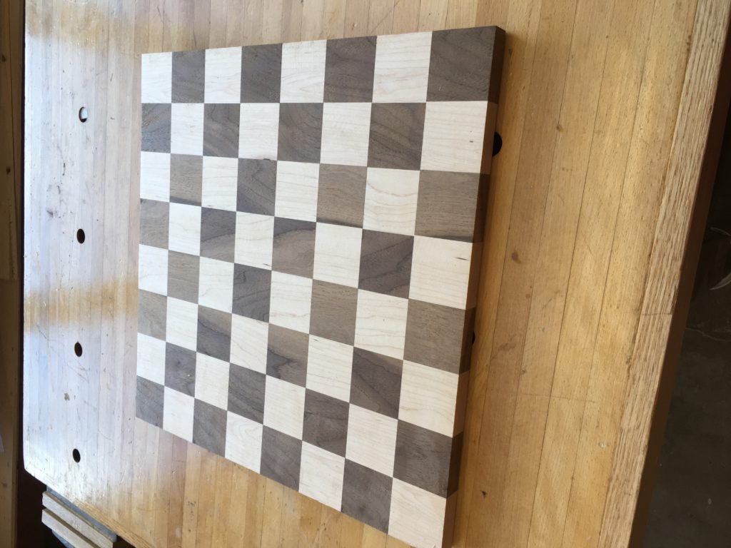
Below is the final product.


3 Comments. Leave new
I would love to see your woodworking skills put to use once again in the finer details of designing chess pieces. I am willing to bet you could beat the challenge. However, the stone pieces have an appealing, classy look as well is this a look you would rather achieve. I can certainly vouch for the flush surface of your design. Fantastic ideation and execution!
The amount of effort and time you put into this project is clear. It manifests with such simplicity, yet your design surely took hours to execute. Also, I thought your inclusion of a table representing the factor of seven taking a look at expectations versus reality was incredibly enlightening. Splendid job!
Hi Benjamin,
I like how thorough your post is. You went through a lot of detail on things that you have learned and the process of how you made the board. You discuss that the contemporary Asian aesthetics involves a lot of bamboo wood, but then you didn’t use that as one of the types for the board. What exactly about the type of wood you chose is part of the Asian contemporary? Is it the washed-outness of the colors? The feel of the wood? A lot of times people stain and varnish finished wood products. I like how it looks without that though. Good call on the glue too, I think trying to join the pieces would have been so much harder! Thanks for a great project!