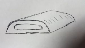
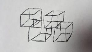
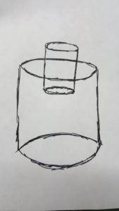
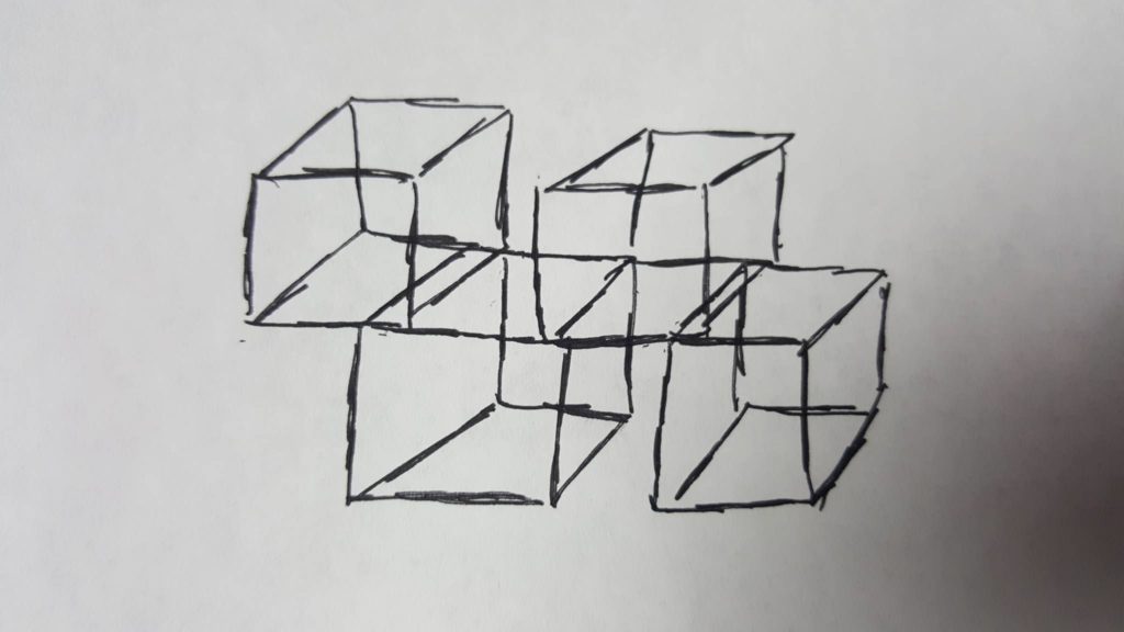
I explored a few of the 20th Century Design movements both on the fish tank portion and the drawer portion of my project. I wanted to keep the functionality of my project for both the drawer and the fish tank. To keep the upside down aesthetic as well as a new aesthetic is quite challenging. Below, I have sketched up 3 different aesthetics blended in with what I already had.
Futuristic Aesthetic Design of drawer is more sleek and shiny with more curves.

BauHaus Aesthetic Design of the fish tank. The fish tanks are compartmentalized into cubes and the cubes that are on top are essentially the upside down portion of the aesthetics.

Modernism aesthetic of the fish tank. Instead of a block for a fish tank, I decided to go with a fish tank with a curve. I turned to cylinders stacked on top of each other to keep the upside down aesthetic.


4 Comments. Leave new
I really like the cube version of this. That would have been difficult to pull off but it could definitely be a project for a bigger budget and time. It is a cool idea and definitely has that aesthetic
The sketches turned out great, they really make it clear how you want the final project to appear. From what I saw of your final project, it seems like you did a really good job of meeting these aesthetic goals and it looked like the final product had a lot of appeal. Great job!
Jason, really good ideas for all of these fish tanks. I really like the cube fish tank, but it seems a bit hard to achieve something like you had in the picture. That BauHaus style is very appealing, and I think it would look excellent if applied to your project. Hope everything turns out as you hoped!
The stacked “cube” fish tanks are definitely my favorite. These are some neat takes on 20th century design movements in regards to your fish tank, but I think it would be helpful to have an image of your design in this post to compare with your “cast-in-a-different-light” aesthetics. It also looks like you’ve been working on the sketching techniques in class, which is really great for developing this skill of seeing objects in a different light. Some labeling of your sketches may aid the viewer in understanding your design intent — at the moment I’m a little confused about how the objects within the fish tank would be oriented in these 20th century redesigns. Overall, nice job casting something that is so simply recognized in one form into several different aesthetics.