So there’s good news, great news, and “pending” (please refer to my Construction Timeline post)…
The good news is that I’ve been able to set up contributors to my page for the Op-Eds and Reviews portion of my page. My brother works in Denver and is extremely well-spoken, so it will be great to have him do some videogame and film reviews. What I’ll have to talk with him about is the size, style, and summary selection for the reviews. I’m leaning towards not giving titles a number score because I feel it can cheapen a product and is difficult to take into account everything a medium or experience offers. Reducing a 2-hour film, 10-hour show, or worse a 120-hour videogame to a single digit not only seems disingenuous to the effort of the creation and the time spent enjoying (or enduring) it, but also limits the writer’s ability to connect with the target audience—If you score it at the top people will begin your article with preconceptions and may misinterpret or outright dismiss your content, and if you score it at the bottom people may gloss over the discussion and opinions you’re writing about to find the number, the big take-away. I feel that avoiding this trap will, at least for the beginning of my site, be the best way to connect with readers and offer an objective perspective.
I have also set up Isabel Smith-Bernstein, graduate student at CU specializing in theatre and Shakespearean literature, to comment on artistic events and cultural developments through the opinions columns.
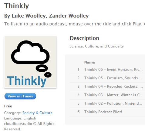
The great news is that Thinkly has just this past week been approved by iTunes, Google Play, and TuneIn for listing in their stores and podcast directories! That’s a tremendous encouragement to me and will allow me to continue this project and make aesthetic and stylistic improvements to the content, presentation, and artwork (theme music and cover) while reaching a real audience.
The “pending” actions are the nitty-gritty of the coding and layout debugging. I have been focused on the content and podcast that I haven’t had much time to address these goals, but now that the podcast and contributions can be checked “complete,” I will dive deep into the world of web script languages to pursue my aesthetic goals even further. I have signed up for a free CSS & HTML introduction session in Denver next week and hope to enlist the aid of my brother yet again (bachelor’s in Computer Science) to help me realize my vision.
Lastly, it is appearing that the professional content goal will be a post-launch improvement… it is proving difficult and time-consuming (mostly waiting around) to get permission to publish my contributions to former employers online. Engineering drawings are, of course, typically private intellectual property, for in-house use and to provide manufacturing information to vendors and suppliers. I may have to scrap this goal as far as the scope of the course project is concerned, but it will be front-and-center on my radar for future content updates.
Thanks for reading! I’m excited to show off the final product at the Expo and see the awesome works everyone else has put together.


1 Comment. Leave new
Hey Luke! First off, congratulations on getting “Thinkly” out there among some really important podcast contributors. It’s awesome to see that you are outwardly looking for and gaining support from alternate communities outside of the Aesthetics of Design class. As for the professional work to be posted I understand how difficult it can be to work around infringing the rights of the companies that you have contracted for. Would it be possible to post some professional work that you have done on the side-lines (i.e. career oriented work that is entirely your own)? If not, it certainly will be in the future.
About the site itself, it’s great that a quick Google search for “cloudfootstudio” results in direct contact with your information as the developer with the site itself being only the third option. This means you’ve created something that is, without doubt, unique to you. I have to be honest in saying that I have never felt like the red font choice fit in with the aesthetics of the rest of your site. I’m not sure why, but it comes across as a bit haphazard with the space vibe that I get at the top of the title page. I agree with Levi, in that moving the menu items to the left side of your title page may make the options more accessible in a fluid way, since we tend to read left to right. I do think the use of “barf” at the header may be a touch unprofessional. I think separating the “joke” section and the “spacey things” section should be separated — maybe if you only had like a joke of the week posted in a smaller post on its own and then it just updates when you have a new joke of the week instead of having a whole section for it, and “spacey things” I think deserve their own designated space. Direct the focus to “Thinkly” and your creations — they are the most creative parts of this website. It’s coming together really nicely. Let me know if I can provide more feedback on anything more specific.