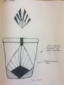
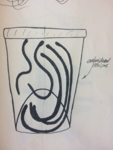
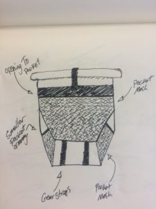
For casting my design in three other aesthetics, I focused on changing the front pocket design to incorporate other aesthetics. The three aesthetics I used were Art Deco, Art Nouveau, and a turtle’s shell.
The art deco design was inpired by a pattern I found while doing research. The pattern was a matrix of diamonds that contained diamonds inside of it. I thought it looked like you were looking up at a corner of a building and sun rays were shine out and up from behind the building. See the image below that shows the pattern I was trying to copy and how I applied it to the front of the backpack.

The art nouveau design was inspired by my favorite cigarette ad for Jobs rolling papers designed by Alphonse Mucha. The ad depicts a women smoking a cigarette and her hair is suppose to resemble the smoke coming from the cigarette. I used the same shape of her hair and put it on the front of the backpack. I thought I could cut out differently shaped curvy stripes and embroider them to the front of the backpack. The idea would be that the stripes serve as an aesthetic but also help form the structure of the backpack. See the photo below for a very basic sketch of that idea.

The third design was inspired by the shape of a turtles back from a bird’s eye view. To construct the shape/pattern I thought I could use pocket mesh in different shapes to depict the different parts of the turtle. The feet are depicted as smaller pockets and the body of the turtle is a larger pocket. See the photo below for complete details.


2 Comments. Leave new
The Art Deco design reminds me of a Volcom backpack: the diamond or stone you have drawn reminds me of their logo, and it looks like a product they would make. The turtle’s back-I think there were Teenage Mutant Ninja Turtle themed backpacks that were supposed to look like a turtle’s shell. Clearly great minds think alike! I would very much like to see the Art Nouveau design brought to reality.
I like all of the sketches that you drew to show the inspirations from the aesthetics from the 20th century. I also like how you explained why each sketch fell into those following categories. Have any of these sketches changed your view on what you want your project to look like?