This blog post will show my lamp design portrayed in several different 20th century design styles to visualize how different the design could look.
The first design style that i have drawn my lamp in is the Bauhaus style. This style shows the simplicity of the bauhaus design and how the structural features are not hidden like some other styles. I pictured relatively simple shapes for this bauhaus style with the inside being a simple cylinder and the outside being a rectangle in shape. This is in contrast to my original design of two cylinders. I think that the simplicity of the two shapes yet the contrast shows off the bauhaus style. I would also envision that the electrical work of the lamp is open to be seen such as some of the interior lighting of the style has been done in the past.

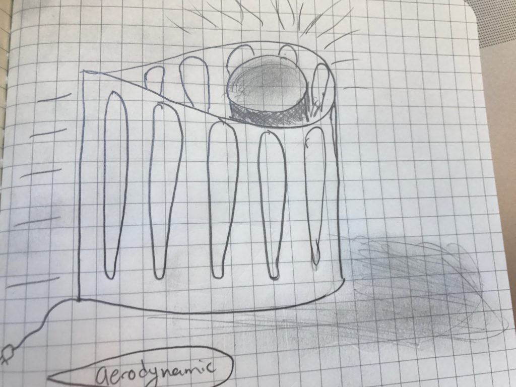
The next style which i have portrayed is the aerodynamic style of the 20th century. This design iteration shows the classic teardrop shape of aerodynamics and reminds me of a time trial helmet of days past which used to be used in the Tour de France. The slits in this version also have the teardrop shape to them being slightly more aerodynamic, however the bottom has been curved for what i think to be more aesthetically pleasing. I can picture this lamp in a Jetsons type setting made out of polished chrome to give it a slippery fast look.

The third style that i pictured my lamp in is the international style. The international style to me is large and imposing. I get this feeling from the office buildings which are done in the international style where they are often quite square and stand out from the landscape. I took this style and turned it into a trapezoid where the slits on the side have changing angles to match the section of the trapezoid which they are a part of. I feel like this lamp puts forth a relatively imposing figure and seems like it would take up more space in the room than it actually does simply because of the shape of the lamp.

For my final design i will consider several of these combinations while coming up with the version which will be produced.


2 Comments. Leave new
You presented some very interesting aesthetic choices, and I think that the aerodynamic design is a pretty cool option! I wonder what the outcome would look like from combining the aerodynamic and bauhaus aesthetics. I am excited to see how the project comes out. Great job so far!
These are some really neat ideas. I particularly like the ‘aerodynamic’ aesthetic. The way that aesthetic combines smooth and geometric shapes is cool. If you wanted to look into other aerodynamic aesthetics, you could try rounding the edges of the tear drop to look like the NASA cowlings developed for jet engines in the 1900’s.