Having decided to make a trebuchet, a weapon from 12th century, for my final project, I find it quite difficult to fit the aesthetic I am looking to achieve into one of the 20th century design movements. May be it can loosely fit into Constructivism because of all the mechanical elements. Or may be it falls under the minimalism category because of its simple structure.
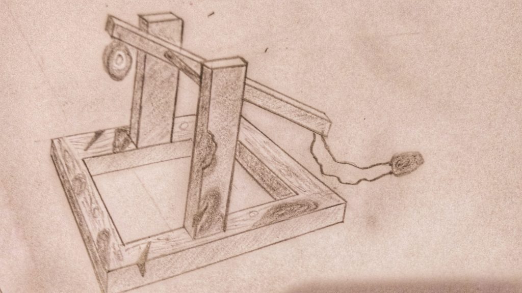
The aesthetic I am trying to produce is a morbid one – the idea of destruction and war, something that could invoke a sense of dread. Perhaps the most close design movement with this idea, in my opinion, is Realism. My illustration below shows some features i’d like to include in my project like the burn marks and sword marks.
The Three totally different aesthetic for my trebuchet would be:
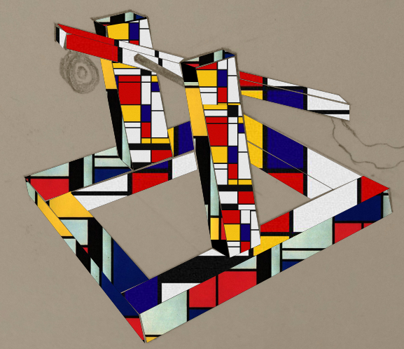
- de Stijl:

This design would be on the complete opposite end of the spectrum of emotions from my objective. While, I try to deprive my design of any colors except that are produced by burn marks, this de Stijl design includes the colors to the maximum.
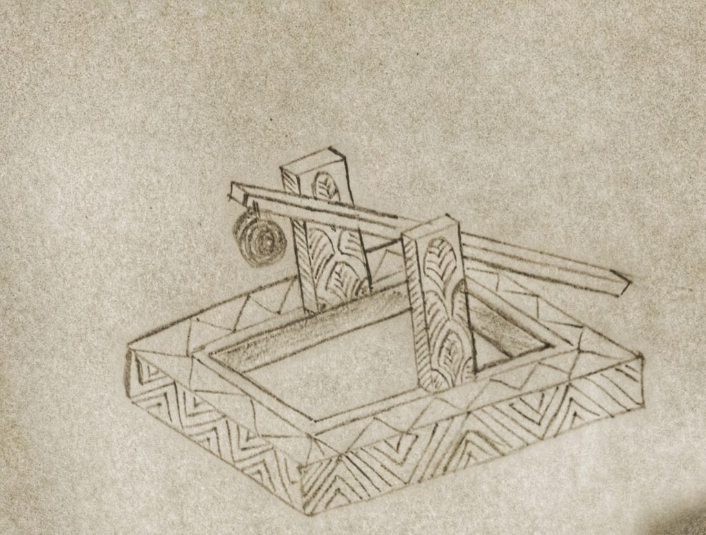
2. Art Deco:
The Second aesthetic I tried was the Art Deco style geometric lines. The sharp mines and repeated patterns gave a completely new look to the trebuchet. Although I must say this is not one of my favorites. 
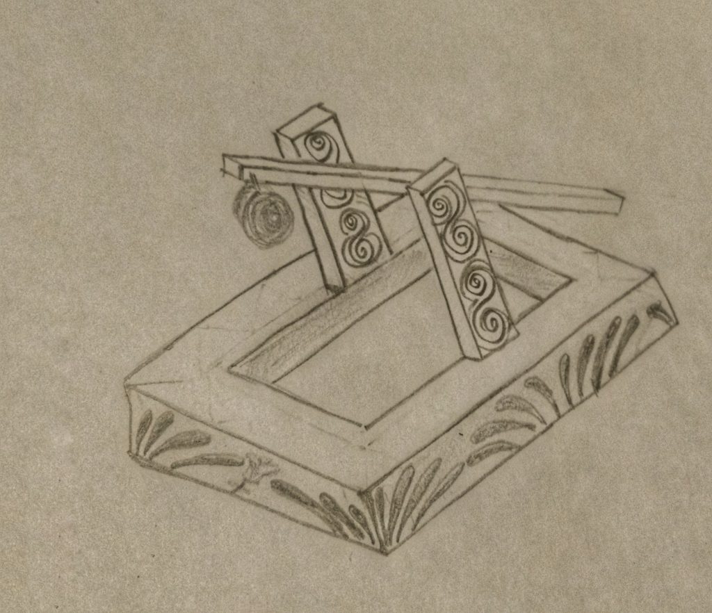
3. Art Nouveau:
The final aesthetic I tried is the curves of art nouveau. The curves and flower petals makes the trebuchet less intimidating. Basically, they make the trebuchet look beautiful which is in stark contrast to what I am trying to achieve. However, I possibly can use some of the curves and burn them over to produce an increased sense of dread.


3 Comments. Leave new
Creating three different aesthetics for a trebuchet is tricky but you managed to pull it off! Very creative ideas to inlay different graphics on the wood. I really like the idea of the burnt and damaged aesthetic to make it appear as if its been through war.
I like the art nouveau aesthetic. Perhaps you could improve upon it by adding more curves to the bottom panel. Right now it seems like they are blades of grass and has a more organic feel to it. But the other sketches are great!
Great sketches! I think you fully embraced the aesthetics you want to convey, I especially like the Art Deco style of the trebuchet. But my personal favorite is the war-torn aesthetic that you are going with. Great job!