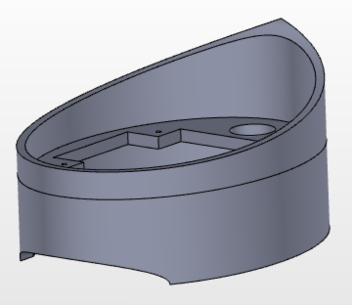
For those of you not familiar with my project, I am designing and building a levitation stand. Something that uses magnets to make another magnet appear to be floating. My current chosen aesthetic is futuristic (shown below), but I’m not liking how my initial designs are shaping up and turning out. For this reason, I’m taking this opportunity to explore the possibility of changing my design aesthetic.

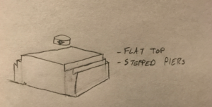
My first exploration is Art Deco. This design sketch is defined by a flat top and stepper piers. The flat top serves an important function in the utility of my design, as the distance from the the bottom of the floating magnet and the top of the base of the stand is not a very large distance, so to give the appearance of the magnet floating, I need a relatively flat top for the base. The stepped piers are something that defines Art Deco to me, and something that I could easily incorporate in my design.

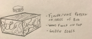
My second exploration is in the Arts and Crafts Movement. This sketch is defined by a flower and vine pattern along the sides of the box, a natural wood finish on top, and golden edges. These details give the appearance that a craftsman made this. I’m not sure how I would execute the flower and vine patterns but the other aspects could fairly easily be achieved. The natural wood finish would come naturally with a good cut of wood and the golden edges could be made using gold leaf over a cheaper metal that holds the sides of the box together.

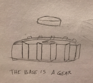
My final exploration is Steam Punk. This sketch is primarily just showing off the gear head side of this design aesthetic, as it is just a gear. This is a simple design that shows this aesthetic and doubles as symbol for mechanical engineering.


2 Comments. Leave new
Great sketches to explore three alternative design aesthetics different than your intended aesthetic of futuristic levitation stand. I would imagine the Art Deco aesthetic could fit your project very well as well, especially if you incorporated some gold in the linear design. And even the steampunk one would be cool. It would remind me of something out of the animated film “Treasure Planet.” But I think I like your intended aesthetic best, as it matches your functional goal as a sort of futuristic levitating stand.
Really solid sketch ups of how your design would look in different movements. Maybe even taking the design aspect from the arts and crafts movement and adding some sort of decorative design (not necessarily flowers) to your final design could be a good addition. The art deco sketch kind of reminds me of Aztec pyramids. You might be able to make something cool revolving around that aesthetic if you still aren’t confident in your current one.