My project definitely resembles the high-tech-matte-black aesthetic movement. The smooth matte black casing, the changing lights, and the effects of the mirror make for an extremely high tech appearance.
Art Deco:
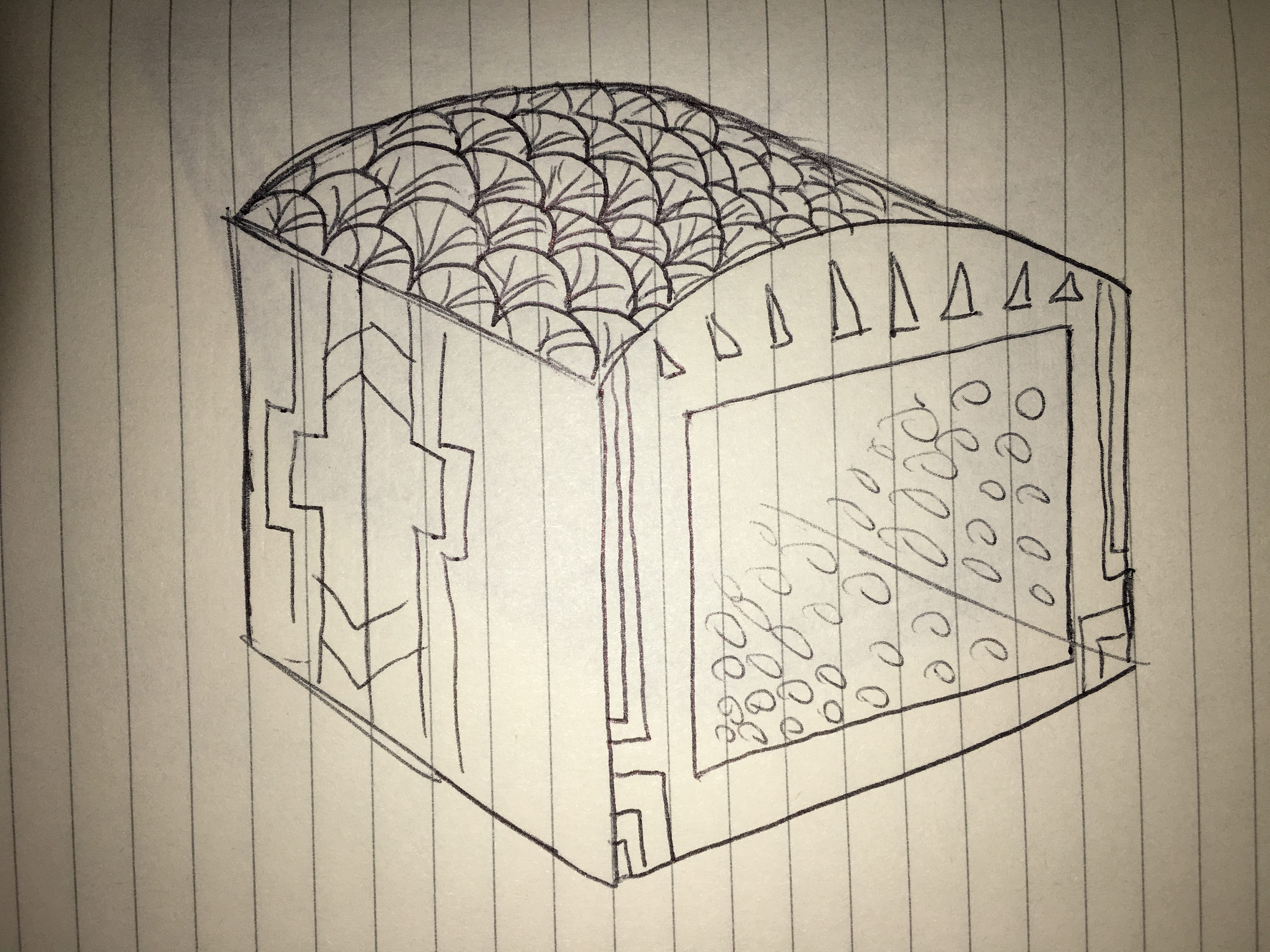
Art deco is one of my favorite aesthetics. For this I would keep the cube shape but change the internal mirrors to create intricate geometric patterns resembling art deco. The lights would only show gold and silver colors and the outside would be decorated with gold and silver patterns as well. The shape of the button would be a square and flash gold and silver as well.
Industrial Chic:
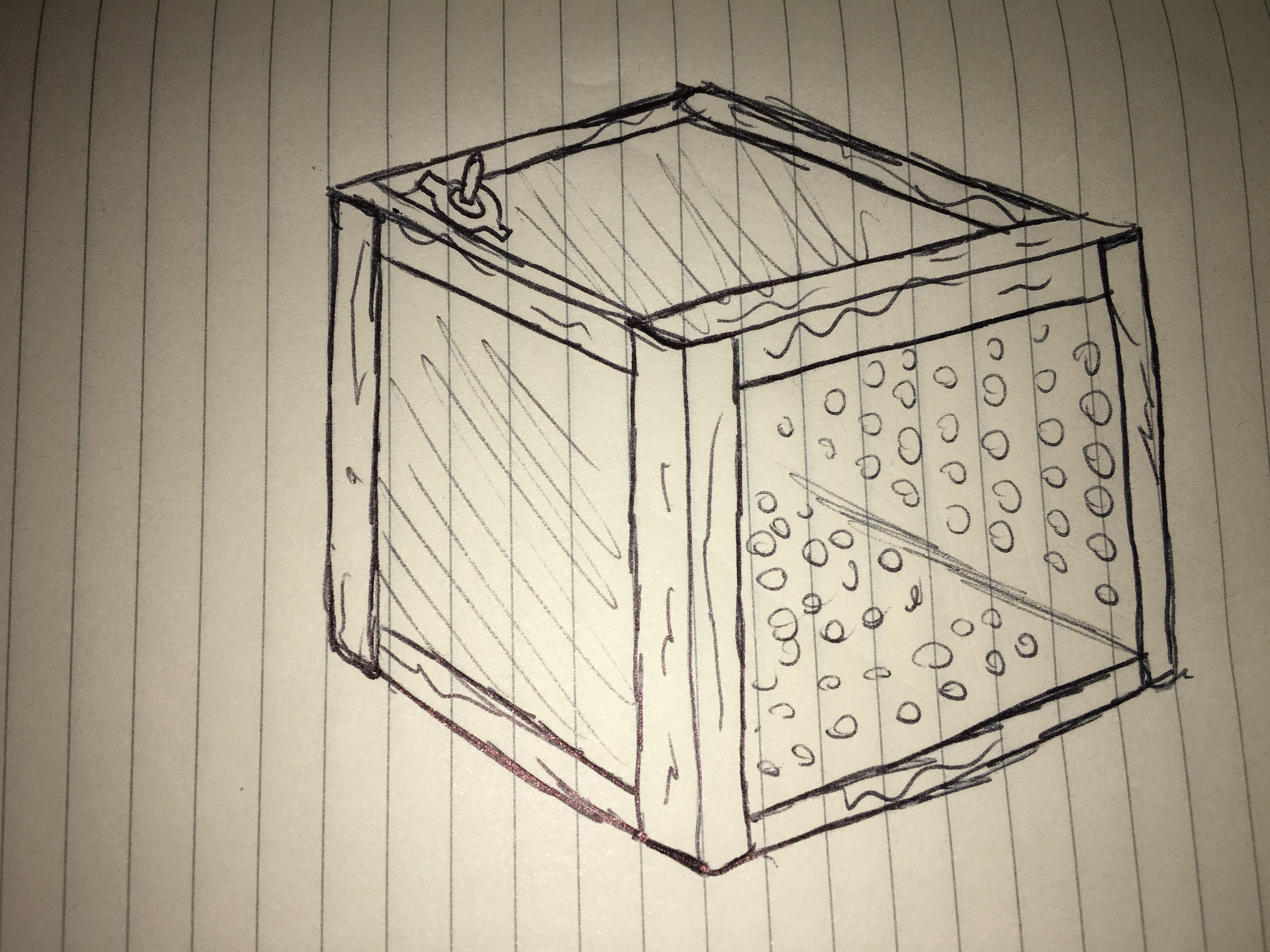
To fit into the Industrial Chic category, I would change the material of the cube to barn wood, with the edges made out of corner bar wrought iron. I would change the light scheme to warm colors, mostly oranges and yellows. This will give the impression of old fashioned incandescent light bulbs. The shape would remain a cube, industrial chic uses many hard corners and edges to give a modern feel to vintage, industrial materials. Rather than a button to turn on the lights, there would be a vintage toggle switch.
Tim Burton:
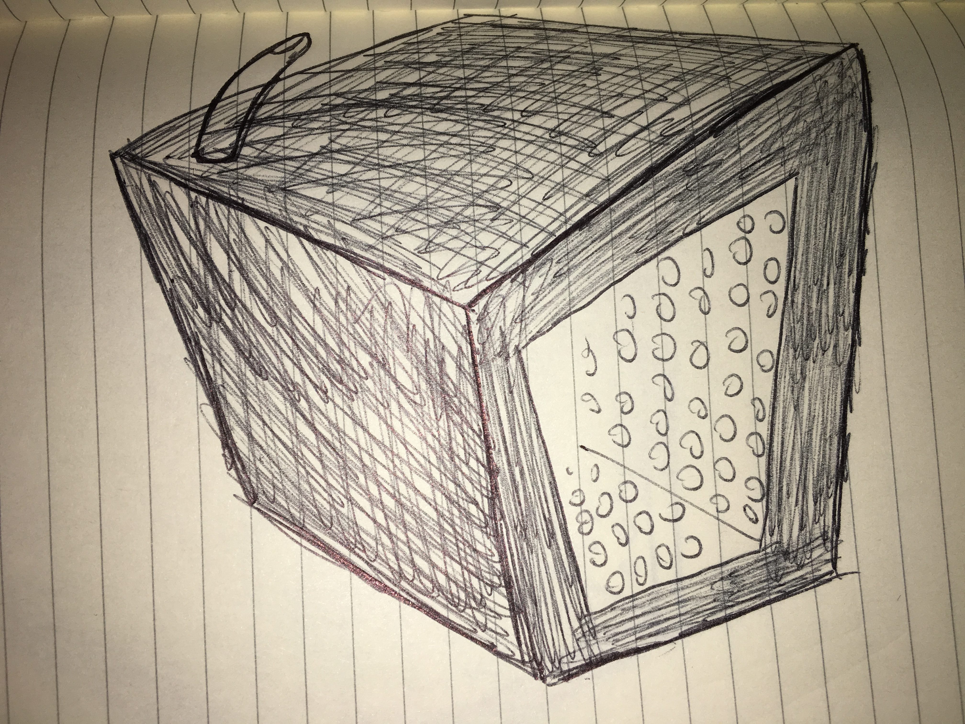
Creepy, spidery, and dark would be the best three ways to categorize the way Tim Burton portrays his aesthetic. To fit my infinity mirror into this aesthetic I was thinking of keeping it as a black box, but add some odd proportions to it. By making the bottom face smaller, and making the top face larger, the cube will appear to be standing taller than it does while having this abstract and gothic feel to it. I would change the light scheme of the LED’s to only be white, and do more flashing and harsh patterns. A bony finger would be used to turn on the device rather than a button.

2 Comments. Leave new
[…] Project Inspirations Top 5 Constraints Design Review Project Aesthetics Compared to 20th Century Design Movements Construction Timeline Final Stretch Progress Final Project Report pt. 1 Final Project Report pt. […]
I love the shading in the Tim Burton design. Your sketches are nicely detailed and true to their aesthetics. I am excited to see how this turns out! I also love the vintage toggle switch!