Hello!
The purpose of this post is to explore what my standing desk would look like with the current aesthetic, and then to apply three very different ones.
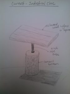
Here is the design as it is now:

The writing is a little hard to see. The base says “cement bottom”, the stem says “black iron tube”, and the top says “reclaimed wood w/glass or lacquer. The elements that make this Industrial Chic are the roughness and material for the base. Cement is probably the most industrial thing I can think of. The stem has kind of a distressed black metal finish, and is made of metal. It looks like it would be dirty or oily if you touched it. Reclaimed wood making up the top is common in a lot of table tops at Industrial chic-style restaurants that I’ve been to. It also has an old, distressed kind of look.
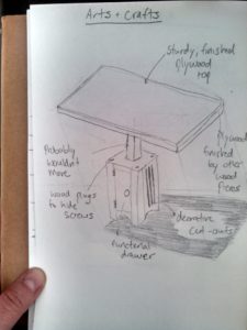
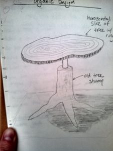
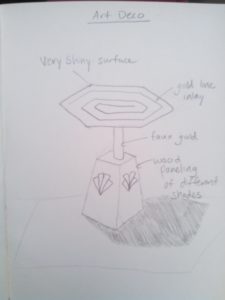
Then I tried some different designs including Arts and Crafts Movement, Organic, and Art Deco:

This desk was partially inspired by this type of desk that I researched: https://s-media-cache-ak0.pinimg.com/736x/56/fe/2a/56fe2a11152f76812d14a57089dde2a6.jpg
My grandpa once built a couple desks for my sister and I. The features that seemed predominant are using a lot of wood, wood plugs and caps, all one color stain, and square features. This desk also incorporates a drawer, because I think the Arts and Crafts movement also had an element of down-to earth functionality. In this movement, my desk would probably not be a standing desk, it would just be at a stationary height.

This sketch was inspired by a design I found here: http://www.granarywoodshops.com/OrganicDesignGallery.html
I really like this one actually. I think the old tree stump shape works really well with the supportive needs of the desk. I’m picturing it as a weathered stump (no moss on it or anything). Also, the table top is a slice of a really old (and therefore large-diameter) tree. Hopefully sustainable sourced! This design takes organic literally, actually made out of nature, whereas a lot of the movement was merely inspired by nature.

The designs on the base in this last sketch were inspired by these: http://transportphotos.deviantart.com/art/art-deco-desk-160757619
I think that this design would have the base be made out of wood, different colored wood panels with a very shiny finish. The stem would be kind of that fake gold metallic color, and the design on the top would have a gold inlay in the wood, and the whole thing would be finished with a shiny lacquer. Again, I don’t think an art-deco themed desk would move, because it really wouldn’t fit with the era very well.
Thanks for reading!


1 Comment. Leave new
Kira these are some interesting design variations based on the original, industrial chic design we discuss in class last week. I really do enjoy the reclaimed wood on top as I think it may offer balance to the industrial chic aspects of the hardware components below the tabletop. You may also be able to capture the industrial chic elements into the wood top. I am excited to see how it all evolves int he next few weeks.