For my current design, I plan on using a “contemporary Asian” aesthetic, which involves a lot of nice stained wood, with a hint of contrasting bamboo colored wood. I’ve started to notice that the shape of this aesthetic is very “sharp”, and does not have a lot of rounded edges. Corners are squared off, and the rectangular shape seems to be most dominant.
In exploring other aesthetics, I wanted to find a few that were totally different than the current, anticipated design, and so I found the following:
- Radical design
- Streamlining
- High Tech/Matte
I considered the “organic design” aesthetic, but decided that it was too similar to contemporary Asian, sharing the woodgrain and elegant feel.
Below are various sketches that I believe portray various aesthetics of my design.
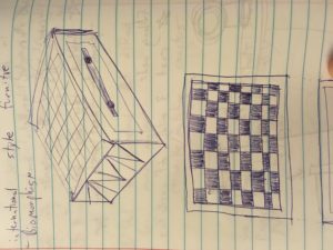
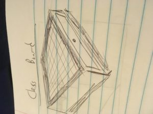
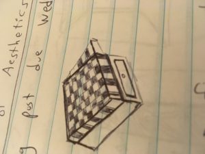
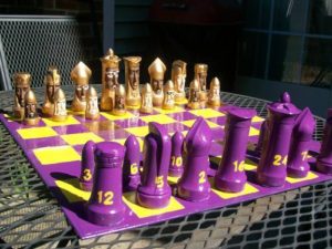
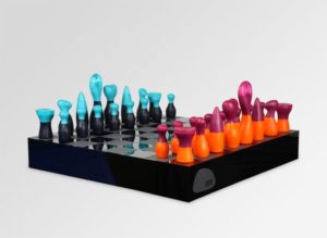
- Radical Design/Funky
http://www.craftster.org/pictures/data/500/medium/185232_06Jun10_102_1820.JPG
https://s-media-cache-ak0.pinimg.c
om/564x/94/2d/fd/942dfd81d56f9392df004b9d6b6d3d02.jpg
https://s-media-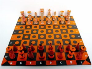 cache-ak0.pinimg.com/736x/11/d7/22/11d7221de004daaae52fb6ae51e54154.jpg
These images above have a funky feel to them, feature bright and unique colors, and have non-traditional pieces to go along with them. This is an interesting aesthetic. My takeaway is that I can try using different (non-traditional) colors of wood, and maybe even stain them to achieve a custom color.
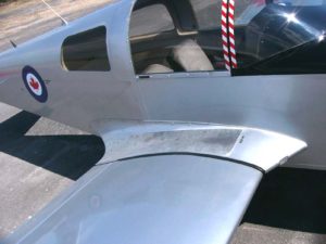
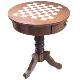
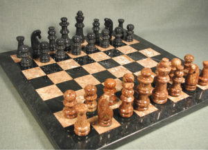
- The second aesthetic is streamlining. For a 2d object that is mostly stationary, this may be challenging. I want to acheive a rounded shape, similar to that of this aircraft and of an airfoil. I can visualize everything having an airfoil on it.
https://upload.wikimedia.org/wikipedia/commons/1/10/WingRoot01.jpg

https://s-media-cache-ak0.pinimg.com/236x/17/bd/e6/17bde66297576a9e4f11c9c4c10190a9.jpg
http://www.chessusa.com/mm5/graphics/00000001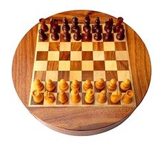 /35-P05/35-P05_1_large_255x255.jpg
http://www.regencychess.co.uk/images/large/RCC001_04_LRG.jpg
A common theme here is that most of these pieces and boards are rounded and look sleek. This isn’t exactly a look I want to achieve on my aesthetic.
- High Tech/Matte
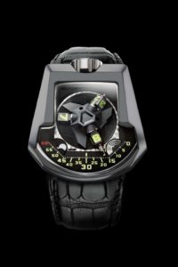
For this last aesthetic, I found high tech/fancy marble/shiny items.
https://www.revolution.watch/wp-content/uploads/2016/08/UR202AlTTiN_FACE.jpg
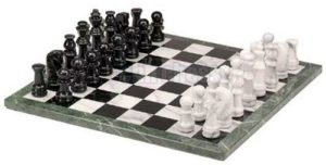
http://www.quincymemorials.com/images/Deluxe_Granite_Marble_Chess_Set_Quincy_Memorials_2.jpg
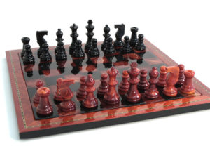
http://pebblez.co
m/pictures/alabaster-marble-chess/Alabaster-Marble-Chess/705/96016BT-1.jpg

http://pebblez.com/pictures/alabaster-marble-chess/Alabaster-Marble-Chess/705/NS155RB.jpg
The common theme with all of these is that they are very shiny and glossy. My takeaway for my project is that I should have a little bit of shine to my parts, but nothing outrageous.
These crazy aesthetics are not exactly what I want to turn my project into, but here are the takeaways that I may be able to apply to my project to create a unique look and feel:
- Using different (non-traditional) colors of wood, and maybe even stain them to achieve a custom color.
- I should have a little bit of shine to my parts, but nothing outrageous.


2 Comments. Leave new
The radical design and the high tech aesthetics actually look awesome. Your project has a sort of versatility that other projects don’t, so you have a lot of potential aesthetics to choose from. I think you should pick the radical design and have some sharp, contrasting colors for each side, but that’s just my opinion. Awesome job!
I actually really like the radical/funky design in this. It is very fun and crazy, and it will add a lot of color to the chess board, which can often be very boring looking. I think you could do this aesthetic and add lots of cool designs to each piece. I also like the matte look, its a lot more sharp and classy looking. If you do this look, you should get a matte paint that dries in that texture. Would look super cool.