For my project, I have decided to go for the aesthetic of a classic and organic look. I have decided to this based on the fact that my product will be going in a non-modern and very traditional dining room. I think that this will be better than a modern look, and so I am staying away from any matte black/ high tech looks, and I am also staying away from very modern aesthetics.
I have decided to sketch my project by first sketching something that I want to stay completely away from. I do not want any of the high tech/matte black aesthetics to be on my project. I feel as though this would really take away from the beauty of just having a naturally stained wood.

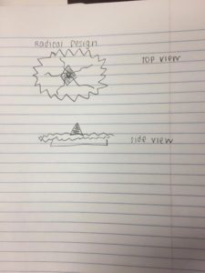
My second sketch is a radical design sketch. This is something I was in between doing when I hadn’t yet decided if I wanted to do an organic and classical look or a modern look. I decided to stay away from radical design, because it was too busy for my object.

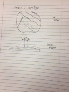
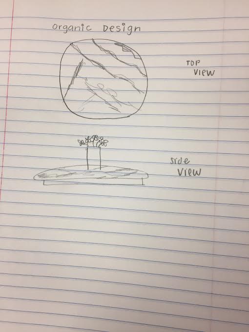
My third sketch is my organic design sketch. This is the aesthetic I am basing most of my project after, because it is very clean and classy looking. This is the look I am going for.


1 Comment. Leave new
Cool aesthetic options, I agree that the organic probably makes the most sense for a lazy susan as well. Although the radical design could be interesting. Just not sure it would match with many of the other items on a kitchen table.