1. Domain name
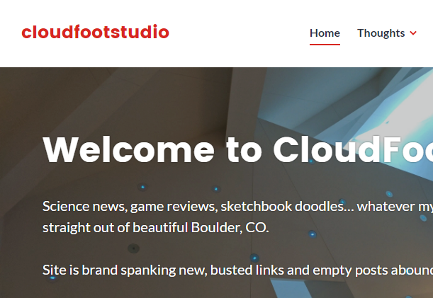
One of the most important features of any website is a unique and memorable domain name, one that is easily understood and easily spelled. It was a bit of a challenge to actually get the domain that I wanted, but I have had it decided for a while. In my previous post on Main Project Inspirations I told the story of how I got the name (Luke -> skywalker -> cloudfoot), but there are so many possible instantiations of that title… cloudfoot, CF, cloudfoot studio, CloudFootStudios, CFStudio, and so on. You can tell I was pretty settled on the “studio” moniker, and going singular was really a result of the number of letters allowed by Instagram and Twitter, lol. Unfortunately my online store on Society6 was already “studios” so I’m trying to fill it with enough keywords and tags that cloudfootstudio will return it as a result. I owe both cloudfootstudio.com and cloudfootstudios.com, but the companies that hold them for me are rather old-fashioned and don’t provide any site design tools. It was very complicated to connect those domains to my current draft site, but I finally got it just yesterday! See for yourself…
2. Mix professional and personal content
I don’t just want a Tumblr. I also don’t just want another LinkedIn. I really want an environment that mixes my personal projects like artwork, music, photography, and blog-type posts with more professional content such as engineering work, career aspirations, and at least some sort of resume or background information that potential hirers can use as a sort of portfolio. I think this will mostly be achieved through the design of my menus, which for now I’ve labeled Thoughts (for blog posts and videogame reviews), Library (for episodes of my podcast and books I’m reading), Creations (for Society6 products and Instagram feed), and an About page to house an abbreviated CV.
3. Mobile-friendly
I was pleasantly surprised at how easy this particular constraint has been to achieve so far… the web template I installed quickly and cleanly proved dynamic enough to adjust based on the width of the screen on which it is viewed. I just have to ensure that, as I make changes, I don’t introduce any incompatibilities with the interface or overlapping graphical elements. I also have some work to do making entire boxes/regions click through to the links instead of just the text within them.
4. Clean and modern
I’m definitely going for a sort of “helvetica” aesthetic here… clean and intentional sharp lines, distinct (one might say high-contrast) graphical elements, welcoming but professional curves. I don’t know if I’ll actually use the Helvetica font, but I can definitely say it’s been an initial inspiration for the layout and balance of the web design. I’ll be employing some of my favorite color palette here… primary greys and blacks, white background, red accents, and most likely a deep blue or black logo.
5. Live-updates based on my online presence
This is going to take some CSS coding, which I’m not very familiar with. There are some rudimentary tools in the web design kit that allow me to tap into a single account on Twitter and Instagram, but I would like to have more specific content shown in certain areas, so I’ll have to do some reading on how to control the displays based on hashtags or other text/settings of the posts. But for now I’ve got the important things up, and more customization can come later when the final deadline is approaching… they’re kind of “icing” options.


2 Comments. Leave new
Having a website be your final project is such a cool idea. Having this class be a part of the ME program definitely makes is seem like we have to create something physical. However, building an interactive website is a great way to incorporate design, aesthetics, as well as the dynamic requirement. I’m not sure if you’ve had much experience with Javascript, but I’ve been learning p5.js (animation JS library) recently and it has a lot of cool interactive features as well as online tutorials.
I really like the idea of having a website as a project. The clean, Material Design approach to your website is awesome! Your step to make it more mobile friendly is a great idea As we just crossed the barrier into more cell phone visitors to a website than desktop users. How do you plan to display this project to an audience in a way that encourages them to interact?