It took me a while to decide what I was going to do for my final project… I considered a sort of large-scale upcycle project with reclaimed materials and wind to generate electricity, but I’m pretty sure I came up with something better.
I’m going to design a website: a personal and professional design-oriented site to aggregate my online presence in other areas like Instagram, Twitter, and LinkedIn. The first inspiration for this I suppose was Dr. Hertzberg’s suggestion that design and engineering students have a personal website to showcase their work and maintain an individual professional online source of contact and information. This makes a lot of sense and I’ve wanted to do it for a while, but didn’t really have the motivation to get it started. I think much of the work in this class has provided (and will continue to provide) the tools and habits I need to keep it maintained.
It will also be the home of a podcast I started with my brother, called Thinkly. So although I’m still in the process of gathering inspiration, comparing design elements, and obtaining a full-fledged web suite as opposed to the various free trials, I can definitely discuss my inspiration for one of the primary graphical elements of my page: the logo.
Because my first name is Luke, since I was very young I’ve received the “I am your father” -type treatment from people who meet me. I don’t think that necessarily had a hand in my affection for Star Wars (engineering minds often enjoy science-fiction), but it certainly helped contribute to one of my earliest online identities: skywalker993 in the old-school MMORPG RuneScape. I tried to be Skywalker2000 but that was taken. Skywalker1000 was as well, so I worked my way down from there and 993 was the first to be available!
Well, I had my handle selected, so I needed a good password. I thought about parallels, analogs, etc. for the game or my username, and one of the first things to occur to me was “cloud foot,” to parallel “sky walker.” This phrase (plus many other random letters and numbers, of course) became my password for many years. Later, in college, when I started putting up music and artwork on YouTube and Facebook, I decided to use that as my handle, with “studio” appended. CloudFootStudio was born.
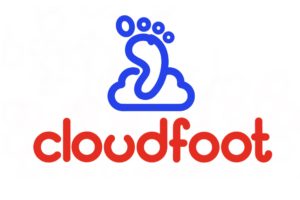
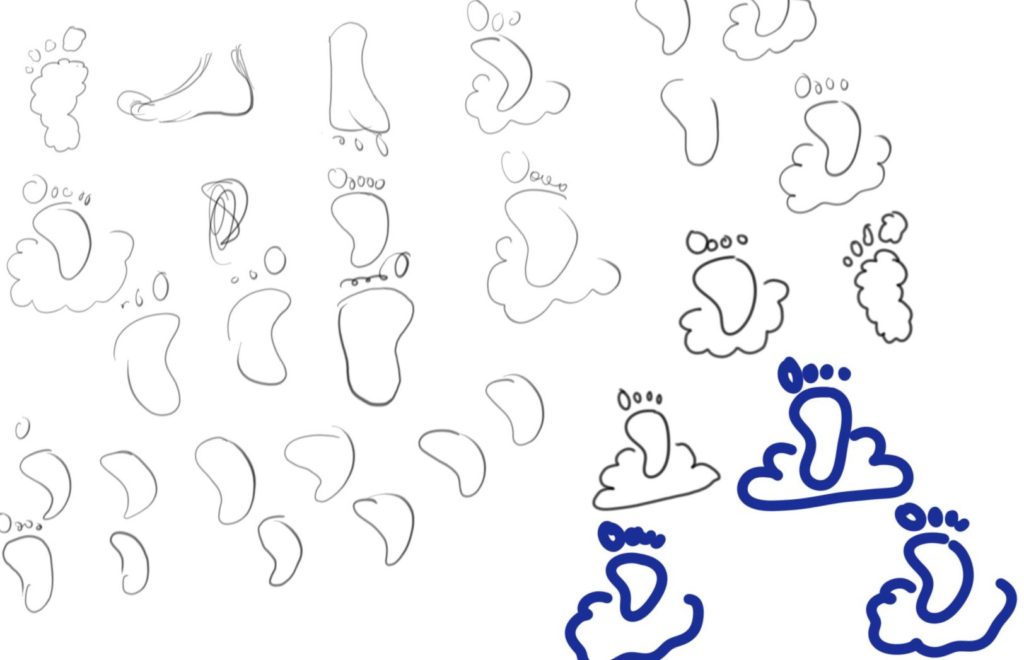
As you can see I had a few different ideas for how to graphically represent this identity, and I didn’t really look at anything to help me decide on the final version. I guess I just like the rounded edges, the simplicity, the cartoonish and approachable nature of the imagery. The type font is based on the curves of the cloud and the close spacing of the lines, though it is definitely on the table for modifications. But this will serve as the initial icon and logo of my website, hurrah!


5 Comments. Leave new
[…] get the domain that I wanted, but I have had it decided for a while. In my previous post on Main Project Inspirations I told the story of how I got the name (Luke -> skywalker -> cloudfoot), but there are so […]
[…] get the domain that I wanted, but I have had it decided for a while. In my previous post on Main Project Inspirations I told the story of how I got the name (Luke -> skywalker -> cloudfoot), but there are so […]
I love the logo, it could definitely be cleaned up and perfected, but the aesthetic is well on the way. It has the same gleam as many tech companies do these days; the rounded edges, the abstract futuristic font. The one thing I would think on more is the color choices. I think there are better options than the red and blue. But I am sure you will keep on improving on this as the project progresses. As mentioned by Kira, I love the back story and this is actually a brilliant idea. To me, this project feels like the perfect blend of Linkedin and a blog site like tumblr. Have you started planning the interface of the webpage at all? I’m curious to see how this works out for you.
Hi Luke. I like how you presented your project and the story behind it with such a personal touch. I remember playing runescape too! I think my name was ladylemon (because I have a sour personality? I don’t remember what I was going for). I’m wondering what the design aspect of your project will be? It looks like you’ve got the logo down already! Are you thinking that font and layout choices will fufill this? Sidenote- what is Thinkly about?
The design will mostly come down to the website layout… how the pages are organized, what side panel information is displayed, font and color choices, that sort of thing. I focused on the logo here because I want it to be the jumping-off point, if you will, for the start colors and clean edges of the whole thing.
Thinkly itself is a short podcast about science breakthroughs, culture and media news, and then a discussion of something that made us curious. The pilot episode is about NASA and SpaceX, the Oscars and our favorite video games of 2016, and then an examination of what makes nuclear power plants different from nuclear weapons. If you want to listen to a little bit of it, it currently lives at https://thinklycfs.wordpress.com/2017/03/01/thinkly-podcast-pilot/ and I would love some feedback since it’s the very first one (22 minutes).