Inspiration and Vision
One of the most common things that is thrown away in my house of seven people, is beer cans. I began collecting them as soon as I heard about this project but did not yet know what I wanted to do with them. I came up with the idea to recreate a statue I remember seeing in a park when I was a little kid. It was about a 20ft foot tall, all red, all metal rendition of a hammer with arms and legs. This statue called “Big Red” by Ed Benavente is much to big to re create in its original size so I made a small scale model completely out of beer cans and beer boxes. Below are three pictures of the statue.
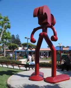
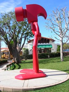
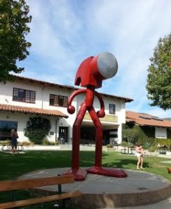
Figure 1 Figure 2 Figure 3
The aesthetic I was trying to achieve was the aesthetic of beer logos/cans. I have seen many small trinkets, toys etc… that are made entirely out of beer cans or material with beer logos printed on them. So using both the childhood memory and the beer can aesthetic I was able to set a clear vision for what I wanted to do. The cylindrical shape of the can is perfect for the arms, legs, hands and feet which is where I got the inspiration for the material from. The head will have to be made out of beer boxes due to its flat sides. My goal is to create a close resembling scale model, that looks well done, and that will be able to stand up on its own.
Design Loop
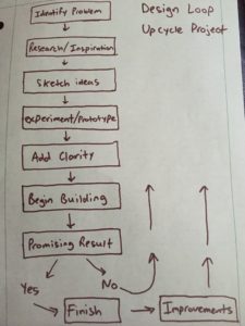
My design loop started really with choosing a material and then using the internet to find inspiration and ideas about what I wanted to make. Once I knew I wanted to make some type of statue, and then specifically the statue I remembered seeing from years ago, I began sketching it out using the “beer cans” I chose as my recycled medium. This gave me the idea that I could create 80% of the statue completely out of cans if I could successfully cut the cans at different angles to creates curves and bends. Once I had it roughly sketched out, I began cutting cans using pliers and a dremel. I discovered that it was possible to create the angles I sketched out without too much difficulty so at that point I knew I needed to refine my sketches because the design seemed feasible. I then began building and got pretty far even while I was just testing my material out. I used various cans all with different heights and diameters to then add some clarity to my design and further plan out how large it needed to be and what cans I would place where. I then just started chipping away at it starting from the bottom. To get to this point after just a few hours.
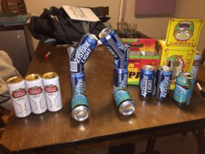
My design then further evolved into the following.
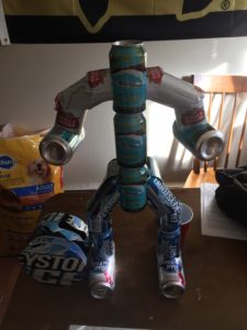
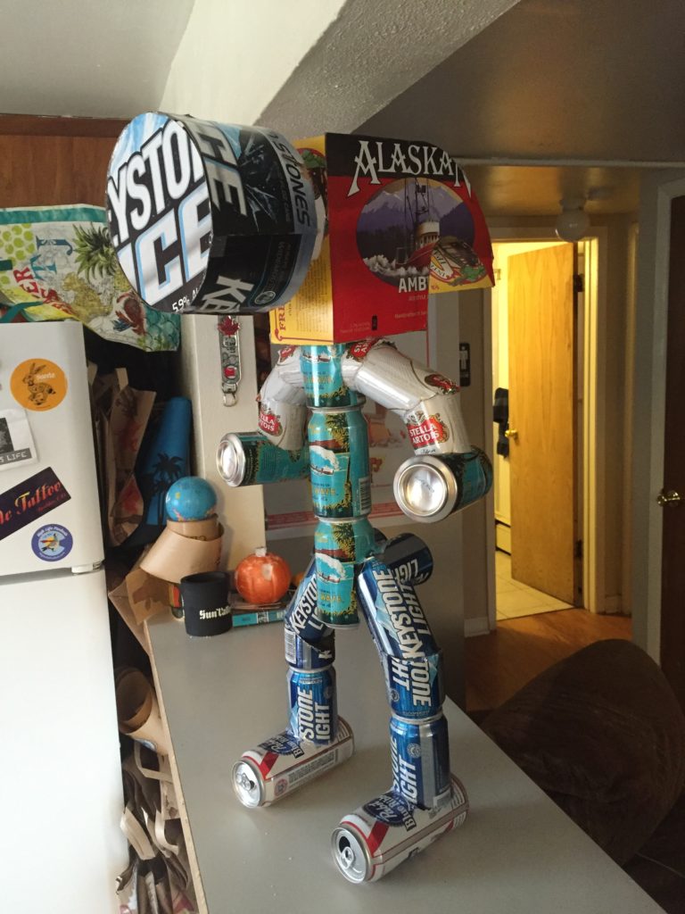
I used a dremel, hot glue and some scissors/pliers as my only tools as well as a ruler and some markers. About halfway through my structure I decided to only use certain beer cans for different pieces of the body such as the feet, arms, legs, etc… that way I could use multiple different brands but keep a simple patter and size. Once the body was complete I began tracing out profile views of the hammer head shape I needed to create. I made the circular part of the hammer head out of two circles for the faces and a narrow strip to connect the two together. The hot glue worked great and really held the pieces together while maintaining the boxes rigidity. A fear I had in the beginning was that the hollow head piece would not be sturdy enough to support its own weight, thankfully this did not turn out to be true and the head piece is one of my favorite parts of my statue. After about 10 glue sticks, 15 cans, and four different beer boxes I completed the statue…
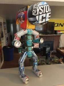
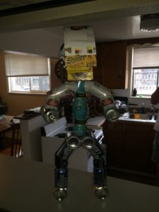
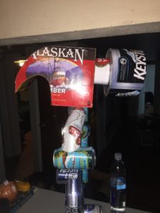
In the end I think my statue achieved the beer can/logo aesthetic while also achieving my structural goal of being able to stand up on its own. In the future I would really like to create another statue out of beer cans but one of a nail running away from this hammer or maybe with its hands up in the air. I think it would be a hilarious addition to this piece.
Video Link: https://www.youtube.com/watch?v=eQHO2sQFSO8
Citations:
Figure 1 : http://www.lotsafunmaps.com/Los_Angeles/Malibu_Country_Mart_Mall.html
Figure 2: http://www.sandywang.net/Hammer.html Photo taken by “Sandy Wang”
Figure 3: http://www.publicartinpublicplaces.info/big-red-1996-by-ed-benavente

8 Comments. Leave new
This was a really cool project. I’m really impressed with how it turned out, it looks very similar to the inspiration artist work. The hammer head that you cut out must have been difficult to get the shape right. Really great job!
Hi Dean, I like how you used a plentiful material in your design, and really stuck to the beer logo aesthetic you were going for, while combining it with a meaningful sculpture from your life. I went to Austin, TX once and there was a Mexican art museum there that incorporated the same aesthetic, so that was cool to see. I also like that it stands on its own, and is structurally sound. I liked your future idea of a nail running away from the hammer, that would be pretty funny!
I like beer and I like great designs so this project really caught my eye. I like the comedy aspect you had integrates into the sculpture. Your design process looked like it was a lot of work trying to get everything to stay in place but for, the looks of it everything worked out. Great Job!
The project came out great! It looks a lot like the original statue. I think that you chose the beer cans well also, you definitely managed to emphasize the logos on the cans. Great job!
I love how whimsical this project is. It always seems like the epitome of traditional masculinity ( beer and power tools ). But what I thin is nice is that you elevated these blue collar aesthetics and turned it in to something purely for art and had no function. I see your point about not using one brand of beer can for the statue. But I think it would have been maybe a bit cleaner that way or if it at least all had the same colour scheme
I enjoyed that you took an ordinary material that you had at your disposal and turned it into a piece of art. I think that the use of cans were perfect for this particular sculpture. I would really like to see you make the secondary sculpture to add to the humor of this project. Great work on this project
This is a really fun and creative product! I can’t say I have seen anything like this before. I’m also impressed how accurately you were able to mimic Ed’s sculpture aesthetic with a completely different material. I think you nailed the aesthetic and the goals you set for yourself. I definitely think you should pursue your idea of creating a beer can nail running away from it. Good work man!
Really cool inspiration and outcome. I like how sturdy and well built the statue is, it looks really symmetrical and stands up well. I also think it is more interesting that you used different types of cans for arms/body/legs.