Video of my presentation is HERE.
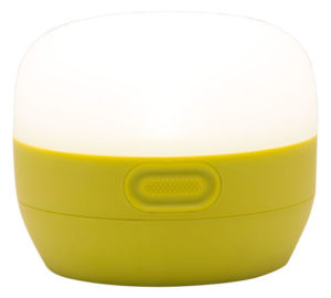
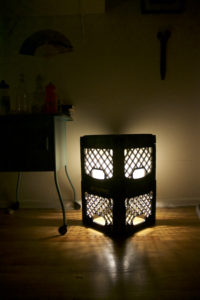
Kept on the ground, the L1 produces a low-mood lighting experience. The bulb is covered in all directions which helps diffuse the light source and blocks the eye from catching direct light, which can be distracting. Providing two levels, the lamp can be used as a bedside table or shelf. This feature allows the user to customize their experience and meet multiple needs. One of the my favorite potential uses is as a soapbox for public speaking. Having the milk crates stacked on top of each other produces a tower of light for the user to stand on top of, which I personally love. The form of the L1 was inspired by Scandinavian furniture. No frills or unnecessary features were used in the shape of the lamp. The simplicity of the lamp allows for it integrate seamlessly into different surroundings and decor. The plastic diffuses the light, which hides the location of the bulb and makes the L1 glow. This was inspired by the Mogi Lantern by Black Diamond (Figure 1). I like to think that hiding the bulb produces a sort of mystery to the actual light source and that the lamp produces its own light without the use of a bulb. The milk crate was inspired by memories of when I was a camp counselor. At lunch time, everyone received a milk box to have with their lunch. 2% or chocolate was the decision every camper had to make and it was always ice cold. It was a time that everyone came together for a break and enjoyed a simple pleasure. This is a fond memory of mine that I will be reminded of when I look at my lamp.
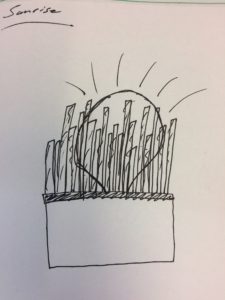
There was nothing very interesting about my design process for this project. I started with sketching ideas for different lamps which mainly focused on using collected sticks. The initial lamp concepts played with the idea of producing a bedside sunrise/sunset experience. However, I didn’t like the idea of the bulb being exposed on top.
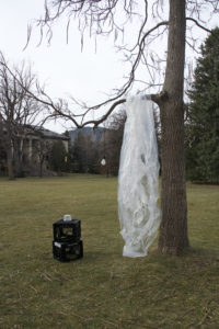
I do not remember the initial inspiration for the milk crate, but I knew that it was the right route for the frame. Originally I wanted to use thin acrylic (white) sheets to line the interior with, but was constrained by the recycled material requirements of the project, so I sought after a different material to use as the shade. I thought plastic bags would diffuse the light enough and stayed within the guidelines. At work, we recently received a ductless fume hood and it was packaged in a giant plastic bag. This was the perfect material to use for the shade. For light, I found a portable flood light fixture in my backyard. These materials are displayed in Figure 3.
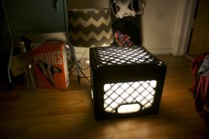
With all of the unnecessary light fixture parts removed, I wrapped the plastic bag around the bulb and shoved it all in the crate. The bulb sat in the middle of the crate surrounded by plastic. Figure 4 displays the L1V1 lighting the ground of my room. I think it turned out quite beautiful.
I received lots of feedback from my team and friends on how I could change it. A majority of people couldn’t tell what the shade was made of and didn’t know initially that it was a lamp, but loved it when it was turned on. although I did get suggestions: “Make more of them.” “What if you had a stage made out of them?” “Stack them on top of each other.” I listened to the people and scavenged for more materials. My roommate scored me another milk crate, but I was unsuccessful to find more plastic. Oh well. I unpackaged the light fixture from the plastic, shoved the plastic back in the crate, put the fixture on top of the plastic and set the plastic filled crate on top of the other. The results were ideal.
The L1V2 directs a majority of the light downward and omits it through the holes in the bottom crate which produces a pattern on the floor. Figure 5 displays the L1V2 lighting my bedroom floor.
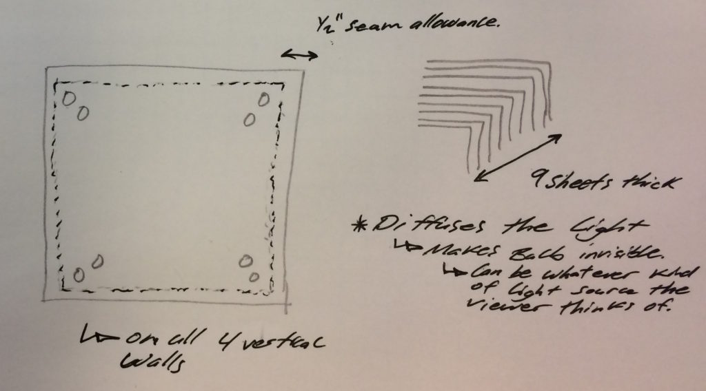
I originally planned to alter the plastic bag from its original form. By cutting uniform squares out of the plastic, layering them, and sewing them together I would make curtains that would line the inside of the crates. See Figure 6 for the concept sketches of this idea. However, I decided on not going through with this because it seemed like a lot of work. I really like the idea that I took garbage, didn’t do alter it, and made it look not like garbage.
There are a couple of alterations I would like to make to finalize the design. I would like to make a wood top that would rest on top of the crates and complete the bedside table functionality. Right now, the light is controlled by plugging it in and unplugging from the wall. This is a pain so I plan to add a foot pedal switch to turn it on and off. The lamp produces a decent amount of heat after being on for a couple of hours (not hot enough to melt the plastic) and this makes me nervous. I need to play around with the design to reduce this heat and make it safer.
Now, I truly do ‘love lamp’.


20 Comments. Leave new
This project came out really fabulously, Levi. I appreciate you incorporating Luke and I’s suggestion of an additional unit — I think it gives the lamp some extra depth and functionality. I would love to have this in my home and use it as a bedside table. Overall your final report is concise and describes your process very well. In the future, perhaps it would be useful to add some of your pictures “together” to spread out the aesthetic of the page. That is unless, of course, you were aiming for a linear aesthetic on your report that mimics your design process! I also think that seeing some photos of your assembly would be neat. Great way to wrap up the report with the “love lamp” line!
I really love your direction of taking a product category you usually disapprove of and creating a version that’s pleasing to you. This approach is promising for product design (or even art) as there are almost always people who share your opinion/frustration and if you have the ambition you can market to those individuals by addressing the problem you perceive.
The flexibility and modularity of your crate stack is pretty great, so I can really see a few of these at different heights in a kind of industrial-chic apartment… a 3 stack, 2 stack, and 3 stack in the living room, then a 1 stack and a 2 stack in the bedroom. This would match your mood lighting goal as well as end table. Regarding your plans going forward, how do you plan to test heating issue to make sure there’s no danger to the plastic?
Overall, this is my favorite project so far, very cool application of upcyclery that fits with several aesthetic trends in modern young living. Kudos!
Thank you very much! I plan to go into Product Design specifically outdoor gear and home furniture so I might take this further and use walnut or teak for the frame.
I like the idea that you solved your own dislikes with lamps. I think many engineering students are drawn to engineering solely to better what they dislike. From a presentation standpoint, I like how you explained your design process with pictures, versus a chart. Great job using the final lamp as a prop instead of just leaving it off to the side. I appreciate how you iterated your design based on how your goals and preferences morphed. Improving it really shows your commitment to the lamp, not just as a project, but also as a belonging that you seem very proud of! Overall, laudable planning and execution.
Thank you for the feedback. I try to present with as little of words on the screen, its a style that I think works best for me. I was very nervous about standing on the crates in the presentation, I almost fell while practicing the night before. I’m glad you liked it!
Excellent work! Despite the appearance of the individual components, the end result was a compelling, beautiful, and functional design. I was surprised at how functional the lamp was: using a lamp as both a light source and a surface never occurred to me.
Thank you! One of my favorite things about the lamp is that I didn’t alter the material I used for it and you cant tell its garbage when lit.
Starting from concept drawings shows your thought process, It’s nice to see that you created something that is close and personal to you, which I feel adds that much more value to it. the L1V2 version looks great. It’s awesome that you created different versions of it and followed an iterative process. The fact that you found so many unique uses for it takes the cake.
Great Job!
I’m glad you liked it. I admire the modularity of furniture design that came from the midcentury modern furniture wave. Thank you!
The milk crate lamp looks really awesome. The patterns produced is certainly gives a different aesthetic than the usual bedside lamps.
I hate lamps also, nothing worse than an exposed bulb. I like how the light seems much more natural than most bulbs. It’s defiantly mood lighting. Could maybe use thinner plastic along the top so that more light can come out. Maybe a way to adjust how much light comes out of the top? A slider or something.
I think the slider is a great idea. I can reduce the plastic on top and have a overlapping panel slide on top to control the light exposure. Thank you for the suggestions and feedback!
I really appreciate that you don’t like lamps either. The light they produce can be so distracting when it hits you in the eye. Also, its such an awkward piece of furniture IMO.
I like your ambition to create a lamp that you like since you naturally don’t love lamps. Your initial sketches show your thoughts and iterations for this project well. The floor standing design is cool because you can use this as a night stand/night light combo. The future additions you mentioned would really enhance this project and take it to the next level.
First of all, love your title.
I totally agree with hating such direct light from lamps, so I love your inspiration. And you’re right, it is actually beautiful! I wish we got to see it in use in the dark to get to really admire it.
The extra features you want to add in the future would be awesome, too.
The visual effect of you standing on the lamp was great.
The milk crate story from your camp counselor days serves as great inspiration for this project, not to mention your distaste for lamps! The mood light idea as opposed to flooding the room with too much light is very cool. It’s really impressive that you had the opportunity to create a first version and a second version both with multiple uses. I’m curious about why you used such a large plastic bag. Was it a design choice or just because it was available? I love this idea. Great work!
I appreciate that you addressed a problem (a dislike in the current design of most lamps) and set out to solve it. By diffusing the light with plastic bags, the light truly does glow instead of shine. Furthermore, the shadows are really interesting. My only concern is that the plastic container and sheets may become very hot from the lightbulb.
Having two iterations is great, and designing it to be on the ground is a cool concept. I also like how you incorporated feedback into it. The cross hatching shadows add a nice touch to it.
Great way to add your memories to your project.