When I started thinking about what I wanted to make for this project I knew I had to make something for my apartment. I also wanted to take the recycling aspect of this project very seriously and didn’t want to buy anything new for this project. So I looked around my room to see what I could spare. I always hoard gift bags, ribbons and tissue paper from presents I receive to use again. I also had a fair amount of paint and glues from sorority crafting and a stack of blank CDs from a movie project I had made for someone a couple of years ago.
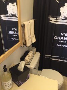
So once I had my materials down I went to pintrest for some crafty inspiration (You can look at my mood board and credit links here). In our first blog post for this class we explored a particular aesthetic and I researched art deco and its revival in the last 5 years. I decided to stick with art deco because I had decided on making a tissue box cover for my bathroom with an old gift box I had. My shower curtain has a vintage print of a Chanel N5 bottle on it, just as a basic college girl should have. But what most other basic girls don’t know is that Chanel was founded during the time that Art Deco was being born. Gabrielle “Coco” Chanel played off of art deco with the geometric designs of her bottles, the sculptural simplicity of her dresses and the typography in her labels.
This project seemed to come together on its own and the inspiration and functionality and placement of my object all just came together.
Below is the documentation of the process:

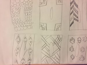

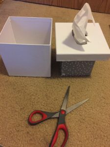
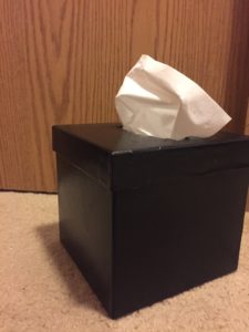
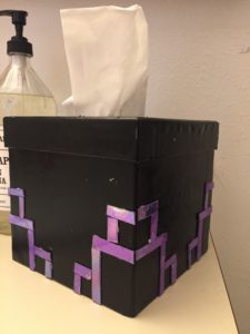
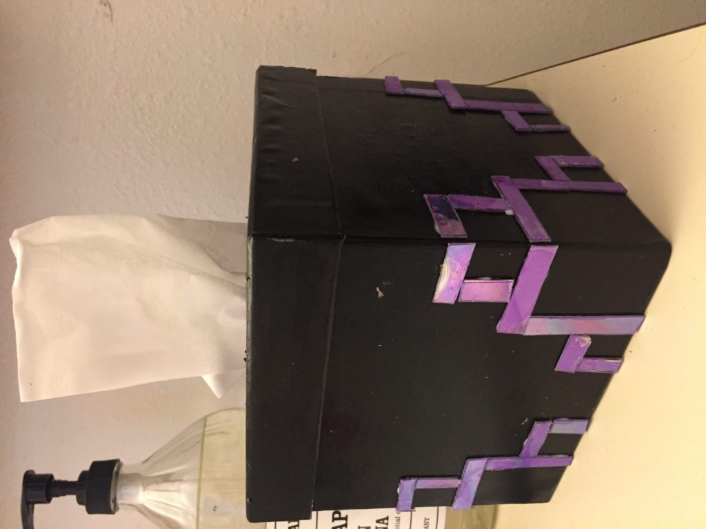
If I happy with the way it turned out even though it took 2 hours just to cut out the CD pieces. Next time I would definitly not use scissors to cut the blank CDs it is very hard to get straight lines. I also would have actually like to have glued the CD pieces right side up with the gold showing instead of the reflective side showing. I think it might have looked less like CDs but would have gone better with my aesthetic and the room.
Monday Presentation:

8 Comments. Leave new
This design was really good due to its simplicity. Its functional and it is aesthetically appealing. The reflective material made the project that more desirable. really nice work.
I really enjoyed that you continued using the aesthetic that you explored earlier in the class. You very effectively captured the style that you were going for. I like that you clearly explained what it is that you would have done differently if you had the chance by using the other side of the CD’s so that it better matched your bathroom. The only thing that I think would have made it better would be if you brought it in despite pieces falling off.
I like how you did not buy anything extra to create your project, sticking to the upcycle part. I agree with the others in that your art deco aesthetic choice really came through well. What kind of paint did you use to decorate the box? How did your design loop look after you did the project? Did you run into more roadblocks than you thought? Also, this post may be strengthened by flipping the pictures (I know it’s not due yet, so you may already be doing this) right side up. Nice project Olivia!
I enjoyed how your project focused not only on achieving its own aesthetic, but also on complimenting the art deco aesthetic. I think your final result achieved this. The use of CDs with straight lines was also unique and led to a more professional look for the box as opposed to the Pinterest CD collages you were inspired by.
I really like how you used the CDs, especially because when you typically think of a CD, you think of their round shape yet you decided to use them in blocks with straight edges. The design you created definitely fit the aesthetic of art deco in my opinion and it appeared to be very symmetric. Wish the presentation was a bit longer however. Good job!
Creative inspiration behind the idea from art deco. It is always good to have attractive looking stuff around the house instead of plain looks. Great use of the upcycle project. Good job!
You definitely got the art deco, geometrical design aspect out of this. If you could find a better way to cut the CD’s you should try and get a little more intricate with your designs, and you mentioned that the other sides of the CD’s were gold, which may make for some nice contrast against the more colorful side. But if you were going for the more two tone, high contrast look, I would stick with what you have. Good Job!
I like the idea of reusing CDs to give off a different look at each angle that the tissue box is viewed from. I like the simplicity of this design that can be transferred to many other objects in a persons home.