Upcycle Project: Final Report
Creation: Custom “iPhone” Laundry Hamper

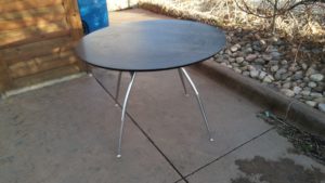
Before

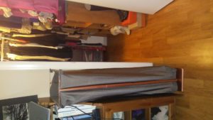
After
Discussion
Inspiration
My inspiration came from the need for a custom laundry hamper with a small foot print (9″ x 16″) due to the size of my room. A standard laundry hamper with bag design was adapted to a laundry hamper that was made for the exact size of the space. It is taller in design for two reasons:
- To fit enough clothes since the length and width of the bag is not large.
- To meet the aesthetic requirement: this design is inspired by an iPhone.
Vision
The vision was formed from the material itself (table). Originally, the concept was envisioned using wood pallets and baling twine because they were readily available materials. The practicality of using wood to form a frame, however, was determined to be time consuming since the wood is not the same dimensions. Additionally, wood from pallets has several sharp edges and splinters which could snag clothes. It was also aesthetically unpleasing.
Trying to find additional materials for the frame was difficult because online searches for random free objects did not provide anything worthwhile. Brainstorming led to a vision based off of the first aesthetic assignment which I did on Apple products. The idea was to narrow my search to metal tubular materials and shape them into an ipod frame. The aesthetic was a much better fit for the design because it was more aesthetically pleasing for my room, would not snag clothes, and would be much more stable for the small space without the bulk of a wood frame.
Design Process
The actual design process matched closely to reality. It was fairly linear because when I plan a project I incorporate specific steps and milestones even if they are slightly similar. One surprise was how the first aesthetic assignment defined and solidified my vision.
Metrics
Artistic: The artistic vision changed a few times. The original idea to use wood pallets and baling twine to make it look aesthetic was scrapped from the beginning. The next idea to use each of the four table legs as part of the laundry frame was scrapped before fabrication.
The final artistic design before fabrication was achieved. The modification to use the additional two legs to add length to the frame in order to achieve the vision was performed in process.
Paint to give the iPhone aesthetic and choosing the metallic grey lycra fabric provide the finishing/surface touches to the aesthetic. The design itself to only use two long pieces to support the bag from a frame is minimalist and similar to the design concepts of an iPhone. The aesthetic was also further established by the use of rounded corners on the wooden base and metal frame.
Function:
The function was fully achieved, and the design meets all of the criteria for size and capacity. Additionally, the frame is stable due to the wooden base which was cut down from the table top in order to support the frame’s height. The wood base is the perfect weight and thickness for the screw attachments. Additionally, a hole was counter sunk to fit the middle portion of the metal frames and provides the majority of the stability.
The fabric of the bag is lycra and is strong yet stretches enough to hold a weeks worth of clothes, towels, and sheets for the laundromat.
Lessons Learned
- The biggest challenge was finding equipment resources (oxy acetylene torch) to form metal.
- The next biggest challenge was the schedule of the equipment resources (attending workshops to have access to equipment and hours of availability).
- Another challenge was allowing enough time to learn new skills (sewing) and allowing enough time to perform simple steps (attaching snap buttons to the bag).
What’s Next
Use it! It fits perfectly in the space, looks great, and is large enough to fit a week of laundry!


5 Comments. Leave new
Super cool project! The fact that you can put it right to work is the crux of the project in my opinion. I like the exposed frame, it really shows the handmade quality of the project. I appreciated all the pictures of the project, your project was better documented through pictures than most.
The amount of work you put into this is phenomenal! I am so impressed by your go-getter attitude. Also, you really adapted your design well dependent on challenges that came about. I think you could sell these (or designs like them) to students living in college campus dorms.
Great utilization of your resources throughout the design loop. Your resulting basket was a perfectly functional! Used your available space very well. I recommend turning your photos within the report. The main picture of your basket is sideways. Also I felt like you were speaking to the tv most of the time, some eye contact to the crowd would be a huge boost to your presentation quality.
Grea presentation, lots of visual aids and details to your process. You should add the photos from your ppt to the project. As an engineering student, I alway am designing around constraints whether it be budget or client requirements. Your project really exemplifies this perpective and demonstrates the design process well.
This was a great idea. I like how you created a project based on something that you actually needed. Furthermore, you had limited space in your room so needed to design a custom sized solution. It was interested when you compared your final product to something you could buy in a store. This is something that you will definitely remember and cherish since you built it yourself.
Your presentation was very engaging, and I enjoyed all the images of the build process and the iterations of the built. The pictures definitely enchanced it!
The final product meets the aesthetic that you were going for, and definitely could be featured in a Martha Stewart catalog.