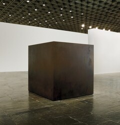
One of my personal favorite design aesthetics is minimalism. The minimalist movement begun in the 1950’s with artists such as Donald Judd and Tony Smith. Minimalist design can be identified by its simple nature. Only enough information is displayed for functionality or display of emotion, and nothing more. A classic example of minimalist art is on display currently in the Whitney Museum of American Art.

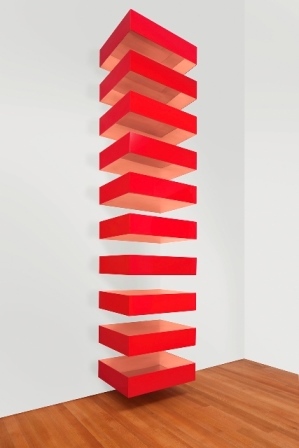
Donald Judd had a similar take on art with a more modern twist. More than 20 years after the Die piece displayed above, he created these famous pieces. that come in a variety colors and materials, all of them interestingly enough, have the same name.


Right: copper and red Plexiglas. 1989
Even a minimalist designs can portray powerful emotions, but minimalism is not strictly reserved for sculptors. Designers have taken this design aesthetic onto our personal electronic devices.
 The i-Phone, with its single button. It has just enough options for interaction as needed to function. Leaving the consumer with an elegant piece of technology that can be carried around in their pocket. People are moving away from digital watches back to analog, again with just enough information displayed for functionality. This watch below has taken the minimalist aesthetic to the extreme.

Other minimalist designs are seen everyday in advertisements. Those with a lot of negative space, or dramatic typography. The Coca-Cola logo is a great example. It is so simple you can’t mistake it for something else. Smooth flowing white text on a red background, nothing more.

Minimalist designs can be found nearly everywhere, from the internet, to the packaging on consumer products. The more I look for it, the more I see it, minimalism seems to be a popular aesthetic.


5 Comments. Leave new
Branden,
Really good post, I like the multiple examples you provided to help me understand exactly what minimalism is. When I first saw the title of your post I thought it was going to be about those people that live in the really small houses, but I now understand that has nothing to do with the “minimalist” aesthetic you are talking about. I would say I am a little bit of a minimalist, always throwing away things I don’t use anymore, only keeping things that are truly necessary. I really like this concept of minimalism, and although I agreed with the concept before I did not know it had a name. Overall really interesting post though, good job!
I really enjoy minimalist art. Not only is the art interesting but living as a minimalist is somewhat comforting. Easy and simple, but elegant. Creating minimalist art can also be challenging because it is easy to turn minimal into something more complicated. The idea of minimalist is the do the least while providing the same aesthetic or the same use for the design.
Your post was really informative! I associate minimalism with deconstructing design in order to portray how we fundamentally attribute meaning to objects and you really nailed that concept with your analysis. Seeing your first example of minimalism, the work “Die,” helped solidify the idea of minimalism in my mind. Providing multiple examples of minimalist works got me inspired to integrate minimalism into my own designs while making me think about how minimalism can be integrated into how I live my life. Can everything be reduced to what is necessary for its functionality? You got me thinking about how reducing something to its base form can still be elegant and aesthetically pleasing.
Very interesting post! It’s funny to me to see the minimalism passed from generation to generation now as well. For example, my grandmother and grandfather were raised during the great depression. They kept absolutely everything in their houses from newspapers to receipts, to hundreds of grocery bags. My parents grew up with the clutter all around them, which made them organized beyond belief. That’s one of the greatest parts of minimalism… it’s tidy! Now, we don’t even need to keep filing cabinets of paperwork. It’s all saved to our computers and cell phones.
Every aspect of your post intrigued me. From the work, “Die” at the beginning, which forced me to Google the Vitruvian Man to see the original dimensions, to the Coca-Cola logo. It’s incredible how many companies are making simpler and simpler logos now. One of my favorites is the new MillerCoors logo. It’s simply three circles put together to look like a glass of beer from the top. My one suggestion would be to explore more companies that are making their logos simpler and show a comparison on your post. Overall, great post! Keep up the good work.
I’ve always found myself to minimalist art, your first example, Die, is such a striking piece of work. Especially after reading the museums note on it, I get a sense of an ominous presence from just looking at the photo of it. Great examples though, your product examples have me thinking about how much minimalism I’ve seen everyday, yet hadn’t noticed until now. Cheers man! good post!